Fertility and Income: Some Notes
UPDATE: Forgot a section! Added now!
Pretty much everybody has seen a graph showing that richer countries have fewer babies. Here’s an example from the March 2024 revision of Our World in Data’s fertility page:

OWD heads this section by saying, “Fertility first falls with development — and then rises with development.” Building on this, UVA student Maxwell Tabarrok argues that “Maximum Progress” can prevent permanently declining fertility. If society advances enough, fertility will rise again. I mention Maxwell because I did a twitter thread recently rebutting his piece. I did so because I was asked to do so by others; but ultimately, Maxwell did an impressively good job of putting together the “U-shape argument” in one specific place. Since writing the thread I’ve had requests to formalize the argument a bit more. That’s what this is.
My basic thesis is this: The view that mere growth will boost fertility again is wrong. It is based on seriously outdated underlying research, doesn’t fit the actual empirical facts of the case well, and it leads to theoretical confusion which inhibits clear understanding of how fertility actually works.
The Zombie Curve
The discussion of fertility and income usually begins with either a graph like the OWD one above showing a decline in fertility with income, or with a graph like this:

Fertility falls at low incomes, rises at high incomes.
Except… this graph is wrong. Let’s count the reasons why.
Sample Size, Sample Error
The first thing to recognize is sample size. The graph above is much better than the usual version of this zombie graph, an old screenshot people circulate on twitter, which doesn’t show sample sizes. Maxwell here has tried to show you sample sizes: you can see women in households earning $1 mil+ are a small sample.
But how small? The answer is that in the 2017–21 American Community Survey (the source used above), of the 3.3 million women ages 15–50 in the sample, just 2,287 of them are in $1 mil+ households, of whom just 118 had births in the sample window. So something like 0.07% of the sample is in this $1 mil+ group.
Within that group, their incomes are noticeably heaped:

That’s a bad sign as it could point to respondent inattention.
But that’s not all. With just 0.07% of the sample falling into this sample, random errors may make up a huge share of the total sample.
Consider a simpler case. Imagine that people take surveys quickly. Imagine 5% of the population is gay. Now imagine a survey question asks, “Are you gay? Yes or No.”
Suppose that of the 5% of the population which is gay, 1% of them (so 1-in-100, a pretty low rate) misread the survey, or aren’t paying attention when they take it, or are trolls lying to surveyors, and they say “No” even though the true answer is “Yes.”
Now suppose 1% of the straight population also lies or has errors. Here’s how that shakes out assuming a sample of 10,000 people:

You can see that 99.9% of the “said they were straight” population is straight. But only 83.2% of the “said they were gay” population is gay. A very large share of the “gay” population in this sample isn’t really gay: even very low rates of survey error can result in high rates of errors among rare subgroups.
Two factors shape this kind of error: 1) the size of the population you want to study, 2) the error rate of the question you’re using to identify the group.
We’ve established the high-income group is very small. 0.07% of the sample. That’s itty bitty.
We’ve established there’s a nontrivial error rate in this group observed from income heaping.
We don’t have a standard way of estimating exactly what the rate of erroneous income reporting in the ACS is. But we can ask, “How high would the error rate have to be for 50% of the $1 mil+ respondents to be fake?” The answer is pretty simple: about 0.03%. If even 0.03% of ACS respondents erroneously classify themselves over $1 million in household income, then about 50% of the $1 mil+ group is erroneously classified.
On the whole, my sense is that income reporting does have considerable error. There are well-known errors on the low end where respondents fail to report lots of income. Particularly looking at the spouses of wealthy men, it’s totally plausible many of them could have highly erroneous views of household income. The upshot here is I’m skeptical even a huge survey like the ACS gives us resolution to say much about a 0.07% of the population subgroup, unless we can have a high confidence for other reasons that they are accurately reported. For example, the Amish are about 0.05–0.1% of the population. I use the ACS to study them. But I’m in process of publishing a paper matching administrative records on the Amish with ACS estimates of the Amish, enabling high confidence that this particular rare subgroup is relatively accurately reported.
Nor is this error unknown. About 10% of ACS respondent Hispanics have mismatched race or ethnicity vs. linked administrative data, and some racial groups have match rates as low as 60%. Date of birth varies in about 10% as well. Almost half of ACS same-sex marriages may involve erroneous sex reporting of one or both partners. About 1/4 to 1/3 of ACS respondents misreport the industry they work in. I could go on.
The point isn’t that the ACS is bad! It’s a great survey! And sometimes the linked administrative records may actually be bad, and the ACS is correct!
The point is that when we study small populations in the ACS we need to really know that they aren’t susceptible to considerable error in the reporting that generates the data, and we simply do not know that when it comes to very-high-income women reporting births.
My rule of thumb is: if you’re trying to study a group smaller than 0.5–1% of the population in the ACS, you need special justification that your results are reliable. Here you can see how I tested reliability of identification of Ultra-Orthodox Jews in the ACS.
Income When?
The next problem with the income-fertility graph is timing.
The graph shows “Total Fertility Rates” by income. TFR is a simple calculation. You take births of women of a given age (say, 26), and divide by the number of women of that age. That yields an age-specific birth rate. You then sum that across all ages, and you get a TFR. That TFR is a kind of crude hypothetical of “how many children would a young woman have if she had children over her lifespan like a typical woman of each age does today.”
You can calculate TFR for subgroups. If you want TFR by race, you do it by age-and-race, so births to 26-year-old-Asian-women, divided by 26-year-old-Asian-women, and so forth.
This works well when the subgroup is stable across the life course: rates of race-switching are fairly low and probably not too closely related to fertility. We could also do fertility rates by place of birth, or fertility rates by number of siblings you had growing up, etc, etc.
But the TFR is crude. Imagine we calculate a TFR every year, and it’s going down. But imagine over this time, what’s really happening is women are starting having children later, but still having the same amount. You’d observe birth rates at young ages fall, but you wouldn’t observe birth rates at older ages rise for many years yet. So you’d have an optical illusion of falling fertility for quite some time. So, if the age-pattern of births is shifting, TFR is a biased estimator.
What if we calculate TFR by some time-varying trait? Instead of TFR-by-race, we do TFR-by-marital status? This is a very common demographic practice. We assess “marital fertility rates” in historic populations as a way of measuring the prevalence of fertility control. In this report, I used status-specific first birth hazards to make an argument about the importance of marriage like so:

There are cases where we can use time-varying traits alongside age-specific birth hazards. It’s not totally invalid. But it absolutely is complicated. We have to know one of three things:
- That the time-varying trait is unrelated to fertility
or
2. That the time-varying trait has a known causal relationship with fertility
or
3. That our results will be subject to serious limitations in interpretation
Where does income fall in this spectrum?
Income is not unrelated to fertility. The entire thesis of the U-shape argument is that income is not unrelated to fertility.
There is some evidence on causal ties between income and fertility: at least one study shows exogenous positive shocks to male incomes boost fertility, and there are many others using more quasi-experimental variation from sectoral or occupational exposures. But “male income” isn’t “income.” The figure the U-shapers rely on is family or household income. It includes male income and female income.
Below, I’ll show what happens if we untangle that particular knot. But the key point is the clearest causal findings related to income and fertility do not apply to the evidence U-shapers muster, which includes income from all people.
Thus, 3) is the binding rule here. Serious limitations in interpretation.
What kind of limits?
Well, imagine a family wins the lottery. They get $1 million. They are suddenly quite rich. They decide to have a baby. We would find that income predicts fertility. And in this case it really is causal.
But are families that win the lottery high-income? Usually no. Lottery purchasing is strongly negatively correlated with income. Even with $1 million added in, lifetime earnings of lottery winners are almost certainly far below average lifetime earnings. Transient shocks to income are not the same as “being high income.”
So do we have any evidence on lifetime disposable income? Yes we do, from Sweden:

Fertility rises with men’s income, and has since basically forever.
Meanwhile, women’s incomes are pretty much totally unrelated to fertility. Whoopsie! And women’s earnings are negatively related to fertility:

So what we can see is that there’s no evidence of a U-shape. Rather, men’s income regardless of source is pronatal. Women’s income has no birth impact, but women’s earnings have a negative impact, which strongly suggests that women’s non-wage income has a pronatal income, offsetting earnings.
So, every kind of income is pronatal except for women’s wages. Women’s interest income, business income, rental income, welfare income, support from husband or family… all probably pronatal. Earnings, no.
But the key point here is about timing. Low-income people tend to be younger. High-income people tend to be older. Over the last few decades, we have seen births get pushed later. Thus, into higher ages. This creates the optical illusion of a fundamental change in the income-fertility relationship when you look at annual income, but the relationship between lifetime income and completed fertility probably hasn’t changed much at all.
One way to try and guess at latent social status is education. Here’s raw data from the CPS June Supplements through 2020, by birth cohort:

On its face that doesn’t look like a huge change in fertility’s relationship to underlying economic or social class, though there is compression in the mid range. But if we look at the biggest groups and look at change over time in their gap by race, we get:

So for the 1910 and 1920 cohorts for most racial groups, there was no big fertility gap between college-graduate women and only-high-school women. But for the 1930–1950 cohorts there was. For most groups as of the 1970 cohort, the gap has shrunk quite a bit again.
We can also look by nativity:

We can see that the education gap in fertility is persisting for foreign-born women, not for native-born women.
What this comes down to is what you think of the birth cohorts 1930–1950. Do you think the negative correlation was a strange quirk of the mid-20th century that doesn’t inform us much about fundamental fertility dynamics? Or do you think there’s something inherent about those dynamics?
If you believe theories about “opportunity cost” as driving fertility behavior, the mid-20th century probably to you seems like the inevitable forever situation. I disagree with that view. There’s no reason to believe there’s any inherent negative relationship between income/education/status and fertility.
On the other hand, you might look at the nearly-universal rule of species that status predicts reproductive success, you might look at the stable male earnings-fertility gradient, and suppose that high income will usually predict high fertility. This is my view. High income will usually predict high fertility. Exception cases will usually involve unobserved underlying cultural stratification, or mismeasurement, or be very transitory.
Underlying Stratification
What is underlying stratification? This is a broader term for the kinds of things that give rise to “Simpson’s Paradox,” i.e. a case where two very different groups are lumped together and so even though the within-group relationship may be X, the combined relationship seems to be Y. ANother case of this is the old genetics joke about the chopstick gene. There probably isn’t a gene for using chopsticks; but it’s amazing how well you can predict chopstick usage from genes! That’s because of cultural stratification; people with similar genes culturally cluster together.
Is there important stratification in the income-fertility relationship? Yes. Here I do TFR by income percentile. Remember, these annual TFRs are kinda nonsense to begin with, but supposing we take them, here’s TFR by income percentile:

You can see that native-born non-Hispanic whites are very different from “all ACS women.” There’s a small amount of decline moving from bottom income percentile to 10th, but across 90% of the income range, fertility rises with income for native-born non-Hispanic white women.
Okay, so let’s expand that. We’ll look separately at: Foreign-born women, Native-born Hispanics, Native-born non-Hispanic whites, Native-born non-Hispanic blacks, and Native-born non-Hispanic Asian/native/other/multiple.
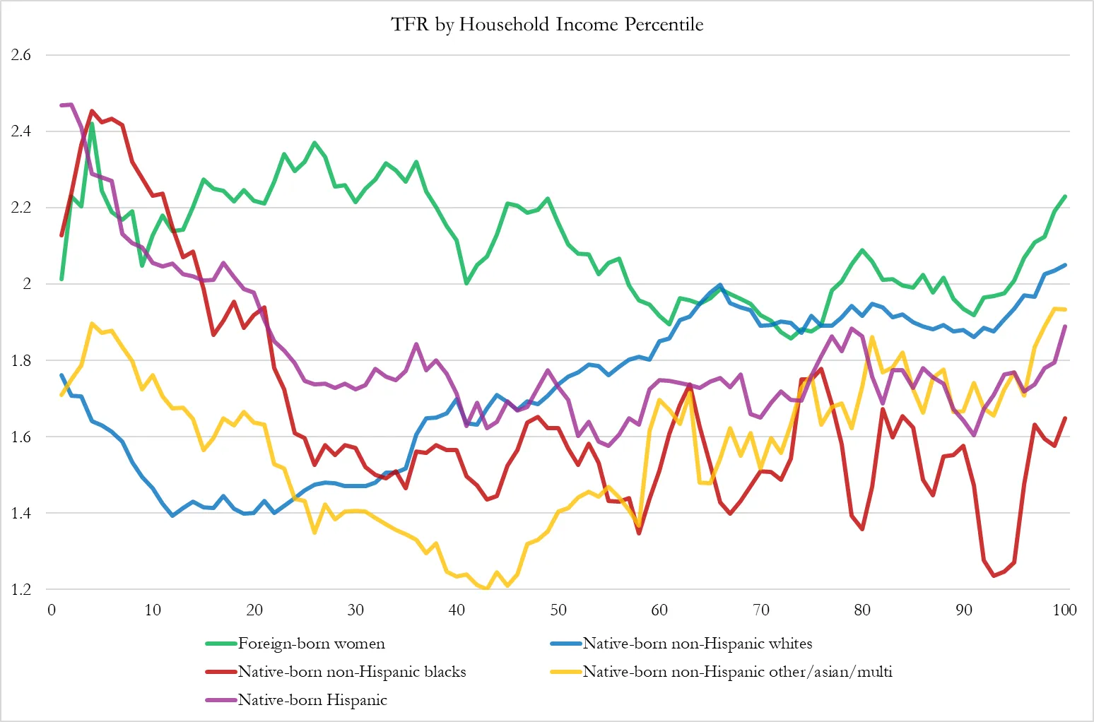
You can see the income-TFR relationship is not even remotely similar across groups. Black women with low incomes have the highest birth rates, while black women with high incomes have the lowest borth rates, except for middle-income “other,” mostly Asians and multiracial women.
Speaking of the “other” category, they are the only group to exhibit a clear “U-shape,” and that may be due to still further granular stratification within that group.
Meanwhile, white women are the only group to show a super clear positive gradient.
What does this tell us? This is hugely important so think about it when I say it:
The relationship between income and fertility is culturally determined.
Income has a relationship with fertility. But it’s not Income →Fertility, either up or down. It’s (Income X Culture) →Fertility.
Let’s get weirder. What is the income-fertility relationship among Yiddish-speakers and Pennsylvania Dutch-speakers? In the ACS, women under age 50 who speak Yiddish at home are overwhelmingly Ultra-Orthodox Jews, and women who speak Pennsylvania Dutch at home are overwhelmingly Amish. So we can ask if income predicts fertility in these especially pronatal subcultures.

In these groups, there’s little income-fertility relationship until you get to around the 80 percentile.
Note that that’s 80th percentile of US income, not of Amish/Yiddish income. Same axis as above.
To put it another way, Amish and Yiddish people in the 90th-100th income percentiles of American income have about 3–4 kids each. That’s about 50% lower than their poorer co-religionists. But it’s about double the fertility of other Americans in that income range.
And it’s worth noting even in these groups, “Income” isn’t just “Income.” Some Amish groups allow phones. Their members are also wealthier. Their members are also less likely to be farmers, and are more integrated into wider society. Is it income, or is income proxying for further underlying cultural stratification?
Other People’s Incomes?
We can also use the ACS to look at the incomes of people besides the woman we study for fertility. We can ask, “How high is income in the rest of the household?” If we then arrange that in percentiles… here it is:

This is a really fascinating graph! It suggests that TFR is highest for women with “middle income housemates,” usually spouses. When women have rather low-earning households besides themselves, their fertility is very low. When women have high-earning households besides themselves, their fertility is also kinda low.
Spoiler: what’s going on here is family structure. “Low income besides woman” is disproportionately “single woman living alone, with her kids, or with housemates.” While “high income besides woman” is disproportionately “living with parents.”
Income, then, ends up proxying for household structure. So what happens if we include ONLY married women who don’t live with their parents?

Fertility is artificially inflated by only assessing years in which women are married, so disregard the absolute numbers. That’s an example of how calculating TFRs from temporally-shifting categories can lead you astray.
But notice the trend: there’s a VERY real penalty to fertility among women whose other household members (overwhelmingly husbands or partners) have a bottom-third income. Very low income husband=very low birth odds for wife.
But there’s no action at the top. Low income prevents births here, high income doesn’t cause them.
The Zombie Curve: Conclusion
The U-shaped curve observed for household income and fertility:
- Depends on an extraordinarily small number of women and thus is highly sensitive to sampling and survey errors
- Misidentifies income-fertility relationships by failing to account for important temporality and endogeneity between income and fertility (for example: income tends to fall for women after having kids, so fertility actually causes lower measured income)
- Masks dramatic cultural stratification, and it turns out the income-fertility relationship is extremely culturally sensitive, not least because cultures vary in how they time the career course and the family life course.
Other Individual Income Data
I have a personal loathing for the zombie curve. But there are a lot of other wrong ways to find income-fertility relationships too. For example, Maxwell’s article cites two sources both of which use “presence of household children” in the Current Population Surveyas their fertility indicator. But that’s not a measure of fertility! Some women have babies they give up for adoption, or of whom they lose custody. Some women are surrogates. Some people adopt children. Some women have babies very young so their kids are out of the house in their 40s, some women have kids very late so they show up as childless at young ages. “NCHILD” (the code name for the variable) is not a measure of fertility in any way, shape, or form. Especially since income helps families stay together and lack of income is a cause of giving kids up for adoption, income will obviously better-predict NCHILD than actual fertility.
When we use the actual fertility variable in the Current Population Survey June Supplement, as I did for completed fertility above, we don’t find the U curve.
Macro Relationships
Our World in Data argues for a U-shaped relationship based on macro-level evidence. A related argument, the “Incomplete Gender Revolution” or “Second Gender Revolution” hypothesis likewise posits a U-shaped curve based on gender norms.
The evidence on these is pretty bad. During the 2000s when Nordic fertility was temporarily high, it looked like there was a close relationship. But it hasn’t provided general. Consider this chart also from Our World in Data. Zero U-shape on women’s education!

In fact, schooling years turn out to be almost linearly predictive of low fertility, whether within a country over time, or across countries. That graph shows women’s educational attainment, but if you looked at men’s instead the graph isn’t actually radically different.
The reason schooling predicts fertility is that schooling is one of the largest proximate causes of delayed marriage and one of the strongest correlates with lower child death rates, and delayed marriage and declining child death are the proximate causes of declining fertility around the world. Those two variables, marriage and child mortality, explain the overwhelming majority of all fertility change across all time periods we have data for.
Schooling delays marriage for at least four reasons.
First, school culture is non-familistic. It locates a kid’s social world in non-kin, and orients them towards non-kin authorities. As a result, it nudges them towards considering non-kin parts of life more. As a result, schooling is inherently rivalrous with family formation.
Second, school puts people in a childish position. As long as you’re the learner, you are, psychologically, a child. Witness university administrators referring to their grown adult students as “kids.” Being in the learner posture creates a feeling of being a child in the learner, and so tends to tamp down engagement with the serious work of what has come to be called “adulting.” Enrollment has a well-known “incapacitation” effect on fertility and marriage: school is the best contraceptive. This is worth celebrating when it protects 14 year old girls from unwanted pregnancies. It’s more concerning when it prevents 30 year old women from settling into desired marriages.
Third, school can change your economic opportunities. When the economic opportunities outside of the home are more lucrative, families rationally choose to trade off home production for market participation. That applies to how much food comes from home gardens vs. the supermarket, and it also applies to production of children. What children are born are also likelier to be cared for by non-parents as schooling of the parent generation rises. Again, this isn’t terrible stuff! We want people to have more opportunities!
Fourth, and this is the one we may actually have the best empirical evidence for, is that schooling changes the culture of the places where kids grow up. The mere existence of schools changes the life-course ideations, aspirations, and anticipations of even non-enrolled people. Mere proximity to schools predicts major changes in family behaviors even for non-enrolled people in poor countries. It’s possible that this is a spillover of items 1) and 2) above, that schools shift society-wide norms in a less familistic way and push childhood later in life, or that it’s some other independent effect. My dissertation is specifically on this point, but no spoilers yet.
These are basically the reasons schooling might matter.
And none of them change at high incomes. They remain true at every income level.
We can look at other measures of development. OWD uses the HDI. I wrote about this at IFS a few years back. And…. there definitely is not consistent evidence for a U-shape of fertility with respect to Human Development in countries that have recently crossed the high-development

At high incomes or high development levels, fertility because basically unrelated to further increases in income or development. It could go up. Or it could go down. The research points to many important mediating meso factors like:
- The policy support environment for families
- Schooling
- Cultural norms around marriage and family
- Housing
- Labor market structure
- Laws regulating abortion and contraception
- Typical kin proximity
- Intergenerational care norms
And other factors.
Now, here I want to be very clear.
When I say fertility is largely unrelated to income at high incomes, I am arguing against both the view that income always reduces fertility and the view that sufficiently high incomes will increase fertility.
Both of these views are wrong. In highly abundant societies, fertility rates are simply not related to income anymore (if they ever were). Instead, fertility rates relate to the kinds of social, economic, and cultural variations that can occur within income ranges. Countries of a given income level can vary widely on the factors I outlined above, and those factors can easily drive differences between fertility rates of 0.7 and 3.5 kids per woman.
The Gulf States
As an example, we should consider the wealthiest societies in the world: the Gulf States. These societies are very rich. But their incomes are often mischaracterized. These societies are composed of small bases of citizens who capture the vast majority of societal income, and huge groups of very poor immigrant workers. Those immigrant workers skew income estimates and also dramatically skew fertility estimates. As a result, Qatar’s official total fertility rate is something like 1.4, which some commentators have used to argue that even extreme cultural conservatism alongside limitless resources can’t forestall fertility decline.
But this is nonsense — that 1.4 includes a huge population of domestic worker women who are legally precluded from becoming pregnant. If they get pregnant, they’re deported.
Luckily, the Gulf States actually publish enough data in various hard-to-reach sources that we can estimate fertility among citizens of these countries. In every case, citizens of the Gulf States are virtually 100% Muslim and gobsmackingly wealthy. Their income-per-citizen is so far off the charts it would make the most transhumanist techno-optimist salivate. There is no society on earth even approximately as wealthy as the Gulf States citizen population.
And here are their TFRs:

Bahrain is probably below 2 now. The others are all above 2. I can tell you, these declines are not because these societies got systematically richer or poorer in important ways: they’re all fabulously rich across all of these periods.
Rather, what happened was… culture changed. Here’s marital fertility rates:

In Qatar, the average married woman’s fertility rate plummeted between 2004 and 2019. Though, broader perspective, it’s still very high:

Meanwhile, marriage also declined in frequency:

The point here is that if it were the case that income could boost fertility on its own, we’d see it in the Gulf States. And it’s true they have high fertility. But their marriage rates and fertility rates within marriage are both falling, and thus their fertility rates are falling. And the reason is a shift in the culture of family, school and friendship in these countries. I could go on much more, but suffice to say this is almost a paradigmatic case of a “purely cultural” fertility decline.
What Matters? Can We Change It?
Mere income shocks won’t drive fertility trends in high income countries. Prosperity does not monotonically reduce fertility. In fact, the best evidence suggests that it’s schooling years, child mortality, and cultural exposure via mass media that actually explains most fertility change (and schooling + exposure largely work via marriage). While income proxies for those, many places have seen dramatic shifts in those variables without dramatic shifts in income, and many places have seen dramatic shifts in income without dramatic shifts in health, school, and media. Our prior should probably be that “mere income” has no societal effect on fertility.
But there is an important sense in which income does matter: social status. Across societies, male status in particular predicts fertility. Income may predict fertility because it predicts relative status.
We can test what matters. If income matters because it is income allowing consumption, then as countries get richer, the “more babies” effect of higher incomes should shift down the income distribution. As economies grow, the absolute income of a 50th percentile person rises. And so if it’s absolute income that is pronatal, then rising absolute incomes within a given percentile should boost fertility.
But if fertility is sensitive to relative income, then the fertility-income percentile relationship should be relatively stable even if there is major economic growth within income percentiles.
We can test this in the US. Here’s household income by percentile in the ACS data:

And here’s TFR by income percentile:

Using percentiles defined in each period, we can see that fertility fell at every percentile.
Here are the changes over time in the absolute income at percentile, and changes over time in fertility by percentile:

They are not very correlated. However, to be fair, if I drop percentiles 0–10 where there’s some weirdness going on, the correlation becomes 0.27, which is pretty good! But “the correlation is high when I drop the parts of the graph where the correlation is low” is also cheating.
Moreover, it’s important to recognize that absolute inflation-adjusted household income is higher for 87% of the income distribution, yet fertility estimates fell in 98% of the income distribution. America is already in 2006–2010 a very rich place, if extra income was gonna boost fertility on a scale relevant to the rest of the world, we should have already been at the point where it would show up.
Thus, to the extent income-fertility changes are informative, they suggest that it is relative income that predicts fertility, not absolute income. In this telling, no income change could ever boost fertility, because fertility is about relative status perceptions. Full disclosure: I’m sympathetic to this view.
But in this particular case there’s a better explanation of what happened:

Male earnings crashed at young ages. As a result, coupling and fertility at young ages plummeted. As a result, fertility fell.
It’s an income story, but a very specifically cultural one. It matters not just that society is rich, but that young people in society are rich. We got richer as a society virtually 100% via higher earnings for people over 30. This is bad news bears for fertility.
So, can we change any of this?
Yes.
There are many policies that can offset falling income for young people! There are many policies that can adjust housing or labor market structure! Policies influence cultural norms too! Copious academic evidence strongly supports the notion that pronatal policy works. Evidence is constantly accumulating reaffirming this notion.
But the policies are costly. They require society to recognize just how massive the forces we have aligned against family formation are, and thus how hard we have to shove back. That in turn requires a serious political project which is about more than just incidentally doing a bit of pronatalism on the side. That pronatalism can be made to work is not in dispute. The academic literature is clear and there are plenty of well-tested policies that can be stacked up to get big effects. The issue is there is not political will to do this stuff in a serious way — yet.
And it must be understood from the beginning that “just wait on an imaginary U-shaped curve to work itself out” is not just theoretically and empirically incorrect, its promotion originates in efforts to undermine pronatal policy. “We don’t need to actually help families, just get more GDP.” When, in fact, we really do need to help families. “Mere income,” “mere progress” is not enough.
-Lyman
