Rutvik PatelCovid-19 Dashboard using Power BIThe best way to track the COVID-19 outbreak is by using data and visualization. The COVID-19 patterns are sometimes contradictory and this…Jan 11, 2022Jan 11, 2022
Rutvik PatelUsing image data, predict the gender and age range of an individual in Python.IntroductionOct 28, 2021Oct 28, 2021
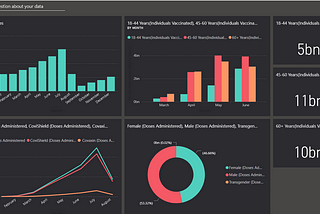
Rutvik PatelGenerating Reports Using Power BI for Data VisualizationIn this blog, we are going to create various reports from given data. These reports will help users to get some insight into data.Oct 28, 2021Oct 28, 2021
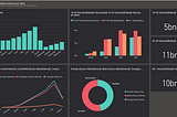
Rutvik PatelData Visualization Using Dashboard In Power BIIn this blog we will be going to create a dashboard on that we can visualize our data in different forms of charts and can have better…Oct 27, 2021Oct 27, 2021
Rutvik PatelData Pre-processing tasks using python with Data reduction techniquesDetails in datasets are wildly increasing. This might generate problem because of a lot of data main important feature in dataset may…Oct 22, 2021Oct 22, 2021
Rutvik Patel6.Data Preprocessing Using Orange ToolData processing is manipulation of data by a computer. It includes the conversion of raw data to machine-readable form, flow of data…Sep 17, 2021Sep 17, 2021
Rutvik PatelData Science: Visual Programming with Orange ToolThis blog is all about visual programming using orange tool. Orange is an excellent data mining tool for both novice and experienced data…Sep 17, 2021Sep 17, 2021