31 Tips To Create a Unique Letter Logo

If you spend any time thinking about it, letters are really weird little creatures. They’re basically a bunch of squiggly lines that we arbitrarily assigned to sounds so that we could communicate without making those sounds. The letter “s” sounds like a hissing snake or a rushing stream — so why isn’t it forked like a snake’s tongue or round like a water droplet? See, totally arbitrary.
Letters make even less sense if you’re trying to turn them into a logo design. Because we normally see them as just one small part of a whole word, we rarely think of them as individuals. Even if you do manage to isolate a letter in your mind and imagine that it’s a complete unit all by itself, that still doesn’t tell you what it is. Do you treat it like a symbol? A picture?
Actually, you should do both. Letters in logo design act as both a symbol (bringing the connotations of our written language) and a picture (acting as a separate visual element with its own unique shape, style, and personality). To help you see what it looks like when you treat letters right, we rounded up 31 of the best letter logos and set out to see how they work. Here’s a little of what we found.


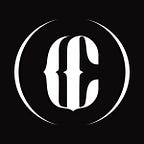
Just like any visual element, letters need to be connected to the rest of the design. The first two logos are conjoined by shared strokes, but let’s take a look at the third example. Rather than actually sharing a stroke, half of a K implies connection by “emerging” from the curve of the S. The S helps by providing a top serif and bottom curve that loosely fit the place where the vertical stroke of K should go. Missing letters are a great way to involve your audience in the design, because they have to think harder and spend more time looking at it.
Shared strokes are a simpler way to unify the design. Use a horizontal crossbar (left) or vertical stroke (center). With a pop of color on a shared stroke, you can add personality and control how the viewer’s eyes moves along the logo. In personal letter logos, color can even indicate how a person wants to be addressed — Diana Haller may prefer to be called Diana, since the orange d is more prominent than the pink h.
Bonus tip: The Alireza Holding logo is slanted, with one side of the H lower and one diagonal of the A sharper than the other. Always remember, you’re free to bend your letters into other shapes that help represent the brand behind the design.


These letter logos show two different ways to use negative space. One creates negative space in a letter that does not naturally have much white space. The alterations to the letter m — the missing swipe out of the left leg and the chunk missing out of the top — create visual interest that leads the viewer into the rest of the design. (And if you squint, it totally looks like a little rhino, which is adorable.)
The letter C in the Fit Cat logo, however, already has plenty of white space on its own. In this case, you can capture the audience’s imagination by filling that space with something relevant to the logo but otherwise unexpected — like a chubby blue-eyed cat. The cat’s tail cuts into the letter C, altering its shape slightly, and the lines that make up the cat match the logo’s color.
Bonus tip: Look closely at the letter A in “CAT,” and you’ll see that the white space here is filled with a tiny paw print. While you shouldn’t go completely bonkers and hide all the extra space, you can make use of white space in more than one letter of your logo.
To learn more tips for designing two-letter logos (or just to appreciate some clever logo designs), view the full post and its companion infographic.