15 Principles for Creating Interactive Interfaces That Designers Shouldn’t Live Without
Obviously, interaction design always involves a very close connection with users and in fact, must anticipate their thoughts. Below we have compiled a list of some of the coolest insights that will help you achieve a superior user experience.
So what are the main principles behind effective interaction design? Let’s figure it out.
Walking in the user’s shoes
Even many experienced web designers create interfaces based only on their intuition. You may think that users perceive a particular interface element in a certain way and apply it for specific purposes, just like you do. In practice, things may turn out differently. In this case, you risk getting a bad user experience.
And vice versa, in the right design, all its elements have an unambiguous purpose and are used intuitively, without requiring training.
Although in interfaces it’s impossible to provide users with instructions on how the particular element should be used (otherwise this will mean a poor designer’s job), it’s very important to develop mental models and form images that are familiar to the target audience, embodying an exact correspondence between expectations and reality. Observing user behavior, analyzing surveys, creating user scenarios, and much more will help you create such models.

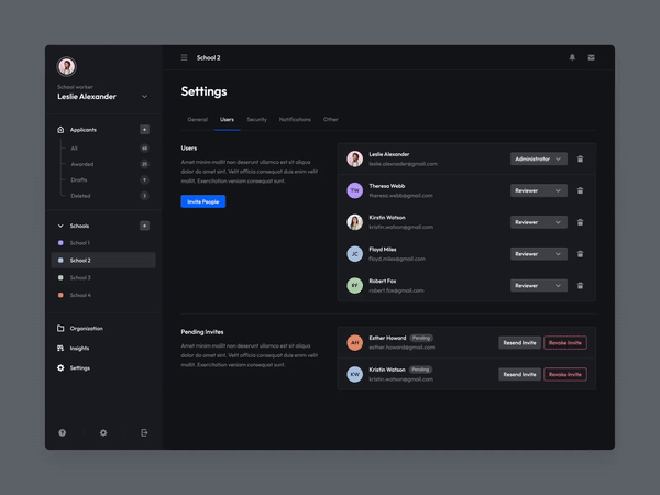
Consistency
Consistency in an interactive interface refers to the visual logical relationship between elements that must be used to achieve a specific goal. Due to this, the entry threshold of the interface is reduced, and users spend less time figuring it out.

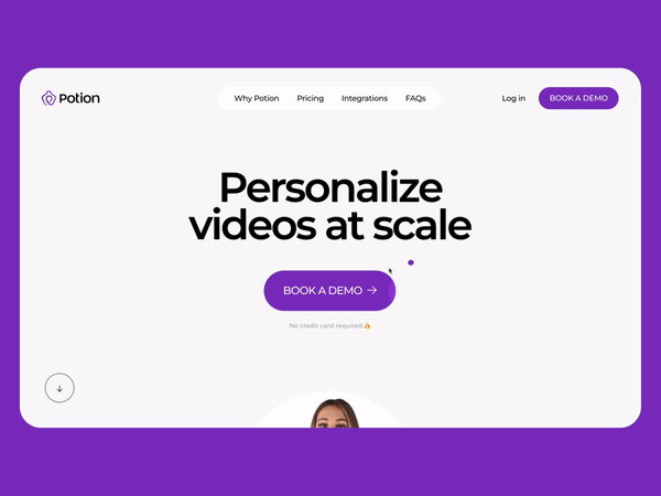
Conciseness
Today, the conciseness of user interfaces is quite a familiar attribute. And although architect Ludwig Mies van der Rohe became its ancestor, the concept of minimalism in the digital world reached the general masses only after the release of the first iPhone. All in all, if you want to get the perfect source of inspiration, you know where to look.

Ease of presentation
You have to keep in your head that your target audience is unlikely to understand at least the basics of web design. That’s why the language of your interaction with them should be as simple and understandable as possible. Create interface elements and connections between them with this aspect in mind.
You should also refer to the so-called two-second rule, which determines the acceptable time to wait for a system response to a user action (two seconds). If your target audience has to think longer about what the next step to take on the way to completing the target action is, you should definitely think about whether the product you created is really good.
Emphasis on functionality
You must understand that a functional interface is better than just a beautiful one. Therefore, if you choose between aesthetics and practicality, the choice should be made in favor of the latter.
That’s why you shouldn’t remove elements if they are inappropriate in terms of, for example, symmetry, but can still be useful to the end user. However, there is nothing wrong with bringing a bit of useless beauty to a strict and gloomy design. Still, if it pleases your target audience, you will already be in the black.
Error tolerance
Even though you should initially aim to create the most simple, clear, and intuitive interface, you still need to leave your users the right to make mistakes. This means that even if they do something wrong within the product you are building, they must be able to go back a step to complete the target action correctly (or do something else).
That’s why you need to provide them with clues to get out of a situation when things don’t go as planned.
Visibility
The more visually noticeable the element, the more likely that your target audience will use it as you intended. Conversely, if some element isn’t on the main screen and has a small size, it’s unlikely that your TA will start using it from the first seconds of getting to know the product. This is why, instead of drop-down menus with many branches, it sometimes makes sense to use tabbed panels.
On the other hand, the desire to show everything at once makes the interface unnecessarily cluttered. So, it’s important to be able to correctly prioritize each of the features that should be present in your product.

Limitation of possible actions
To prevent your users from being wrong too often, you should limit what they can do. The fewer options there are for choosing, the more intuitively your users will move towards completing the target action.
By the way, this is why often conversational interfaces that interpret human speech turn out to be useless in practice, as they provide users with endless possibilities for entering voice instructions.
Compliance with usability heuristics
There are generally accepted heuristics that help web designers check their solution against usability indicators. In particular, you can use the list of ten heuristics that was compiled by Jakob Nielsen. Thus, by evaluating your web design against ten objective criteria, you can understand how it can be optimized (and whether it is necessary at all).
Hierarchy in navigation
We have already said that the designer must properly prioritize each of the functional elements. Let’s look at this aspect in more detail.
To keep the interactive interface intuitive, you must create a clear visual hierarchy between major and minor functions, providing logical connections between them. Contrasting shades, different shapes, and arrangement in the “tree” will help you with this.
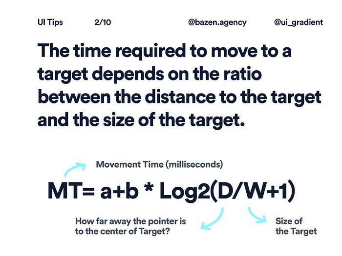
Manipulation reduction
The human brain is designed in such a way that its owner acts in the least resource-intensive way in any situation. This also applies to interaction with user interfaces. If you want to provide an intuitive interaction with the functionality, take into account Fitts’ law, which says something like this: “Target acquisition time depends on the distance to the target and its size.”
This means that even mouse or touchpad manipulations should be as short as possible. On the other hand, too close arrangement of elements reduces the level of usability. So moderation is also important here.
Compliance with standard eye movement
This is a very interesting observation related to the habitual movement of the eyeballs when browsing the web.
For example, the Gutenberg diagram demonstrates typical eye movement when viewing uniformly distributed homogeneous information, suggesting that elements located outside this trajectory should be emphasized to attract user attention.
You can also use the Z- and F-patterns, which follow the shape of the letters Z and F, respectively. They define areas on the screen that will receive little attention from users. Therefore, if you are forced to place critical elements there, take care to add a visual accent to them.
Finally, there is another useful “Above the fold” rule that states that the most important content and interface elements should be placed at the top of the screen.
Feedback
Perhaps this is obvious, but we recall that any user action must be accompanied by a certain interface reaction. It can be sound, notification, changing the color of elements, highlighting, and other effects.
Accessibility
And finally, the last but most important principle is accessibility. In fact, there are entire web resources, approved at the international level (we are talking primarily about W3C), which are dedicated to how to properly implement this principle.
However, even if you aren’t going to create a product that is specifically adapted for people with disabilities, you must at least follow the basic rules (acceptable waiting time, support for alternative UI interaction tools, etc.).
Final Thoughts
We hope you now have a thorough understanding of how to build interactive designs. As for making it even easier and faster, you can use special tools like User Flow or Flowchart. And of course, don’t forget to do usability testing to make sure all your goals are met.
