By Talea Miller, Sr. Brand Marketing Manager at Kiva
When Kiva began in 2005, we had a simple goal: to connect borrowers who need small amounts of capital to improve their lives, with lenders who want to help. Ten years later, we’ve seen the incredible power and impact of this model brought to life by 1.5 million Kiva lenders and 2 million Kiva borrowers.
Kiva’s grown into a true global community, where people come together to support and believe in each other. That evolution is part of the story we wanted to tell with our refreshed brand and logo, and our new, mobile-responsive website.
The refreshed Kiva includes the most significant changes to the website since it was first created, and is the culmination of more than a year of hard work by Kiva’s engineering, product, design and marketing teams.
The process kicked off with an intensive 8-week engagement with SYPartners, the creative firm that helped give shape to Kiva’s story (known in the industry as a brand narrative), challenged us to simplify everything and helped us work through the most critical experiences each lender has on Kiva.
Along the way, we also benefitted from the immense talents of designers Marty Grasser and Marian Chiao, who helped evolve the Kiva logo.
This post focuses on the brand and logo refresh, and next week we’ll share more on the redesign and user experience changes.
Getting to the essence of Kiva and our evolution

For our work with SYPartners, we created a core brand team from Kiva, composed of representatives from teams across the organization, as well as our President and Co-founder Premal Shah, CEO Martin Tschopp and Executive Chair of Kiva’s Board Julie Hanna.
SYPartners kicked off our work by challenging us to take a step back (more difficult than it sounds when you’re as passionately involved as Kivans are!) and answer some big picture questions. What are the core beliefs that bring someone to the Kiva platform? What motivates someone to stay involved?
We very quickly zeroed in on a few main themes and beliefs that kept surfacing in our discussions and that we’ve heard from Kiva lenders over the years.
- Dreams are universal, but opportunity is not. All people have dreams for a better future for themselves and their families. No matter where you’re born, you should have fair access to capital to pursue those dreams.
- All people deserve dignity and respect. A loan creates a partnership of mutual respect, and also puts power in the hands of the borrower. Kiva borrowers choose how they want to use the funds, using their own expertise and knowledge of what their business needs.
- Lending to an individual creates a powerful connection. Making a loan on Kiva is not just about monetary support, it’s also about showing someone you may never meet that you believe in them and want to help them on their journey. It’s a human to human connection.
- Money can, and should, work smarter. Lending and relending on Kiva allows the same dollar to touch more lives and creates a powerful, sustainable source of funds for social good.
The core beliefs that surfaced in these conversations speak to Kiva’s evolution over the past 10 years. When Kiva began in 2005, we were focused on agriculture loans to farmers in Uganda. But over the past 10 years, Kiva’s expanded to serve borrowers in 84 countries, with lenders in 192 countries. It’s a place where people come together, and in many ways symbolizes the better, more equitable world we all want to create.
SYPartners used this conversation about core beliefs to develop our brand narrative, which became a compass for us as we developed the new site. You’ll see the essence of this narrative woven throughout the new creative and language.

A united Kiva
Another important piece of the brand process was uniting Kiva’s work in developing countries and the work we do with socially impactful and financially excluded borrowers in the United States.
Kiva has worked with small businesses in the U.S. since 2009, so the program is well established, but much of that lending lived on a sub-site for our pilot direct lending program, Kiva Zip. We knew it was time for Kiva Zip to graduate out of beta and become a part of the main platform, and SYPartners helped us envision what the Kiva of 2016, and the Kiva of the future, looks like and represents in the world.
As part of that conversion, we kept coming back to Kiva’s vision statement, which was created in the organization’s early days and felt particularly relevant and even prescient for this discussion.
We envision a world where all people hold the power to create opportunity for themselves and others.
As part of that vision, we see a future where anyone, anywhere can support borrowers in their own communities or halfway around the world. And it’s already begun on Kiva. We see people in the U.S. lending to small businesses in their city, and to many different countries. We see the same in Kenya and Mongolia. That’s the beauty of Kiva, you choose where to make an impact and in the process we are breaking down the barriers and stereotypes of who gives and receives assistance.

Evolving the logo
Marty Grasser and Marian Chiao channeled the work we did with SYPartners into the logo refresh as well. The goals for the new logo were twofold:
- Eliminate issues with alignment and typography from the original logo
- Capture the essence of the new brand narrative and Kiva’s evolution

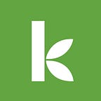
The new evolved wordmark logo preserves the spirit of the original Kiva logo, but modernizes it and moves it forward. The typography and style feel approachable, warm and humble. Those are all traits Kiva works hard to embody, because we know it is the Kiva community that makes our incredible impact possible.
The leaves on the original Kiva logo were inspired by the early focus on agriculture loans. Kiva still serves many farmers around the world, but we also facilitate a broad spectrum of other types of loans: for education, clean energy, arts and community level projects, to name a few.
We kept the leafy K in the logo not just as a nod to the original, but also because it represents growth and connection to the earth.
For both the logo and the brand refresh in general we wanted to honor Kiva’s roots, while setting a strong foundation to enable new growth and impact around the world in our next 10 years. We did this by preserving and amplifying the underlying beliefs that have guided Kiva over the years, while making them even more inclusive in service of the better, more equitable world we hope to create.
Thank you to everyone who participated in this journey. Check our part 2 for more details on the redesign process and if you haven’t visited the new site yet, take a look!