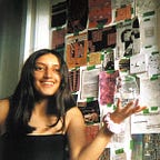
1440 minutes of data visualised | final GCSE piece

This is a summary and some notes on my GCSE final piece, an A2 poster, illustrating every minute of my day—1440 minutes! I tracked the data by hand and used NodeBox for generating the grid and circles and Illustrator for tweaks and design refinements. It was very exciting and nerve racking but it was lovely to see it when it was printed:

This graphic is displaying the capturing of a minute breakdown of my activities for one day — grouped as sleep, sit, stand and move. Each small circle represents a minute of time (1440 in total). It is coloured by the activity it consumed. Each block is grouped in 30 minutes intervals.
SOME BACKGROUND | IDEA AND AIMS:
For my final piece, I wanted to link my work to the topic of activities. I went about this through deciding to produce a poster representing a ‘minute breakdown’ of the activities in my day.
When researching, I found that the topic of ‘data’ linked to activities offered an overwhelming choice of pipelines of exploration, as there were countless ways of presenting my day into data visualisations.Therefore I decided to focus on some key points that I would like to incorporate into my final piece.
I aimed to capture the activities from my day in a meaningful way, which is why I ensured that all my work is accurate to the data I recorded and that everything was to scale, in order for my work to be an accurate and real representation of my data.
I also wanted my viewer to feel engaged and interested in the piece and create a connection between my data and the person. I went about this through using simple geometric shapes and contrasting colours. I was very selective of my colour palette which consisted of ‘techno colours’ such as yellow, black, pink, red, green and blue.I chose this colour palette because of the contrasting colours which are energetic and electronic, making my poster vivid with the use of black to add depth and contrast to the bright electric colours.
My artwork was vector based, which allowed me to control the colours for both printing and the scale of my final piece, so that I did not need to worry about issues regarding pixelation.
ARTISTS I WAS INSPIRED BY:
I was interested in how the artists I interpreted captured what otherwise may be missed or even seen as meaningless activities but share in a beautiful engaging and intimately revealing manner; they pause to notice even the small things that, as Ferris rightly said:
“Life moves pretty fast. If you don’t stop and look around once in a while, you could miss it.”
For my final piece, I interpreted the work of Sol LeWitt (rule-based art), Stefanie Posavec (collecting data), Laurie Frick (large scale and repeating shapes) and Nicholas Felton (presentation of data) I went about this by further developing my responses and incorporating my own twist to give my experiment a purpose and make it original.
HOW I INTERPRETED SOL LEWITT’S RULE BASED ART:
I will interpret Sol LeWitt’s use of rule-based art in my idea, by creating my own algorithm:
Represent each minute (x) by a circle (I found 60minute circles to be too large so made them 30):

Group in segments of (x) minutes:

Colour the circle by its activity:

This algorithm is inspired behind the ideas Sol LeWitt uses in his work as it means that if someone else read the algorithm they would interpret in a completely different way and end up with a different outcome as to what I am going to produce for my final piece. They may represent the circles in different numbers of segments or group the activities differently, use different colours and form a different display/pattern with the circles. I used Nodebox to produce the circles as this was the generated art part of my poster.
COLLECTING DATA:
Out of my chosen artists, Stefanie Posavec, Nicholas Feltron and Laurie Frick, all use data in order to produce their work, their data is often very personal to their daily habits and activities.
Inspired by this I decided to track my own data. I tracked everything I was doing for a whole 24 hours (0:00 to 23:00)
I did this all manually using pen and paper. By doing this I could find discover more about my daily habits in a way that my phone would not be able to track. The data had a personal feel to it and was interesting to review and be more conscious of how I spend my time through a minute breakdown. I then wrote up my data onto a spreadsheet and began drafting some pieces and ideas of how I could visualise my data.
One of the key challenges I faced was categorising my data as it was very detailed and somewhat varied,however I eventually decided on the categories: sleep (as this was a very large proportion of my data),stand,sit (also very large from eating,watching tv etc.) and move (this would be when in transition and also exercising.)
I decided to use colour as a key to represent these four categories, I chose ‘techno colours’ in blue, pink, red and green. I felt as though these colours contrasted well and also made my work more engaging as they look more exciting and electric.

EXPERIMENTS/DEVELOPMENT
Before producing my final piece I experimented with different ideas and sketches of presenting my data.