For my A-level Graphics personal study, I am exploring the question ‘How Can Sound be Visualised?’ I am intrigued by how I can reveal the sounds around me into a visual form, and am experimenting with the ways I can do this.
Idea and aims:
For my first set of experiments, I was interested in how I could use code to generate outcomes based on sound data. I went about this through mapping the frequency data from songs onto a sequential colour scale.


Choice of sound:
I created a series on ‘The Velvet Underground and Nico’ album because I’ve always found this album inspiring and wanted to visually explore the experimental sounds and transitions in moods from each song.
“No one sounds like that they are a very unique sounding band”-Dean Wareham
Choice of colour:
I decided to visualise it using a sequential colour scale with the low frequencies on the left (purple) side of the spectrum and the high frequencies on the right (green) side of the scale.
I chose this colour scale because I feel as though the colours are dynamic and represent the emotions and ideas of the songs that I interpreted whilst I was listening to it (although I realise this is very subjective.) I also feel as though contextually, It links in with the psychedelic colours of the sixties which is when the songs were produced.
It was interesting to visualise the Velvet Underground album using the same colour palette for all songs, as it allowed me to compare how long songs were and which parts of the album were more lively and energetic.
Choice of layout:
I decided to use squares in this set of experiments as I was interested in how they explored colour transitions smoothly and ultimately formed a rectangular shape, which represented the song, I also felt as though they represented the length of the song well and allowed the viewer to compare the data patterns throughout songs.
I experimented with squares further through my use of typography, which was a font composed of squares, and explained which song was being visualised as well as the duration of the song. I feel as the font worked well because it was abstract and futuristic, fitting in with the concepts of the piece.
I also used a grid composed of paper sizes in order to frame my data and create visual drama through the negative space between the squares and typography.
Visual Outcomes:


Presentation:
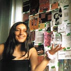
I had the opportunity to volunteer at a ‘Girls Only Code Club’ where I had the chance to present my Sound project, and allow children from the ages 19–13 to have a go at creating their own project, based on their favourite song and their visual ideas of how the sound should be presented.
I found this experience really insightful, as through allowing people to interact with my project, I was able to see clearly how I could improve it, and how it was perceived differently through different perspectives.
For instance, I feel as though it was quite effective to hear the sounds as the squares appeared which has led me to consider how I can create an interactive experience which could perhaps be more engaging and immersive.
I explained how changing one line of code, can create a very different visual outcome, I also encouraged the children to look at the patterns created and how these match to the song that is playing.

Conclusion:
Through doing this project, I have gained an understanding of how I could visualise sound from songs using code.
For my next series of experiments, I would like to further explore visualising sound through experimenting with visualising more than one data set, for instance, I could consider changing the size of the squares as well as the colour based on different data.
I would also like to experiment with real-time/live data, as I feel as though it could offer a more immersive, personalised experience where the viewer has influenced the visual.