PinnedNate BaldwinAccessible color for design systems just got easierOver two years ago, we released Leonardo: the first-of-its-kind contrast ratio based color generation tool. Since then, Leonardo has…May 9, 20221May 9, 20221
Nate BaldwinResponsibility and opinionsI’ve worked in design systems long enough to get some strong opinions about things. I’ve learned a difficult lesson that I want to share in…Jun 103Jun 103
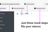
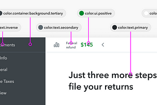
Nate BaldwinSynchronizing Figma variables with Design TokensSummer of 2023, Figma announced Figma variables: an internal feature that mirrors the functionality of Tokens within Figma, along with REST…Oct 17, 20235Oct 17, 20235
Nate BaldwinCreating a flexible design token taxonomy for Intuit’s Design SystemThis article covers how we evolved our tokens at Intuit to create a flexible taxonomy for a small but powerful set of semantic tokens.Jun 20, 202312Jun 20, 202312
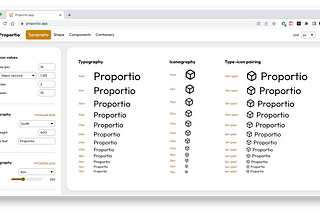
Nate BaldwininBootcampProportional design systems with Proportio.appIt started with a design system request. Our design system team was asked to add a larger size option to our existing button component…May 8, 20235May 8, 20235
Nate BaldwinComponent-level Design Tokens: are they worth it?There are lots of resources for learning what design tokens are, how to use them, and their benefits to design systems. This is not that…Oct 4, 20228Oct 4, 20228
Nate BaldwinColor scales for data visualization in LeonardoCreating custom color scales for data visualization can sometimes be a burden. With Leonardocolor.io, it just got a whole lot easier.May 9, 20222May 9, 20222
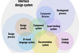
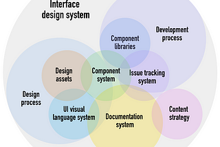
Nate BaldwininUX CollectiveRevisiting the anatomy of a design systemOver the years, a lot has evolved about what a design system is what it’s comprised of. An article from Brad Frost inspired me to revisit…Dec 7, 20211Dec 7, 20211
Nate BaldwininUX CollectiveCreating contrast-based themes with LeonardoA feature enhancement to Leonardo, Adobe’s open-source tool for creating beautiful, accessible, and adaptive color systems using…Feb 28, 20206Feb 28, 20206


