Suz CollinsHouse prices SPIKINGAt first glance you can see the data clearly marked in a bold red outline. This element is striking.May 6, 2022May 6, 2022
Suz CollinsIs this the best graph in the world?Frequently used authorship wordsMay 6, 2022May 6, 2022
Suz CollinsCovid 19 Hospital acquired infections are risingSimple data visualisation is defined by a clear orange line that hovers above the blue line of hospital admissions.It is interesting to see…Apr 30, 2022Apr 30, 2022
Suz CollinsIllegal fishing versus conservationToday, underwater species are unsafe in their natural habitat. Trawling the internet I found a fleet of journalists interested in Life…Apr 17, 2022Apr 17, 2022
Suz CollinsCountries with the highest estimated prevalence of slavery in 2018I chose this chart because it challenges slavery in a simple and effective way relating to the number of victims per population of a 1,000…Apr 15, 2022Apr 15, 2022
Suz CollinsPM Modi tops approval ratings among list of 13 global leadersThis chart from The Times of India has striking colours which demonstrate traction for and against World leaders. Red is a good colour for…Apr 10, 2022Apr 10, 2022
Suz Collins147 billion USD predicted chocolate expenditure by 2027This chart interested me because of projected facts and prediction based on estimated data.Apr 9, 2022Apr 9, 2022
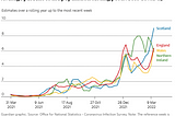
Suz CollinsThis graph from the Guardian shows peaks and trends in Covid figures for the United Kingdom for the…England, Wales and Northern Ireland are visible by the colour of the text.The blue line represents Scotland and has the highest percentage…Apr 9, 2022Apr 9, 2022
Suz CollinsCovid cats and dogs; ownershipPrinted in the Guardian, is a simple cartoon drawing of a cat and dog to demonstrate the millions of cats and dogs homed in the United…Mar 30, 2022Mar 30, 2022