React Apps: Approaching Organization / Structure / Architecture

Folder Structure
With some evolution, we’ve taken cues from Ryan Florence’s approach to folder structure. The 2 basic ideas at work here are:
1. File structure maps to routing
Given these routes:

We have this folder structure:

2. There are “generic” folders and “feature” folders

This is a pretty standard representation of the types of folders to be seen in an application and their relation to each other. The big key here is that many generic folders map to one feature folder. A quick explanation of each general folder and it’s relation to a feature folder may help to make this idea more concrete. These are in no way exhaustive examples of valid general folders:
components -> These are the other component parts a feature is composed of. For example, App may have Navigation and Footer components in addition to dynamic main content.
shared -> Reusable component parts that get used across multiple views of an application find their home here. More detail on these later.
state -> state management related code goes here. In the case of redux, you’ll find action and reducer code here. State used across multiple views gets organized with root App component. If state management is unique to a particular view, it gets organized with that particular view.
style -> styling for associated component. The style directory for App holds global styles and settings. Generally for other views and components a single `style.css` file will suffice.
config.* -> Global app configuration related code. For example, config.routes is where the route registration discussed above can be found. These directories are name-spaced in an effort to keep the root of the app flat. General config folders are also appropriate with views and other smaller components requiring configuration.
utils.* -> Global utility / helper functions. For example, utils.rendering could contain methods such as `capitalize` which simply capitalizes strings. This may be a helpful utility across multiple components. General utility folders are also appropriate with views and smaller components unique to them.
Feature > Function
Every thing is feature-centric and is therefore organized by feature rather than function. To get a better understanding of what this means, let’s contrast it with an app organized by function.

Atomic Development
Being fiercely feature-centric is heavily influenced by the concept of Atomic Design as championed by Brad Frost. Atomic design is a “methodology for creating design systems.” Though simple, the concept is a powerful one to grasp. It is encouraged to read Brad Frost’s post on the matter, but the following illustrates the idea well:
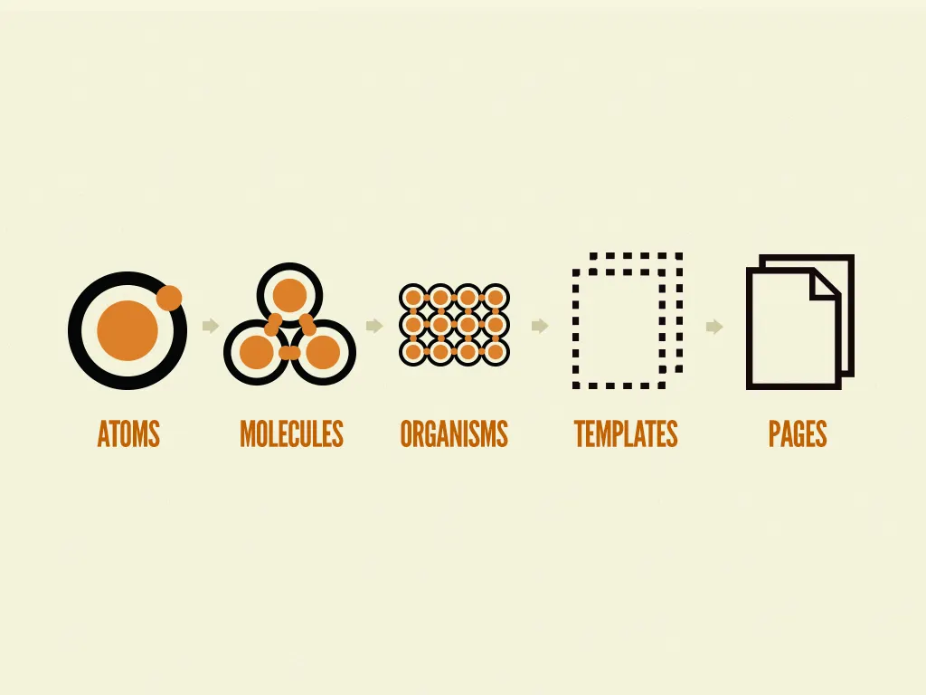
With atomic development, a button atom + an input atom + a label atom = a nice search field molecule to pair nicely with a navigation links molecule to make up the header organism sitting at the top of a home page.
Thinking about an application in terms of atoms, molecules, and organisms helps promote a more thoughtful, purposeful mindset when developing components, ultimately leading to more reusability. This reason, along with the ability to quickly locate and understand a components utility, has led to the practice of name-spacing each component with its corresponding type.

Notice 2 additional `types` of components that we have found distinct utility apart from the relative size utility derived from our chemistry based components.
hoc -> higher order component -> “a function that takes an existing component and returns another component that wraps it.” See an example introduced by Sebastian Markbåge here and the popular medium article it inspired by Dan Abramov here.
object -> objects deal strictly with structure and layout. They should be pretty well style agnostic. The concept is borrowed from the inuitcss framework by Harry Roberts. For example, obj.Flexbox is no more than the css flexbox api adapted to be utilized via react component and deals strictly with layout.

The other potentially curious thing we want to highlight from the above screenshot is that each component directory should contain every file relevant to it. One idea here is the ability to add or remove a single component directory to add or remove it from the application instead of hunting down different files. This is a continuation of the feature-centric approach.
This practice was inspired by and liberally borrowed from Nicolas Gallagher of Twitter who revealed their modular approach to applications at dotcss in November 2014. It is worthwhile to watch his presentation to gain deeper insight into the wisdom behind the approach.

Other guiding principles
Lastly, it is worth noting some general guiding principles that can be seen at work here, and should be considered when making organizational decisions. Let as examine the LIFT principle preached by John Papa:
L — locating code is easy
I — identify code at a glance
F — flat structure as long as we can
T — try to stay DRY
