Adam Fisher-CoxinUX CollectiveFighting Zoom fatigue with a spatial user interfaceAs video conferencing has rapidly moved from work tool to social tool, interfaces should take a cue from the fun of early UI design and…May 25, 20202May 25, 20202
Adam Fisher-CoxAccessible Design Doesn’t Have to Be UglyThough many examples seem to exist to the contrary, there’s no reason signage that works for everyone can’t look good.Feb 15, 20192Feb 15, 20192
Adam Fisher-CoxinUX CollectiveMisrepresenting the truth to make traveling easierTransforming maps into diagrams can help speed up travelers’ comprehension, but requires removing many factual details. How do we know what…Jan 4, 20199Jan 4, 20199
Adam Fisher-CoxinPrototyprCooking Up a Better UX for MealPalMaking a great product not feel like a chore to use.Aug 15, 20182Aug 15, 20182
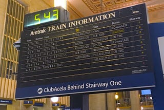
Adam Fisher-CoxinNYC DesignBringing Some Sense to the JFK AirTrain Arrival BoardsThese things are so insane, it’s kind of a shame to fix them.Jul 23, 20182Jul 23, 20182
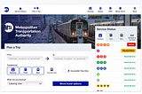
Adam Fisher-CoxDesigning for Transit: The MTA WebsiteIn which my design proposal gets upstaged by an actual new design.Jul 2, 2018Jul 2, 2018
Adam Fisher-CoxTouching up the face of Citi BikeNew York’s bike share system could use a little bit of precision applied to its fun brand.Jun 18, 2018Jun 18, 2018
Adam Fisher-CoxinUX CollectiveDesigning effective countdown clocks for the MTACan we do better than barely trying?Jun 3, 201813Jun 3, 201813