AIGA Eye on DesigninAIGA Eye on DesignA Short (But Useful) Guide to Not Getting Screwed By the IRSAdvice for filing taxes, plus planning for them year roundApr 10, 20201Apr 10, 20201
AIGA Eye on DesigninAIGA Eye on DesignHow the Fantastical, Futuristic Art of AR Face Filters Is Subverting Traditional Notions of BeautyReality-bending AR lenses imagined by a new generation of designers are redefining our relationships with our digital selvesApr 8, 20201Apr 8, 20201
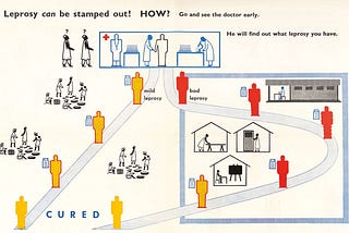
AIGA Eye on DesigninAIGA Eye on DesignWhat Role Does Design Play in a Public Health Crisis?A look back at the positive impact communication design can have in matters of life and deathApr 2, 2020Apr 2, 2020
AIGA Eye on DesigninAIGA Eye on DesignWe Need a New Approach to Designing for AI, and Human Rights Should Be at the CenterDesigners need a methodology that helps them weigh the benefits of using a new technology against its potential harmApr 2, 2020Apr 2, 2020
AIGA Eye on DesigninAIGA Eye on DesignWhat Would a Feminist Alexa Look, or Rather Sound, Like?The first generation of voice assistants are feminized and domestic — can designers help to make the next generation any different?Mar 27, 2020Mar 27, 2020
AIGA Eye on DesigninAIGA Eye on DesignHow Bernie Sanders Built a New Visual Language for Democratic SocialismSanders’ logo is distinctly Americana, but is that enough to convince Americans to buy in?Mar 24, 2020Mar 24, 2020
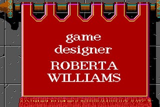
AIGA Eye on DesigninAIGA Eye on DesignRoberta Williams Is the World’s First Graphic Computer Game Designer — But She’s Famous for All the…‘Video game history doesn’t know how to make sense of her except to single her out’Mar 20, 20202Mar 20, 20202
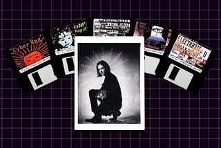
AIGA Eye on DesigninAIGA Eye on DesignMultimedia Artist Jaime Levy Was at the Forefront of Web Design Before Websites Even ExistedWith her interactive floppy disks and zines, the Silicon Alley star was ‘basically making websites offline’Mar 19, 20201Mar 19, 20201
AIGA Eye on DesigninAIGA Eye on DesignSo You Wanna Design for the Movies?8 lessons from graphic props master, Annie AtkinsMar 9, 2020Mar 9, 2020
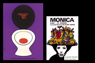
AIGA Eye on DesigninAIGA Eye on DesignMid-Century Uruguayan Graphic Design Proves That Creativity Flourishes With LimitationsGráfica Ilustrada del Uruguay showcases rare work from the ’60s through the ’80s that mixed expressive illustration styles with polished…Mar 6, 2020Mar 6, 2020