Alex PersianThe Case Against AsyncImageReasons why AsyncImage doesn’t work for non-standard usages.Feb 19Feb 19
Alex PersianBuilding a replacement for Google’s Earth View extensionCreating a SwiftUI app to view Google Earth imageryFeb 17Feb 17
Alex PersianinBetter ProgrammingBuild Spotify’s Colorizer Effect in iOSRecreating the ever-popular duotone look from Spotify’s brandingFeb 12, 20202Feb 12, 20202
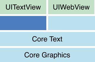
Alex PersianinBetter ProgrammingDetecting Truncation in UITextViewsDo your text views show…?Dec 10, 2019Dec 10, 2019
Alex PersianinBetter ProgrammingBetter Code ReviewsBecome a more effective and empathetic reviewerJul 22, 20195Jul 22, 20195
Alex PersianDVD animation in Swift with SpriteKitThis a quick one for you. Remember the screensaver that would to show up on your old CRT tv when the DVD player went to sleep? I loved…Jun 1, 2019Jun 1, 2019
Alex PersianinBetter ProgrammingUsing the UIMenuController and Manipulating the Responder ChainA detailed guide to handling events through UIMenuController with SwiftMay 20, 20191May 20, 20191
Alex PersianSimultaneous Network Calls with PromiseKitAwhile back I worked on a project where the networking layer was built around a promise-based architecture using PromiseKit. While building…Jul 6, 20182Jul 6, 20182
Alex PersianView Controller ExtensionsOriginally published at blog.alexpersian.com on September 24, 2015.Sep 24, 2015Sep 24, 2015
Alex PersianVisual Studio Code: Cross-Platform EditingOriginally published at blog.alexpersian.com on April 30, 2015.Apr 30, 2015Apr 30, 2015