Reviewing My Facebook Year in Review:
Algorithmic Curation, Emotional Traces, and Values in Design
It’s been a year. Thanks for curating a part of it…
Introduction
This is an essay about emotional design. And a bit about depression.
“It’s been a great year! Thanks for being a part of it.”
If you’ve decided to read on, you likely have come across Eric Meyer’s blog post, Inadvertent Algorithmic Cruelty, in which he discusses his experience with Facebook’s Year in Review and the death of his daughter. It’s a sobering anecdote that tackles the fraught issue of automated personalization and agency in computational systems. After the mainstream coverage of Meyer’s story, other reactions surfaced in agreement: the Year in Review just doesn’t cut it for people that had, well, less-than-“great” years.
But in his follow-up, Well, That Escalated Quickly, Meyer challenges the public condemnation of the Year in Review engineers, arguing that the difficulty of designing for all use cases continues to be an unfortunate “shortcoming.”
“A failure to anticipate how a design decision that really worked in one way completely failed in another, and work to handle both cases… This is such a common failure that it’s almost not a failure any more. It just… is.”
In this essay, I want to put forth my own experience of the Facebook 2014 Year in Review and also reflect on this issue of design decisions and—at moments—my year of coping with depression.
Sidenote: Data
I wrote a Python script that queries the Facebook API for all of my “feed” events in 2014 (and earlier). Surprisingly (or not), there are no metadata about likes or comments in Facebook’s download-your-data feature, so I had to create my own scraper. If you would like to conduct a similar analysis of your own Facebook feed, you can find my code here: https://github.com/alexleavitt/fb_yearinreview
My Algorithmic Year
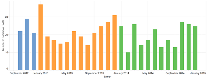
When I first browsed through my “year” in review, the first thing that stood out to me most was how much of the year was missing. What then became visible to me — and likely not Facebook (but who really knows)—was how much of the missing Year reflected when I dealt with depression (mid-January to March and bits of September through November, as well as August through October of the previous year).

2014 had its ups. I started the year in Japan, vacationing with my girlfriend there for the holiday (also the first time back since 2008). I passed my PhD qualifying exams and earned my Masters degree. I landed a great summer job at Sony PlayStation. I met a bunch of great new friends, gave some enjoyable lectures at a handful of events, and even published my research. My girlfriend and I finally celebrated our fifth anniversary. And yet throughout all this, 2014 had many downs too, and I encountered numerous moments of depression, some fleeting, some lasting entire weeks. I’ve dipped in and out of small bouts of depression since 2009, but the end of last year into this year really hit hard. It was also the first time that I consciously recognized what I was going through.
My Year in Review was not bad, but it made me think. It included the following:
- (Opening profile photo) Cosplay at Anime Expo.
- “Pasta making class!”(4 pictures, March) Cooking class with my girlfriend.
- “June” (1 picture) In the emergency room, after getting hit by a car on my bicycle. (1 picture) Walking around E3. (1 picture) A prize I won from trivia at Sony.
- “August to October” (1 picture, August) Touring the new building at school. (1 picture, August) My special guest badge at Penny Arcade Expo in Seattle. (1 picture, September) Professional photo of my lecture at Penny Arcade Expo. (1 picture, October) Exploring the HelloKittyCon VIP party.
- “September 23: It is really fun to speak in front of a packed house. #notacademia” (3 pictures) Professional photos of my lecture at Penny Arcade Expo.
- “Kitties!” (4 pictures, October) Our cats lying around the house.
- “November 23” (3 pictures) Showing Los Angeles to friends visiting from Boston.
- “First night of ice skating at LA Live! — L.A. LIVE” (4 pictures, December) Ice skating at an outdoor rink.
- “CicLAvia!” (4 pictures, December) Riding with friends at the Los Angeles bicycle festival.
- (Closing profile photo) Lecture at Penny Arcade Expo
Seeing the gaps in my Year in Review (first half of 2014 had almost nothing, and the big achievements of the year were missing) highlighted the episodes of depression in a jarring — yet provoking — way. I became curious: How did Facebook choose what to put in my Review? Why did it choose what it skipped (and did it know that it coincided with my depression)?
Reviewing My Year in Review
Below, I take a look at my own data from 2014 to investigate how my Year in Review reflects certain design values that were built into the feature. (Note: the leading and closing profile pictures in the Review are not included in the analysis below.)
Visualizing Data for Visual Memories

The most obvious thing that everyone should realize is that the Year in Review can only contain so much information. But it will also contain specific types of information, skewed toward making the Review visually appealing, emotionally positive, and (ideally) personally meaningful. Above, you can see just how many posts from my Timeline were included in the Review, in relation to the total number of posts I contributed over the course of the year. Notably, they all are photos. This design decision is different from prior features: if you experimented with it, Facebook’s 10-year anniversary Look Back video creator drew from only-text-based status updates in addition to photos (the latter of which were fairly random and held less meaning for many people). The decision to include only photos in the 2014 Year in Review significantly skews what kind of information can be and is included.
Facebook’s Attention Economics
Facebook previously provided a personal Year in Review feature back in 2012 (in 2013, they offered one that focused on friends). Mashable’s coverage of the feature highlighted two trends: highly-liked and -commented posts, and more-recent posts.
Not surprisingly, the 20 most important events of my year were vacations and photos with celebrities — the events that received the most likes and comments from my Facebook friends and subscribers. I did notice that my events were present-heavy — four events from the past week made my Year in Review.
I wanted to investigate how much these two aspects played into the Year in Review, so I graphed the data below.
For likes, the Year in Review seems to set a threshold for minimum-number-of-likes (I assume a measure of meaningfulness), but it also did not include my most-liked posts. Below, I order all the posts by number of likes for ease of comparison. Nine posts were more-liked than the most-liked post included in the Review: six of these were status updates, and three were photos. Honestly, I felt a bit jilted by the Review’s algorithms for not including the moments that actually meant the most (e.g., passing my PhD qualifying exams).

The exclusion of these posts (especially the photos) makes me wonder if the engineers found that most-liked posts were sometimes not something that people wanted to be reminded of.
Another question is how much both likes and comments played into which posts were curated. Below, I graph each post’s likes against comments. A bit surprisingly, many of the curated posts had fewer comments than unselected posts.

Examining the data closer, I found that the top-commented posts were helpful or cathartic, but definitely not things I would consider memorable or particularly meaningful. In general, I also think it’s safe to assume that the engineers conducted linguistic analysis (word use and sentiment analysis) to avoid posts with many comments that might be negative (e.g., “I’m sorry” vs. “Congratulations!”).
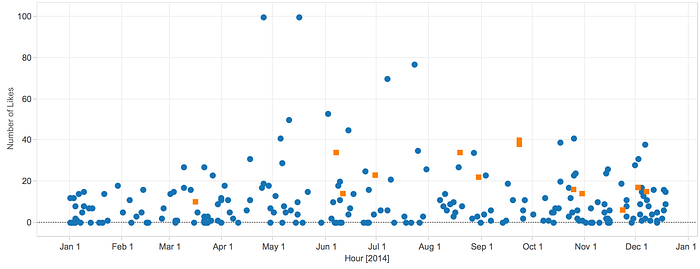
Finally, to look at the temporal element, I graph the posts over time, according to number of likes.

The posts included in the review highly skew to the second half of the year, but notably fall in the last quarter of 2014 too. I still am not quite sure why this is the case, but this particular structure in my Review made me connect it strongly to my depressive episodes.
Emotional Traces, Emotional Algorithms
In 2014, the ACM CHI Conference on Human Factors in Computing Systems hosted a workshop on Designing Technology for Major Life Events. While the papers in the workshop’s archive are critical and astute, I would note that few of them tackle the problem of designing for emotional major life events. This will especially be critical toward the analysis of mental health. In 2013 in the New Yorker, Maria Konnikova authored a good overview of the scientific research on this topic: How Facebook Makes Us Unhappy. The New York Times also provided a good overview of these areas and its issues just this week (I highly recommend my colleague Munmun de Choudhury’s paper; she is profiled at the end of the article).
One of the intriguing future areas of research is emotional profiling. IBM’s Watson user modeling system relies on training across thousands of individuals given many features derived from trace data. These systems have the potential to map out a fuller scale of humanity, yet the critical eye will have to be toward the error rather than the prediction.
At the end of the day, error is what designers will have to turn a critical eye to most. When algorithms don’t quite work as planned, that is when we notice them. Lucy Suchmann, in 1995, pointed this out in Making Work Visible by describing how service work, when done better, becomes more invisible. The same happens to any infrastructure, especially algorithms.
Earlier this year, my colleague Yvette Wohn demonstrated this in a paper on the “uncanny valley” of targeted advertising: people find it creepy when targeted by algorithmic advertising until the convenience of a good match diminishes the repulsion. When we design and engineer, we hope that the processes that make human interaction and emotional communication work will fade into the background. The work of my colleagues Karrie Karahalios and Christian Sandvig, on how people understand how Facebook’s Newsfeed filters certain content, is especially pertinent here: while many people get offended at filtering, when it works well, people tend to understand why and accept it.
Overall, Facebook’s Year in Review basically worked for me. But in working in a very peculiar way, it illustrated a year that I felt I hadn’t experienced according to what I was shown. The design of the Year in Review is supposed to be “good enough”: but emotional algorithms should strive to be more than good enough.
Post script: For a thoughtful article on depression, I have consistently referenced Ethan Zuckerman’s thoughts on his own experiences.

