This writing is continuation from Building Portfolio Website using compose multiplatform(1)

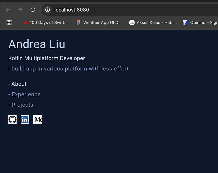
We will build menu area from this app. As seen from above picture, the app is divided into 2 big box : menu area & content area. If the app is landscape, we will arrange it into row. Vice versa if the app position is portraint, we will arrange it into column.
The menu area is divided into 3 subparts :
- Text & description,
- Text button area
- Icon buttons.
The first part will be column that consist of Title text, Job position text & description text. It will consist of 3 lines of Text arranged into one column.
@Composable
fun DescriptionText() {
    Column(verticalArrangement = Arrangement.spacedBy(6.dp)) {
        Text("Andrea Liu", style = MaterialTheme.typography.h4.copy(color = silverTextTitle),
            modifier = Modifier.padding(bottom = 2.dp))
        Text(
            "Kotlin Multiplatform Developer", style = MaterialTheme.typography.subtitle1.copy(
                silverTextTitle
            )
        )
        Text(
            "I build app in various platform with less effort",
            style = MaterialTheme.typography.body1.copy(color = grayText)
        )
    }
}
The same code pattern also happened for the 2nd part for TextButton, only for each text, it will has Modifier.clickable. The modifier enable app to call the callback when the text is clicked by user.
@Composable
private fun MenuTextButton() {
    val focusTextStyle = MaterialTheme.typography.subtitle1.copy(silverTextTitle)
    val unfocusTextStyle = MaterialTheme.typography.body1.copy(color = grayText)
    val textFocus = remember { mutableStateOf(0) }

    Column(verticalArrangement = Arrangement.spacedBy(6.dp)) {
        Text("- About",
            style = if(textFocus.value == 0 ) focusTextStyle else unfocusTextStyle,
            modifier = Modifier.clickable { textFocus.value = 0 }
            .hoverableExt { textFocus.value = 0 })
        Text(
            "- Experience",
            style = if(textFocus.value == 1 ) focusTextStyle else unfocusTextStyle,
            modifier = Modifier.clickable { textFocus.value = 1 }
                .hoverableExt { textFocus.value = 1 }
        )
        Text(
            "- Projects",
            style = if(textFocus.value == 2 ) focusTextStyle else unfocusTextStyle,
            modifier = Modifier.clickable { textFocus.value = 2 }
                .hoverableExt { textFocus.value = 2 }
        )
    }
}
On this part, I also added special effect ; if user hover on the TextButton, it will highlight the text. Thus, I make extension function for Modifier which will detect if pointer is hovered/pointing to the text area.
@Composable
fun Modifier.hoverableExt(
    onClick: () -> Unit
): Modifier {
    val interactionSource = remember { MutableInteractionSource() }
    val isHoveredState = interactionSource.collectIsHoveredAsState()

    if (isHoveredState.value){onClick()}

    return Modifier.hoverable(
        interactionSource = interactionSource
    )
}
Similarly on the last part, we will arrange all the IconButton inside one Row. But first we need to find the logo linkedin, Github & Medium. Once it has been downloaded, we need to paste it to folder commonMain/composeResources/drawable.

Now we can create the IconButtons row almost similar with the previous TextDescription & TextMenu. However inside the IconButton function we need to passed function that will open url when the icon is clicked.
@Composable
fun IconButtons(openUrl:(String) -> Unit) {
    Row(horizontalArrangement = Arrangement.spacedBy(12.dp),
        verticalAlignment = Alignment.CenterVertically) {
        IconButton(Res.drawable.github_icon, {openUrl("https://github.com/andrea-liu87")})
        IconButton(Res.drawable.linkedin_icon, {openUrl("https://www.linkedin.com/in/andrealiu87/")})
        IconButton(Res.drawable.medium_icon, {openUrl("https://medium.com/@andrea8787")})
    }
}

@Composable
private fun IconButton(image: DrawableResource, openUrl:()-> Unit){
    Icon(
        modifier = Modifier
            .size(24.dp)
            .clickable {
                openUrl()
            }
            .background(Color.White)
            .clip(RoundedCornerShape(12.dp)),
        painter = painterResource(image),
        contentDescription = null,
        tint = Color.Unspecified
    )
}
Now we have all the elements ready, we can arranged that into the App function. We will pass empty function for open url on IconButtons for now.
@Composable
@Preview
fun App() {
    MaterialTheme {
        var showContent by remember { mutableStateOf(false) }
        Column(Modifier.fillMaxSize()
            .background(navyBluePrimary)
            .padding(24.dp),
            verticalArrangement = Arrangement.spacedBy(20.dp)) {
            DescriptionText()
            MenuTextButton()
            IconButtons({})
        }
    }
}
Hit the run button for wasmJsDevelopmentRun on Android Studio, it will look like this.
Complete code is here. Next part will be creating content area and showing it to user.