Doing business wearing GIMP suits
Or how we designed our studio’s site — www.antonandirene.com
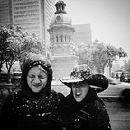
In February of 2015 we spoke at the awesome Graphika Manila design event in the Philippines, and after a 4 hour long autograph signing marathon, we felt like Mick Jagger. Besides our professional obligations, we also spent quite some time lounging around and relaxing on idyllic little Philippine beaches with piña coladas in hand. Needless to say we were not really looking forward to going back to New York City in February.
“Winter is coming” we heard from the cockpit as the captain was landing the plane in the freezing cold.
When we got back to the studio, we had a two week gap before the start of a new project, and since we had literally just gotten back from vacation and were fully rested, we decided to invest this time into the studio. We had been wanting to update our portfolio site for quite some time now, as the only thing we really liked about our current site was the graphic of our name that our good buddy Bradley (Gmunk) had done.

When we got to the studio we sat down all morning and enthusiastically started concepting. Nothing! We had zero good ideas! We could not decide on the Art Direction, we could not decide on the framework, we could not decide on the content, or even what shape our content should take. It was a disaster. We realized we were somehow being inhibited or blocked because for once we were doing something that was supposed to represent us, and not a client. Somehow we were too close to it. We were taking everything way too personally.
A couple of hours later we decided to take a break and went to our favorite Indian restaurant in Gowanus for lunch. As we were chomping down on some delicious cheesy garlic naan we said “Fuck it!” “Let’s just do some cool portraits instead!”.
Outside it was snowing heavily, and we got to thinking … Let’s do a shoot in the snow. Ok. So what type of imagery would look awesome in the snow? Something white. What’s white? Chef’s uniforms? Mummies? Nurses? Fencing outfits? Yes! Fencing outfits! That’s it! We were finally excited about something.
Part 1. Fencers Combat.
After lunch we came back to the studio and jumped on Google and found the one place in Manhattan that rents and sells fencing equipment. We rushed from the studio to the city to get there before they’d close, and somewhere on the 5th floor in the Garment District of Manhattan our first portrait was born.

We were all over the place, laughing our asses off, putting on different outfits and getting our hands on everything that looked cool. The guy who worked there was trying to explain to us that THAT sword belongs to a DIFFERENT style of fencing (apparently there are three kinds, who knew?), and that the helmets we already had on were WRONG. Whatever, who cares! We ended up taking whatever looked cool. It’s not like we were planning on competing in the Olympics or anything!

The next day we were back in our studio and looked for fencing photos on the internet. We printed out six bad-ass poses, and started practicing on the floor of our studio. When we felt we were quite pro at fencing (15 minutes later) we went up to our rooftop and got to business.

Our roof was a complete disaster. There was crap all over the place, and the sun had started to melt away all our precious snow! We had to get this done ASAP! Since there were only two of us we had to be smart about how we would take the photos. We decided to climb the elevator shaft so that we could position the camera pointing straight down in order to get the angle we were looking for. So while one of us would be the model, the other would be the photographer.
While we were doing this we realized we couldn’t actually wear the helmets since then people wouldn’t see it was us. So we decided to shoot the helmets separately and then add them back into the scene in post.
FUCK IT WAS COLD! By the time we got back down to our studio our hands and butts were literally blue!

Well … that doesn’t look great. Yet. Next we had to select the best poses that worked together and combine them in Photoshop so it wouldn’t look fake. And since the snow had started to melt we had to fix that too. We also wanted to add more drama and motion to the whole scene like a Nike ad!

The PSD file took about 6 hours to complete. But the result was totally worth it!

So now we have this bad-ass portrait. Great! But what the hell do we do with it? No idea. We were hoping it would inspire us to do the site, but we could not use this photo as a base for our Art Direction, or in the marquee since then people would probably call us for fencing lessons. And believe me, you do not want to take fencing lessons from us!
Ugh. Back to drawing board.
Part 2. From Fencing to Religion.
Around the same time we got invited to speak at the OFFF festival in Barcelona in May. Our friends Enric and Bruno from Vasava told us they were working on the book for OFFF’s 15th anniversary and asked if we would like to design a spread for it.
The brief basically said “Do whatever you want as long as it fits within the main theme of religion”.
Fun! Let’s do another crazy portrait! The site can wait…
We had been listening to Queen in the studio and happened to look at the video for Freddie Mercury’s “Living On My Own” during lunch time, and he had this awesome checkered spandex lycra suit on. We thought there was something really hypnotic and special about the checker pattern that would work really well for the religion theme.
Turns out checkered lycra suits go for just $16 on Amazon, which was the best deal of the winter in our humble opinion.

But just in case we couldn’t make the checker pattern work, we got neutral grey ones as well. We pulled one of our awesome Blue Dot desks to the wall, set the flashes up and started experimenting with what we thought were some spiritual poses.

We were using a Canon 5D Mark III with a 24–70mm 2.8 lens. We don’t have a proper light set up, so we just used two Canon Speedlight flashes. We put each of them on a tripod 45 degrees to the left and right of the subject in order to even out the light.
After trying different things we got back to our computers and went through all the photos in order to select the final image. This one of Irene looks pretty weird and interesting:

After having spent a couple of hours in Photoshop combining the two of us into one photo, we realized the result didn’t look that great. The scene looked too much like a 3D render and not enough like a photograph. It looked like something you could find on a stock photo website. Ugh. No.

We then decided to reshoot the scene but this time wearing the grey suits so we could add different textures and colors later on in post. Grey is the best neutral color when editing images. You can make grey look like any other color while maintaining the shadows and highlights by using blend modes.


Oh my god we love it! Portrait number two is done! We packaged the file and sent it over to Vasava for printing.
Part 3. Zip up those Suits.
Now, that’s where the magic happened. While working on those portraits and coloring the suits in post, we finally came up with the Art Direction and concept for our site. We wanted to have a portrait of us with our faces covered, and on hover, we would slowly reveal ourselves. We were symbolically shedding our previous skin. We used to be directors, now we are hands-on designers. We used to work at an agency, and now we have our own eponymous design studio. Everything finally came together, and we knew exactly how to do our site.
Back in the suits! Fire up those flashes!


Now we are on to something! We looked at the edited images and could finally imagine our site. This is it. We merged the two photos together into one image and BAM! we had our marquee.

If you move your mouse cursor, the body suits starts to unzip and reveal our faces. Scrolling down moves us to the side and shows the things we are good at and like doing. Check it out.
The really hard part here was to have multiple images of us colored in the same style. Every single part of the body was cut out and colored manually and it took about 2 hours to retouch each pose. So the more images we added to the sequence, the more work it became.

Part 4. Back to the Site.

From the piles of paper on our concept table in the studio we pulled the original sketch with the site structure we outlined in the very beginning. We wanted to have all the information in one easy-to-scroll page. But we didn’t want our site to look and feel static, instead we wanted it to have smooth animations and gently reveal information as the user scrolls. Our colored suits inspired us to find other fresh color combinations for the different backgrounds and type as well.
We decided to bring back Oleg Chulakov Studio to build the custom page based on our designs. They did a fantastic job building the front end for the Karim Rashid website we designed this winter, and we thought they would crack this task like a pro.

One of the main goals for redesigning our site was to highlight some of the new work we did. A long time ago, when we were both directors at Fi, we started doing case studies that showcase the process of creating a digital experience step by step. The problem was that over time the process got more and more complex and started to involve too many developers, as each case study had to be built from scratch. We wanted to improve that process so that it would be super easy for us to get case studies up ourselves, but still wanted something that would look amazing and not look like a boring Behance portfolio page.
So our options were to build a very simple CMS with minimal flexibility which would look boring (something like this article), or we could hire a development team each time we wanted to create unique case studies with a custom designed layout (The old Fi way). Neither of those options seemed very appealing. It’s also not like we could become HTML5 masters ourselves overnight! We knew that both options were off the table and we had to look for a better solution.
That’s when we started to look deeply into the ReadyMag platform. Anton was a big fan of this service and had used it multiple times to put together his photo stories like “One Month Off — Indonesia” and “New York Photo Guide”.
So we started imagining how we could use this platform to create case studies and integrate them seamlessly into our custom-built site. The beauty of ReadyMag is that it works almost like Keynote, but on the web. You can position anything anywhere by just dragging objects into the browser and create pretty much any layout you want and customize it to the extreme.
The only tricky part was that ReadyMag is not open source, so how do we integrate it into our custom site? We wanted the integration to be so seamless that when you browse our site you don’t even know you are technically jumping between two different platforms.

As Irene’s mom always says “You already have a no, but you might get a yes”. With this motto in mind we reached out to ReadyMag. And to our delight and surprise, the people over at ReadyMag were kind enough to embed custom code into our account that would show our global navigation on top of the case studies which would be living on the ReadyMag platform. Done! Now we can go crazy designing case studies how we want them and when we want them!

And wouldn’t you know it… We managed to find a home for our two earlier portraits as well. The fencing portrait became the background for our About section and the OFFF Book portrait became our 404 page!


We will leave you with this.
The moral of the story is that sometimes it is hard to start creating something from scratch when you don’t know what direction to take. And if you do force yourself to move forward, you might end up with mediocre work. Sometimes it really helps to start somewhere completely differently and allow yourself to be really open about where this new route might take you. It might not be what you were imagining in the very beginning, but chances are — you will surprise yourself.
When we sat down on that first day, we could not have imagined our site looking the way it does today. We also did not plan on using a third party service to build our case studies. But, by exploring all the different options and trying things we normally would never do, we ended up with a site that we are extremely happy with. On top of that it got tons of traction from different magazines and awards as well.
We wanted to say thank you to everyone who helped us in making this site a reality and for all the support we got along the way as well as after the launch. We are a small studio and everything counts.
Don’t forget to vote for Anton & Irene in “New Agency of the Year” category on the .NET Awards. And for Urban Walks in “Side Project of the Year”. You can also help our friends at ReadyMag and vote for them in “Game Changer of the Year” category.
With love,
Anton & Irene