Din Tai Fung Case Study (Paper Prototype Reservation App)


Project Details
UX/UI Group Project
Team Size: 3
Time: 2 weeks
Location: Costa Mesa, CA
Tools: Sketch, Adobe Illustrator, Adobe Photoshop, InVision
To view more of my work, please go to Behance!
Summary
Din Tai Fung is a popular restaurant chain specializes in xiao long bao (soup dumplings), and it’s founded in Taipei, Taiwan.
The problem that customers are experiencing is the long wait time. Typically, the wait time is around 1–3 hours. However, sometimes the wait time can pass the estimated time, and the only way to find out is by going back to the restaurant in-person, which can be inconvenient. Furthermore, currently customers need to be in a “registration line” just to have their names and phone numbers on the wait list. Once they registered, they will receive a welcome text message to inform them that they should return to the restaurant once they receive the next message.
Having the problem identified, my team and I decided to create a reservation app for Din Tai Fung to solve the problem and improve the overall experience. With a reservation app, customers can cancel and make a reservation without standing in the line, so it’s more convenient and time-saving. Customers can also receive notification for live update regarding the wait time. The app can possibly improve the quality of the service as well by preventing the waiters/waitresses feeling pressured and frustrated by all the customers waiting.

Research
We started our project with online research, user research, and on-site observation. Before we dive in to research, we already know that Din tai Fung is infamous for the long wait time.
Through Yelp, we found 2,049 reviews mention the word “wait” out of a total of 2,970 reviews. Within those Yelp reviews, a majority of them were negative comments about the long wait time.
After online research, we went to Din Tai Fung to observe, distribute surveys, and conduct interviews. While we were at Din Tai Fung, the first thing we noticed was many customers were confused about which line they should be in because there were three different lines: one line for wait list registration, one line for waiting for seats at the bar, and one line for customers who already received the “table is ready” text message. We also noticed the line for wait list registration is long, which was about 15 minutes wait. This being said, customers need to wait before they can be on the wait list, and once they are on the wait list, they wait even longer for a table. On top of this, customers need to wait again inside the restaurant to be seated, after they receive the text message.
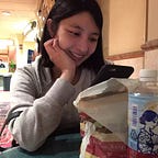
Below are some observation photos that were taken while we were there.


In order to have a better understanding of customers, we created a survey through Google Survey, and we asked several customers to complete it, which includes basic demographic questions, questions regarding wait times, and the overall experience. We also interviewed some customers while they were waiting. Most customers said they really like the food and the service at the restaurant. The only downside is the long wait time and the inconvenient method for reserving a table.


User Persona
After research and discussion, we decided to have a female (Cindy), who is a foodie, in her late 20s as our user persona. You can find a more detailed description of our user persona below.

With our user persona, we thought about what Cindy needed the most and how we can solve her problem and/or improve her experience. The insight statement for Cindy was that “a millennial foodie wants to have a new, authentic, and high quality, experience trying authentic asian cuisine at a prominent restaurant, because her measure of success relies on appreciation of different cultures and a breadth of novel experiences.”
Story Board
With our user persona and insight statement, we created a story board:


User Journey
Next, together we worked on our user journey map to have a better understanding of how customers feel and which area(s) need(s) improvement.

Paper Prototype
With our paper prototype, we included features such as location, weekly specials, reservation, to-go order, and menu. Our main focus was to guide users through making a reservation. First, users need to choose a location (in this case, it’s Orange County). Then users can choose to make a reservation, which will ask for their name, date, time, and party size. Once users click on “confirm,” a confirmation page will show, and users can choose to make another reservation, check their current reservation, or go back to home page. If users want to cancel a reservation, they can either go to “My Reservation” on the home page or “Check My Reservation” on the reservation confirmation page.

Future Iteration
With further development and more time, the next step would be creating high-fidelity digital prototype so that we can carry out a more accurate user testing and receive feedback for improvements. Also, we would like to add more features to the reservation app that will fit customers’ needs.

To view more of my work, please go to Behance!