UX Portfolio — Redesigning the Team Page
Project Date: November 2016
Project Result : Successful, reduced bounce rate by 60% for mobile devices.
Project Objective:
Find a way to improve the performance of the Team Page.
Project Process:
Stage 1: Analytics
Analyze Google Analytics for the Team Page on a monthly and yearly basis in order to determine any patterns, trends, or issues that may be occurring.
Stage 2: Heat Maps
Place Heat Maps on the Team Page for mobile and desktop devices in order to confirm or refute the assumptions made in the initial data analysis.
Stage 3: Design
Begin lo-fi/hi-fi design stage until a design is approved by upper management
Stage 4: Development/Testing
Place another heat map over the new design layout
Stage 5: Reanalyze/Reporting
Analyze the Google Analytics and heat map for the new design and compare the data with the original design to determine if there has been improvement.
Results:
Stage 1: Google Analytics
There were three major points of focus for the Google Analytics analysis:
- Acquisition: Number of Sessions, New Session Percentage, Number of New Users
- Behaviour: Bounce Rate, Page-to-Session ratio, Average Session Duration
- Conversions: Conversion Rate, Number of Completed Conversions

The number above was used to determine how the user’s experience on this page has been. The goal was for this data analysis to help answer the following questions:
1. How many users are arriving on this page on a monthly basis?
2. Are these users immediately bouncing of the site page upon arrival? ( This might indicate a poor user experience)
3. Are there any conversions?
4. What is the exit rate on this page?
5. What are the differences in user behaviour based on devices?
The fourth question highlighted a significant issue that was occurring on our Team Page.

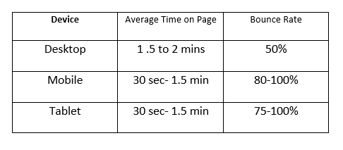
After looking at the performance of the Team Page per device, it was evident that users on mobile and tablet were having unsatisfactory user experiences. Both devices had a Bounce Rate and Exit Rate of over 70%. This implied that users left the site immediately or after just a few seconds of scrolling the site.
Although this flagged a potential design flaw, I simply couldn’t start redesigning right away. First, I had to identify the design flaw in the current Team Page. I did this by placing Heat Maps on our Team Page for both desktop and mobile devices.
Stage 2: Heat Maps
The images below are the Heat Maps & Scroll Maps for desktop and mobile devices . The heat map shows what users click on by highlighting a brighter colour for a higher amount of clicks on a particular section of the site. A Scroll Map shows the percentage of users that scroll down your page. For the scroll map, on one side of the spectrum, yellow represents 100% views whereas Blue represents anything below 20% on the other side of the spectrum.

Desktop HeatMap/ScrollMap Analysis:
The Team Page layout has a standard layout for the desktop. It is a grid with all of the team members in the organization. But the one thing that stood out to me was the content on the first half of the team page.

According to the Scroll Map, 100% of users that landed on the Team Page would see the view above, unfortunately this view did not provide any value for a user that wants to learn more about the team.
The Contact us form located on the right did not provide any value. It seemed like people were interacting with the form, however no one committed to the submission. The Team Page is not intended to be a conversion page but rather an informational page. It provides an opportunity to develop credibility with our user by showing them the faces behind the organization.
I like to consider the first fold of a webpage as an ‘elevator pitch,’ you have a few seconds to convince your audience that there is more to this page than what meets the eyes, spark interest, and create motivation for further browsing. Unfortunately, the content on the page did not meet that standard. A lengthy quote and then a paragraph essentially paraphrasing the quote did not provide any value to the overall user experience. Furthermore, the two paragraphs hinted a potential mobile issue, as discussed later in this article.
The overall activities demonstrated by these maps showed that only 20% of all users scrolled down to the bottom of the page. The drop-in user scrolling begins near the location filter. The hypothesis was that the majority of users used the filter to narrow down their search, rather than scrolling through all of the members.
The heat map supported the assumption since the hottest spot on the webpage was the location filter. This meant that users were not immediately leaving the webpage upon landing, but were instead using the location filter to find the trustee nearest to them.
Although we were not using the first fold of this page efficiently, users on desktop were able to navigate the Team Page. The conclusions aligned with Google Analytics that showed 50% Bounce Rate and Exit Rate. Half of our visitors were happy with what they see, and the other half simply left the site. But the question became, if the design was working reasonably well on desktop, why did mobile devices have close to 100% Bounce Rate.
Mobile Heat Map/Scroll Map Analysis:
One of the first things that stuck out to me, on the mobile version of the Team Page, was the content that users would initially land on.

The two paragraphs seemed to fit well on the desktop view, however the same two paragraphs seemed cluttered and dense on mobile. The mobile layout was extremely text heavy, and white space was not utilized efficiently, which could be overwhelming for users. This created extra scrolling for users without providing any value. With so much heavy text, it made sense that the Bounce Rate was near 100%.

The mobile design of the Team Page had several issues. Firstly, the image of the two co-founders were too close together and their brief bio for each co-founder was lengthy, and cluttered. Its nice to have the co-founder photos side by side but visually it was overwhelming for the eyes. Also, the CTA buttons Read Full Biography were not aligned. Small design flaws like this take away from organizational credibility. Long paragraphs, and unaligned content do not pull users in.
Another issue with the mobile design, was the lack of ability to scan through the corporate team members. The desktop version with a grid layout allowed users to quickly scan through the page to find the person they are searching for. However, the mobile layout did not provide a similar user experience instead forcing users to click an arrow to progress. With over 20 corporate members with designated locations across Ontario, users had to click the arrow button up to 10 times just to find the nearest team member. Although the location filter was just below the ‘Licensed Insolvency Trustee’ title, it seemed as though users just scanned past it and immediately began skipping through trustees using the arrow button only to give up on the process and leave the site. This suggested the location filter option did not stand out to users and conveyed the need for a better way to present our team members on mobile.
The Scroll Map on mobile highlighted a higher retention in user scroll compared to desktop but the heat map indicated that there was hardly any user engagement from mobile users. Although 35% of clicks were in the section that allows a user to scroll through trustees, it implied that it took users that many clicks to find a trustee. Even though the location filter was located just above the trustee profile picture, the mobile users were not using the location filter as much as desktop users. In fact only one mobile user used the location filter to find their trustee.
Any design that takes more than a couple of clicks to reach a goal results in poor user experience. Upon viewing the lack of mobile user engagement on this page compared to desktop, we could safely assume that the high bounce rate in mobile users were due to poor mobile design.
Design Stage
There were several design decisions made for both mobile and desktop devices.
Desktop Device:
- Remove the CTA form because it provided no value for the user experience. It’s unlikely a user will fill out a form if they’re still looking for more information on the team.
- Remove one of the two paragraphs
- Shorten biography summary for each trustee
Mobile Device:
- Remove the quotes and paragraph — it utilizes too much space without providing any value
- Rearrange the co-founder photos
- Design a way for users to simply scroll through content to find trustees on their mobile devices
New Desktop Design:

Changes Made On Desktop:
- Removed Contact Us form as this page was not an appropriate place for it
- Removed bulky paragraph since having two paragraphs pushed down the important content
- Removed quotation marks surrounding the quote as utilizing white space is always better than simply covering it
- Removed the blue bulky rectangular button that said Read Full Bio under each trustee. We left the button there for the co-founder, and changed the colour from Blue to our corporate colours. The other team members had their rectangular button replaced with an Orange hyperlink
- Replaced the old black outdated picture with more modern pictures.
New Mobile Design


Changes Made On Mobile:
- Removed the quotations from the Team Page. This enhances the Mobile users accessibility to the pertinent team member information
- Removed the arrow to scan through team members. Instead of clicking an arrow to see each team member, I designed a parallax layout so that all the team members are on one page, and the user just has to scroll down
- Location filter now stands out
- Location filter sticks to the top of the page as the user scrolls, so that they don’t have to scroll back up just to use the widget.
Conclusion
Overall the project was a success. Bounce Rate and Exit Rate were reduced by almost 50%. The problem was that the mobile design resulted in more stress than relief for users. By creating a better experience for users, we were able to in turn, increase our web activity.


