Michael WilsoninBootcampHow to create accessible animationSome rules to ensure your designs aren’t excluding peopleJan 161Jan 161
Michael WilsoninBootcampAndroid bold text app comparisonDo you know what your designs look like when people turn on bold text on their phone?Oct 25, 2023Oct 25, 2023
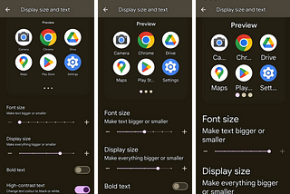
Michael WilsoninBootcampAndroid font size settings app comparisonDo you know what your designs look like when people change the default font size of their phone?Oct 11, 2023Oct 11, 2023
Michael WilsoninBootcampDon’t disable your buttons, give your users feedback insteadA MyFitnessPal example of why disabled buttons often lead users confused and frustratedOct 6, 2023Oct 6, 2023
Michael WilsoninBootcampAndroid ‘High-contrast text’ mode app comparisonDo you know what your designs look like when ‘High-contrast text’ is turned on?Oct 5, 20231Oct 5, 20231
Michael WilsoninBootcampThe problem with tab design and how to make them more accessibleA lot tabs are inaccessible but with a few simple design tweaks you can make them much betterOct 3, 2023Oct 3, 2023
Michael WilsoninBootcampAccessible design systems — ButtonsDesign considerations for creating accessible buttonsJul 4, 2023Jul 4, 2023
Michael WilsoninBootcampThis is Alex, he’s blind — Accessibility context cardsProviding our product teams with a list of accessibility considerations before they begin designingApr 25, 2023Apr 25, 2023
Michael WilsoninBootcampPeople are never edge casesThe term edge case is often misused, which leads to exclusionApr 1, 2023Apr 1, 2023
Michael WilsoninBootcampAccessible link textWhy your links shouldn’t say ‘Click here’ or ‘Read more’ and how to make sure they’re accessible to allMar 30, 20231Mar 30, 20231