Yet another innovative feature for my AI-Powered Investing Platform
Most of the features of my investing platform are simply too technical for the average person. 99.652% of the population have absolutely no idea what the f*ck I’m talking about. This includes friends, family, investors, traders, and fellow software engineers.
For example, one of my latest feature launches has been my AI-Powered stock screener. After implementing this, I was SO excited! I wanted to tell the world how cool this feature was, how valuable it is compared to the current alternative approach, and the technical challenges I encountered when implementing the solution. I sent the final article to my identical twin brother, who is a high-performing software engineer working at Meta. He didn’t even finish reading the article.
So today, I’m going to try a different approach. I’m going to write about a feature that is extremely valuable, but isn’t at all technical. In all honesty, it was extremely simple to implement, which is why it’s so surprising that traditional brokerage platforms like Fidelity and Robinhood don’t have this information available by default. I’m going to talk about the changes I made to support searching fundamental data for a particular stock.
Sounds boring right? WRONG! If you are an investor or trader, PERK UP AND PAY ATTENTION! This is extremely important. This can be the difference between you losing money and earning money. We’ll be discussing a feature that is far more predictive in assessing future stock value than the stock’s current price.
This feature has NOTHING to do with AI, genetic optimization, or large language models. This is a quality of life improvement. Today, I’ll be discussing how I display historical fundamental data in the NexusTrade platform.
A Graph? You’ve Gotta Be Sh!tting Me!
I dare argue that this feature is as valuable as the AI-Stock Screener, one of my favorite features in the NexusTrade platform. This feature is as simple as it sounds — charting for various fundamental metrics for our favorite stocks.
And, before I continue, I have to say this… If I am being biased, call me out! Call me an idiot and a liar, and a snakeoil salesman. I promise that I’m trying my best to be as transparent as humanly possible. The feature that I implemented truly is not complicated, which is why it’s such a shocker that none of the major brokerage platforms have implemented it.

The reality is that an important, useful feature is simply not available in the vast majority of investing platforms. I’m talking Robinhood, Fidelty, TD Ameritrade, and every other major platform. Even small platforms overcomplicate which should be a simple, 2 dimensional graph.

This feature is displaying basic historical fundamental facts about the change of a company over time. Few brokerage platforms like Fidelty MIGHT show some information about how a stock has changed over time fundamentally, at least in a way that’s dead-simple for a person to look at.
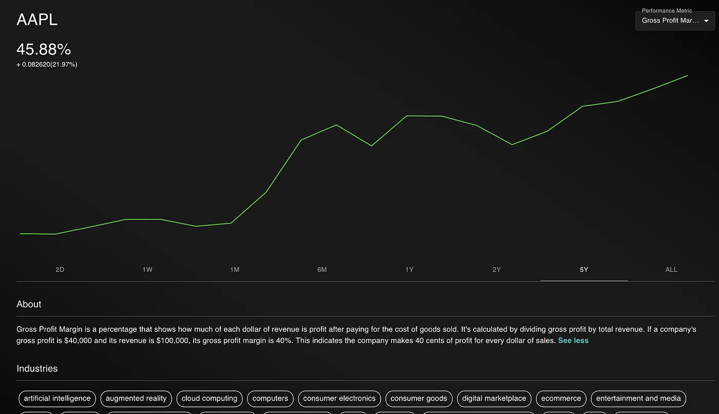
My app, NexusTrade, shows facts like revenue, net income, free cash flow, PE ratio, volume, and other fundamental metrics on a chart that looks similar to the price chart that we’re all accustomed to. This visual is simple but it allows us to immediately identify divergences because our mind automatically has an expectation of what a chart ought to look like. For example,

If I showed you this chart and asked you “what stands out to you?” I would expect your answer to be… NOTHING! Nobody can just read a chart and immediately gain valuable insights through osmosis. Now if I showed you the following graph of Google’s revenue, what would you say?

I can immediately identify that Google’s revenue is at an all-time high.
Similarly, if I showed you this image, you would see the following for Google’s Free Cash Flow.

These fundamental metrics allow experience traders and investors to immediately draw insights from data. We don’t need any complex natural language processing. We don’t have to feed the data into ChatGPT and have it babysit us through an examination. We can just look at the chart and make a judgement.
To me, this is as valuable as any of the AI Features I implemented recently. Being able to make a judgement call on your favorite stocks, and erase all the noise from social media, is extremely important. Free Cash Flow tells an objective story. 5 people might draw 5 different conclusions, but the facts are objective.
Conclusion
That’s really it. That’s the whole article. I wanted an excuse to talk about my new feature, so I invented one. Thank you for reading.