
UX/UI Case Study: Reorganizing the Traditional Restaurant Menu to Highlight Vegetarians
Brief: Create a website for vegetarians to easily identify the number of meatless dishes on a menu, and quickly learn how many of those are entrees.
Teammates
Kate Hunt and Stella Lee
Problem
Dietary restrictions make eating in a group setting difficult. Often friends who have dietary restrictions have a hard time choosing a restaurant which everyone agrees on, how might we help them easily identify options that accommodate everyone?
Goal
To create a website which helps vegetarians to quickly see the entrees in a restaurant’s menu when dietary restrictions are an issue.
Our Proposal
A website which divides the types of dishes at a restaurant by vegetarian and non-vegetarian meals.
This website will assist the user to quickly and accurately understand the breakdown of the food and provide the menu in a clean format.
User Research
Narrowing down the plethora of dietary restrictions we focused on vegetarians as they were our most prevalent user group. Sending out a screener survey, 17 of our 26 users identified as vegetarian and or vegan. From these 17 users, we conducted in person interviews with 6 participants identifying their pain points in the process.
Key Quotes from User Interviews
“I feel like a burden when people want to eat family style.”
“I feel very frustrated because I know there are so many options of what I can be given, but I just have to go with people, and go with the flow.”
“I try to avoid getting a salad, because it’s usually a side dish rather than main dish.”
“I don’t like menus that don’t have a vegetarian section. It just makes me mad.”
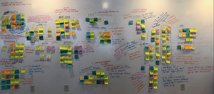
Synthesizing Research
Gathering the data from our six interviews we used over 100 sticky notes to write down key phrases and quotes from our users. Forming these into categories, then “I” statements our persona was born.


Our persona Abby has a goal to “find a restaurant that offers vegetarian options, and to pick a restaurant everyone can enjoy.” Additionally she “ feels excluded when choosing a restaurant and feels bad making others accommodate to her needs.” Following Abby for a night, we discovered a key issue in her relationship, with her vegetarian diet. Often when dining out, her friends don’t understand the limited food choices at restaurants. Many times there is only one option available to suit her dietary requirements. Sometimes she’ll need to make an entree of sides, or of appetizers in order to eat vegetarian. These dinners make Abby feel frustrated because she “knows there are so many options of what she could be given.”

Ideation + Validation
Using this journey map, along with user quotes and we set out to create an MVP based on the key points of our MoScOw map. As a team we decided our website must include a search bar, restaurant information, restaurant menu and the number of vegetarian and meat meals. Additionally we decided that the website should include available substitutions, share link, social media icons, user comments/reviews for accuracy rate of specific vegetarian requests and information of cuisine type.
One idea that we decided against was making our website a search engine for vegetarian restaurants. With multiple search engines available such as Yelp, Happy Cow, Seamless and Google, we wanted our website to focus specifically on menus — breaking down the information and reorganizing the data so our users are able to quickly read and learn the menu to make an informed decision about whether they should eat there.
Keeping these features in mind we used the design studio technique to ideate and synthesis our data.


Moving from Design studio to low-fidelity wireframes and then to mid-fidelity we emphasized concepts that our users had stressed as paint points to create More than Salad. Designing the results page we wanted the first information our users saw, after searching for a restaurant to be the total number of vegetarian dishes. Recognizing that this may be misleading if a restaurant has multiple side dishes like “french fries” or “side salad,” we highlighted the number of entrees, appetizers, then sides per vegetarian and meat menu.


Scenario, Task and Usability Testing
In order to understand if our design was truly functional we gave our users a task to complete. First we asked them to look up the menu on yelp and let us know how many vegetarian options were available. Then we asked them to use More than Salad looking up the same information at the same restaurant. Timing the participants and gathering qualitative data was essential to understanding if this website would improve the lives of our users.
Design Critic
Our initial design was a success! On average it took participants 2 minutes to search for the information on Yelp, while it took participants under 30 seconds to search for the same information on More than Salad. Additionally during our usability testing we gathered users who identified as vegetarian and as omnivores. The users who were omnivores and completed the task recognized how difficult it was to search for vegetarian dishes.
[Yelp] I don’t really see anything that says vegetarian options….it says it has vegan options but doesn’t say where they are.
[More than Salad] Ahh, that’s easy 16. All of the sides are veggie, but very few of the other things.
Through usability testing we were also able to recognize some minor issues such confusion for what mean the users were looking at, and the need for a larger hotspot area. All of our users pressed on the title of the drop down menu rather than the arrow feature.
This menu was for dinner right?
Oh the drop down doesn’t work yet.
Vegetarian specific reviews as opposed to the ones you get on other sites would be nice.
We implemented these changes to the high-fidelity mobile prototype, then created the desktop version of our site.


Designing the desktop version was challenging as we suddenly had a lot of space to work with. Keeping the homepage simple such as Google’s search page, we wanted the menu breakdown to stay prevalent in the larger design. Instead of a dropdown menu, the veggie and meat menu were separated into buttons for users to toggle between. Furthermore the Breakfast, Lunch and Dinner menu are under the food type as well.
[I’d give it] a 4.5 [out of 5] because I can see right away how many options I’m going to have …and I can also see right away what the options are and a description of them — so that’s cool.
This is all very well laid out, I like it, it’s useful, I’d use it.
In this layout we separated the reviews into a separate section with big bold letters, however during usability testing users found the design confusing. We also gained user feedback suggesting to switch “meat menu” to “animal proteins” menu.
I want reviews that are more than just quotes…I want a more comprehensive review system.

The Next Steps
- Incorporate desktop usability test results into the current website
- Expand the scope of the website by including other dietary restrictions to serve a larger user base: e.g. gluten free, dairy free, ketogenic, kosher, vegan
What I Learned
Working with two other colleagues on this project, I understood what it meant to work as a team. Although it’s advised to break down what you did versus your teammates, we truly created everything together and reached a conclusion before venturing on to the next steps in our research. From our original affinity map where we each created “I” statements then synthesized the data to coaching each other during practice for our presentation, to working simultaneously using google suite, and Figma — it’s been a pleasure starting and finishing this research with my colleagues.
