[Shortudy] Why use different share icon in iOS and Android?

In the first article, I would like to introduce the concept of this magazine briefly. Shortudy is a combination of Short+Study that aims to study small subjects in depth.
I’m currently working as a product designer at LINE Corp, I asked myself a lot of questions about design elements or UX strategy. But sometimes I didn’t have enough time to research or forgot after studying. Through this article, I would like to study small details intensively and share them with Medium. It may be related to UI components, benchmarking, or UX strategies. So guys! feel free to comment on If you want to add more information. I love to hear from you 🙂
Share icon

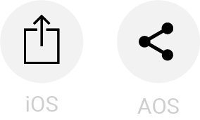
Since there are a lot of iOS users in the service currently I’m working on, my team always designs the iOS screens first and modifies UX and UI to match with Android OS. After one of the AOS developers requested me for a share icon, I started wondering why it’s differentiated between OSs
Dev: There is an iOS share icon on the AOS screen. Can you send it again?
Me: Oh, shh! That’s right! Share icon with 3 dots is common in AOS. Well.. then, Why are iOS and AOS using different shaped share icons?
After passing the AOS share icon, I decided to figure it out. Why it’s different? When has it started? and how do other apps manage share icon in different OS environments? investigation of these questions will be the contents of this article.
History

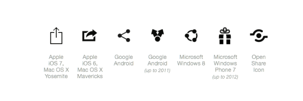
The icons have evolved as OS updates, and have differentiated from OS to OS. these icons above are arranged by the version of the major OS. I will research focussing on iOS and AOS in this Shortudy.
The share icon is attributed to both Google Android and ShareThis. ShareThis is launched in 2006 as a plug-in website for developers and this icon above is also the company logo. Wordpress designer Alex King has released the share icon under the following Open source licenses. and it was purchased from Share This in 2007. so far this icon has been used as a common share icon in Android OS.
The concept of the share icon is slightly different for each OS. For Android, ‘one-to-many’ is the concept of distributing information in many places, such as the appearance of this icon.
Human Interface Guideline at Apple developer officially calls it Action. That’s because this icon evokes a modal containing not only app list but also actions like Airdrop, copy, favorite or save. Apple’s iOS6 used a share icon with a rightward-pointing arrow. A share icon with an upward-pointing arrow is first presented when Apple announced iOS 7 on the stage at WWDC2013. Since then, It has been in use up until now. Some users have mentioned that the iOS7 share icon is too confused with the upload icon.
Reference
kinds of share icon confusing icons
Comparison
What Share icon do other apps use in iOS and AOS environment? Interestingly, Some apps use different share icon depending on the OS, and some cover the entire OS with 1 share icon. It shows differences not only in the shape of a share icon but also the functionality after pressing.
Airbnb

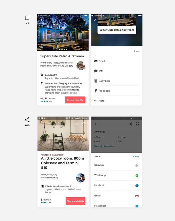
Since Airbnb is an app applied to Google Material, the other icons(Back button, Heart, etc..) as well as share icon use standard icons in Android OS. (Google material — Airbnb) Configuration of modal that comes after touching the share icon also varies by OS. For iOS modal, User name displays on the right edge with specified channels. However, AOS has a close button in the upper right corner (although the user can escape modal by pressing the back button or dim background) and has a list of apps.
Google map

I was wondering if Google Maps, one of Android’s sharable apps, also uses OS-based share icons. I found that the position and function of the share icons differed depending on the OS. In iOS, A share icon is located on the top bar and when pressed, the iOS system modal appears. A share icon in Android Google Maps is in the Overview tab under the name of ‘Share Place’ . when pressed, A function to add more places and various shareable apps appear in the modal. ‘Share more place’ will lead to the screen with a widget which you can add multiple places and share them at once. It can be seen as an upgraded place-sharing feature that can only be used in Android. Then Why are share icons located differently by OSs? I guess in iOS, you can easily click on icons on top bar by tapping the home bar twice to get the top down. For AOS, the share icon is placed in the thumb zone to the right of the midpoint for sharing easier.
Netflix

As the image above, Netflix has applied all of the same icons regardless of OS except for share icons. I think the reason it applies differently is that Netflix wants to provide familiar elements for each OS users. Considering the usage period of a new phone, it will be three to six years. And people get used to seeing icons that frequently expose the OSs. It is possible to guess what role an icon plays, but more clearly each icon is given a functional name. The options for both OSs are the same. It seems that the concept of sharing in Netflix is closer to recommending movies or TV series. Because users may share content that they want to recommend to people around them. So messenger apps are the main options here.
Facebook and Youtube

Facebook and Youtube have chosen to use 1 share icon regardless of OSs. this simple shape of a sharp arrow conveys the feeling that you can send information somewhere and it’s easy to understand its function. In the case of Youtube, there is a clear name under the icons and educate users about its role. The difference is in the modal that opens after pressing the share icon. Youtube iOS shows 4 basic channels for sending a link, and AOS provides all the shareable apps I’ve downloaded. Facebook has different top bar colors depending on the OS. so the icons appear as solid icons, black on IOS and white on AOS. ‘More options’ in the modal is using the default icon according to the OSs.
others

Not all apps have share icons differently for each OS, and followed standard rules. Some are mixed OS default icons into the app. For example, iOS6’s share icon is applied to the Microsoft Excel app on AOS. and it shows the AOS standard share icon in Starbucks Thailand iOS and Lazada iOS.
I’m not trying to say that this is wrong. just thinking about the reason why these are used regardless of OS, I reckon they decided to use those icons in the image representing feature of share in iOS and AOS both.
Which icon will be easiest for users to understand?

So far researching and studying other apps usage of share icon. I reached ask myself which one is the most recognizable among these share icons.
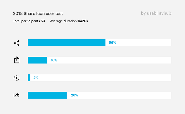
According to the results of the user tests conducted at the Usability Hub in 2018, 56% of people perceive the share icon on Android OS as a tool for sharing information more easily. Although it may be not 100% accurate answer since only 50 people participated in this test. but in other tests conducted in 2017 and 2014, AOS share icon was selected as a high rate of recognition.
—
Friendly Icon = Familiar Icon.
User-friendly icons are predictable of what interactions will be without a title like X (close) and <(back) icons. At this time, the share icon can’t be merged into one in among OSs, but I’ve seen the future and possibilities for share icon on Facebook and Youtube case. Once users get used to this icon, I expect that it can be used without a title after at least 2–3 years, and also become a single icon representing sharing from anywhere.
