Understanding the Basics of Colour Theory
What is colour?
The word colour can be incorporated in various ways and its defination changes when we observe it from different perspectives. So basically colour is what the eyes see when light is reflected off an object.
- Use of Colour in Design -
Colour is used to attract attention. It can higly imapct our moods and behaviors. Colors are powerful psychological triggers that help users learn better and enhance their experience. In terms of Design the importance of colour can be understood by -
- By usage of the proper combinations colours can help your design stand out by grabbing the user’s attention.
- Visual cues and colours affiliated with them highly affect the screen time of users
- People can judge and assess a product majorly just by colour vision.
Studies suggest that people make a subconscious judgment about a product within 90 seconds of initial viewing. Up to 90% of that assessment is based on colour alone.
We could talk about colour psychology forever and discuss what colours mean in design. So enough of psychology knowledge for now, lets move on into fundamentals of colour and colour theory.
According to Googles Material v3 guidelines, colour is used to express style and communicate meaning.
Colour Theory —
Starting with the basics, colour theory is broadly divided into 4 major aspects.
- Colour Wheel
- Colour Properties
- Colour Harmony
- Colour Models
Colour Wheel —
Firstly to understand colour wheel we need to understand the colour compositions.
Colours are divided into 3 sub categories
- Primary
- Secondary
- Tertiary

All these colours combined in a form of wheel representation is called as a colour wheel. Colour wheel is a tool which shows realtionship between colours. It can help you visualize which hues go together.

Colour has three main primary properties -
- Hue — It is determined as the colour in its pure form seen in the spectrum
- Value — It tells the amount or degree of lightness or darkness in colour
- Chroma — It is also known as saturation. It tells us about the intensity and purity of the hue

As we can see in the diagram above, Hue contains all the colours in their pure form found in the colour spectrum. When the intensity of colour changes we call is Chroma. As seen in diagram it goes from pink, light pink and finally white. Value is termed as lightness of a colour.
When you start to add chroma and value to a hue, you start to create new tints, tones, and shades of a color.
Tint — Adding white to a color produces a tint
Shade — Adding black to a color produces a shade
Tone — Adding gray to a colour produces a tone

Colour Harmony
When we organize colour in such a way that it is pleasing to the eyes we call it colour harmony. So in terms of design colour harmony it is a way of creating visual interest by putting colours together in an intelligent way for the users.
Colour Harmony consists of various colour schemes. Some of the important and common colour schemes are —
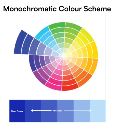
- Monochromatic Colour Scheme —
As the name suggests Mono (One) and Chroma (Colour) means colour. So this colour scheme is made up of only one colour and its corresponding shades, tones and tints. Just select one colour in colour wheel and play around with the same colour to create different variations.

2. Analogous Colour Scheme —
Analogous colour scheme comprised of colors that are next to each other on the color wheel. Mainly analogous colors are any three colors organized by each other on a 12-color wheel. This colour scheme create more visual interest because of presence of different colour.
Colour selected below are adjecent to each other namely Orange-yellow, Orange and Red-orange.

3. Complementary Colour Scheme —
This scheme comprised of pairs of colour which are opposite to each other on a colour wheel. One colour complements the other. It uses colours any two colours directly opposite to each other on a 12 colour wheel.

Colour Models —
A color model is a way to describe colors in a color system. It can be understood as a mathematical model that describes how colors can be represented as a set of numbers.
There are mainly 3 types of colour models
- RGB Colour Model —
It is a additive colour mixing model. This model is made up of three colous namely Red, Green, Blue. Colours are mixed together in various proportions to form its spectrum of colors.
The main advantage of RGB is that it offers a wider range of colors

2. CMYK Colour Model —
It is a subtractive colour mixing model. CMYK stands for Cyan Magenta Yellow Key where Key is termed as black. Overlap of these colours result in formation of black colour.
The main advantage of CMYK is that it can produce more accurate color reproductions than RGB.

3. HSV/HSB —
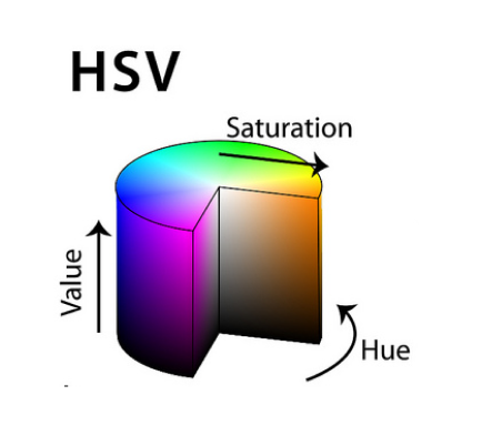
HSV is a cylindrical color model that explains RGB colour model in dimensions that are easier for humans to understand. This model describes colors in terms of hue, saturation, and value (brightness)
Hue specifies the angle of the colour on the RGB color wheel
Saturation is used to tell the amount of color used
Value controls the brightness of the color form white to black

Contrast & Color
In UI design we need to find the right combination of contrast between content and the background so that the text in the design is easy to read and interpret. Find text colors that provide maximum contrast with respect to the background colour used.
We can undertand this more by taking a look into the Web Content Accessibility Guidelines. Web Content Accessibility Guidelines (WCAG) explains how to make content on websites, applications and digital content more accessible to people with disabilities.
WCAG is divided into 3 parts according to the screen contrast ratios —
- Level A is the minimum level with the least contrast. This conformance would make the website inaccessible for the users with disabilities
- Level AA is the acceptable level of contrast reached. This conformance level is used in most accessibility rules and regulations around the world
- Level AAA is the optimal level of contrast reached. Achieving AAA level is the ideal case for all the users but is difficult to reach for different types of content.
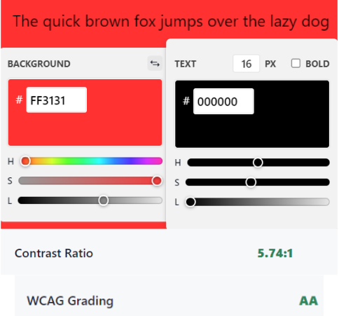
For example Black text on Red background passes the Level AA conformance.

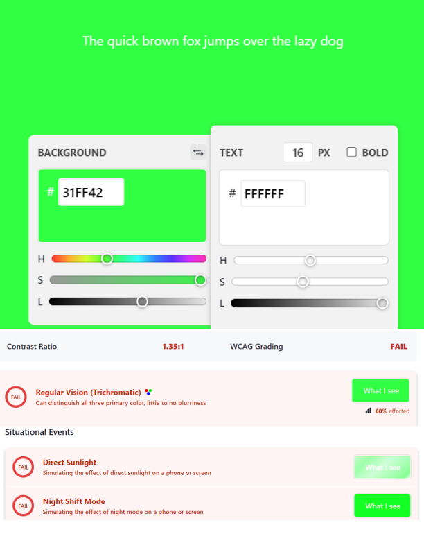
Now White text on a Green background fails all the level of conformance

Colour theory is so much more about feeling than information.
This is just an intro to the amazing world of colours. There’s so much more to learn. We can understand the colour plays a very crucial role in designing an UI. By making use of proper colour systems and considering proper accent colours for respective UI elements a complete, attractive and effective design can be created.

And that’s a wrap !!!
If you like this colourful article don’t forget to give claps and comment on the parts and feel free to share your thoughts.
Follow my Twitter page and lets learn together. Happy Designing.
