Computational Thread Art
Update — I now have a website which features all of my thread art and other projects, and where you can buy pieces. Please visit and take a look around, and if you have any questions about it then I’d love to hear from you!

This is a post describing how I created artwork inspired by Petros Vrellis’ pieces (for more detail, see his website). I will be focusing largely on the algorithms that I used to generate the threads, rather than the physical implementation (which is done using a bike wheel, clothes hangers, and about 3km of thread!). If you would like to see the original code (and a much fuller description of how it works + how you can generate your own images), please go to my GitHub page.
The original algorithm for rendering the actual image went as follows: first, an image is converted into a square array of greyscale pixel values from 0 to 255, where 0 represents white, and 255 black. The coordinates for the hook positions are calculated. A starting hooks is chosen, and a subset of the lines connecting that hook to other hooks are randomly chosen. Each line is tested by calculating how much it reduces the penalty (which is defined as the average of all the absolute pixel values in the image). A line will change the penalty by reducing the value of all the pixels it goes through by some fixed amount. For instance, a line through a mostly black area might change pixel values from 255 to 155 (reducing penalty a lot), whereas a line through a mostly white area — or an area which already has a lot of lines — might change pixel values from 20 to -80 (actually making the penalty worse). Once all these penalty changes have been calculated, the line which reduces the penalty the most will be chosen, the pixel values will be edited accordingly, and this process will repeat from the new hook. Once a certain number of lines have been drawn, the algorithm terminates.


This algorithm just about worked (above are some very crude early attempts), but since then I’ve improved it a lot. Most importantly, I’ve made the penalty formula more complicated. Rather than just being the sum of absolute values of pixels, the actual formula is now:

where pᵢ is the pixel value, wᵢ+ and wᵢ― are the positive and negative importance weightings, L is the lightness penalty, N is the line norm, and the sum is taken over all pixels the line goes through. Explaining each parameter in more detail:
- The lightness penalty L is a value (usually between 0 and 1) which reduces the penalty for negative pixels (or to put it in terms of the actual artwork, it makes the algorithm more willing to draw too many lines than too few).
- The importance weighting wᵢ is an image with the same dimensions as the original image, but when it is read by the algorithm, every pixel value is scaled to between 0 and 1 (so the darker pixels indicate areas you want to give more weight to in the penalty calculation). The algorithm will prioritise accuracy in these areas at the expense of the rest of the image.
- The line norm N can have 3 different values: 1 (so penalty is just total sum), number of pixels (so penalty is average per pixel), or sum of all the weightings of the pixels (so penalty is average per weighted pixel). If w+ and w― are different, the latter mode defaults to using w+.
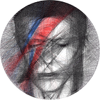
For the images that use colour, I usually just run the algorithm for each colour separately, using very specific images made with photo editing software (I use GIMP). The David Bowie project featured at the start is a perfect example of this.
I’ve included all the relevant images for the David Bowie project below. In order, they are:
(1) The original image
(2) The edited image, used by the main algorithm
(3–4) The images used for blue and red lightning
(5) The importance weighting
(6) Computer output
(7) Photo of the finished piece


In this example, there are a few interesting features of the importance weighting. I prioritised accuracy for the eyes, mouth and nose, but less so for the lightning bold (because that would be primarily blue and red anyway so the accuracy of black lines didn’t matter), and less for the hair and background. Of all the circular pieces I’ve created so far, David Bowie is currently my favourite, because it isn’t just a recreation of the photo. The medium of straight lines elevates the artwork beyond just being a recreation, but rather turns it into something more abstract and expressive (the lightning bolt crossing through the whole image). Below, I’ve included a few more of my favourite pieces which use this methodology.


The Challenge — Full Colour Images
For a long time after these first few images, I continued in a similar way. I made tweaks and improvements to the algorithm over the next few months. These tweaks allowed me to make progressively more detailed pieces. However, I remained preoccupied with the problem of colour. I felt that, if there was a way to create black and white thread art pieces, then there should be a way to make ones in full colour. The difficult lay in how to separate out the different coloured components of the image.
I had many false hopes during this process. In one seeming breakthrough, I was able to create an almost perfect recreation of the Mona Lisa using straight lines:

Unfortunately, this method actually assumed transparency in the lines, so they can create new colours when they cross over each other. How unrealistic an assumption was this? I found out when I removed it, and made every line a solid colour:

In other words, back at square one!
Finally, over a year after I started working on this problem, I cracked it. Unfortunately I can’t reveal all the details here, but suffice it to say that it involved a particular way of separating the image into its constituent colours before running a variation of the above algorithm on each colour separately. The very first piece I made with this method was a rendition of a stag Patronus from Harry Potter, and to this day it’s still my favourite piece:


This piece took upwards of 15 hours to make. It involved 13,500 individual lines of thread, or more than 10 kilometres in total!
…and the future?
Since being able to produce full-colour images, I’ve been continually improving the algorithm, looking for new images to create and new directions to take the art.


I’ve found images that work in thread art just as well as the stag (above), and I’ve found new methods of art based on similar principles, including art with hexagons, Chinese characters, and translucent rectangles (below).


I also have hopes of making the algorithm work more reliably, so that I will be able to produce images of anything I want at any time, rather than having to search for suitable images.
In summary, I have no idea what the future will bring for thread art, but I’m excited to find out!
For more about my work, or to get in touch with me, please see my website here.
Thanks for reading!