The Product Life Cycle — React Web App
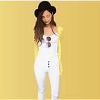
My Beer Selection

View live app
View code
Project Summary
I created this web application to allow my users to make personal beer selections based on their tastes. Using beer data from PUNK API, I made two separate forms — one for flavours and the other for food pairings. Using each form, users can get a beer recommended based on their choice.
Problem Statement
What is the most effective way to provide beer recommendations based on user input and let users customize their selections?
Target Users
Beer drinkers who love exploring new types of beers and want to try different ones.
Purpose
My application can provide a fun environment for searching new beers and learning about them, as well as trying them out if they want! The unique descriptions and brewer’s tips can vividly illustrate each beer being featured, and they could really get people to try it.
My Role
- UI/UX Designer
- Developer
- Project Manager
Built with:
- React
- API
- CSS3
- HTML5
Wireframe
I started this project by creating a quick wireframe of my plan for my concept.

Version 1.0
Then, I coded the application using React, HTML5 and CSS3.
The key features of the first version included:
- pretty detailed instructions page before user gets to the main section
- ‘check my selection’ button floating in the top right corner of the page

- flavour section with a drop down menu (4 options: ‘fruity’, ‘bitter’, ‘citrus’, ‘spicy’)
- food pairing section with a text input (placeholder: ‘chicken’)

- beer info modal on beer click
- ‘add to my selection’ button in info modal page

- in selection section, ‘remove from my selection’ button in info modal page

User Feedback
While building version 1.0, I talked to various people (my potential users) and tried my best to think from a user’s point of view to create a user-centric design. However, with a live application ready, it’s always better to get actual feedback from real human beings.
So I reached out to 35 potential users and stakeholders to collect their feedback and feature requests to improve my app. Below is the summary of the questions and results:
- Was the application easy to use?

2. Given the app’s goal to create a personal beer selection, did it meet its purpose?

3. Did you encounter any bugs or issues?
- 4 people said: “not enough matching beers for food pairings”
- 3 people did not understand the food pairing section had a text input unlike the flavour section which had a drop down menu. They thought it was a bug, so it’s something that may not seem so clear to some people.
- 2 people said: “not many beer options in general”
- 1 person did not understand the default food pairing input’s ‘chicken.’ They thought it was a bug, so it’s something that may not seem so clear to some people.
- 1 person said: “screen goes up to flavour section when ‘no matching beer’ alert pops up in Chrome mobile”
- 1 person said: “floating ‘check my selection’ button covers instructions text and flavour question”
- 22 people said: “no bugs/issues”
4. What features were least useful, if any?
- 2 people said: “food pairing section”
- 1 person said: “‘check my beer selection’ button was shown too early”
- 1 person said: “beer info on CLICK requires too much clicking”
- 1 person said: “instructions show too much info at one time”
- 1 person said: “instructions are not needed as the app is very self-explanatory”
- 28 people said: “everything was useful”
5. Is there a feature you would like to see on the app?
- 9 people said: “better way to input food pairings”
- 3 people said: “more beer options”
- 2 people said: “links to buy beers”
- 2 people said: “option to see zoomed-in images of beers”
- 2 people said: “catalog to show all beers in the pool”
- 2 people said: “beer types (ex. lager, black, IPA)”
- 1 person said: “more flavour options (ex. light, dark, creamy, dry)”
- 1 person said: “beer name to be shown automatically”
- 1 person said: “beer name as alt tag (not just ‘beer’)”
- 1 person said: “beer prices”
- 1 person said: “option to see similar beers”
- 1 person said: “smoother animations”
- 1 person said: “pre-loader for ‘show me a beer’ button”
- 1 person said: “better explanation about ‘why should I use this app?’”
- 1 person said: “more info on environmental beers”
- 1 person said: “option to share my selection”
- 1 person said: “option to save my selection”
- 1 person said: “option to add any beer as user”
- 11 people said: “nothing else is needed”
Live App (Version 2.0)
I carefully reviewed the feedback and organized my plans depending on what things are critical and realistic versus what are not.
The key changes made in V 2.0 include:
- opening question at the top to give users a better sense of why they should use this app

- shorter instructions in bullet points rather than full sentences so that I don’t scare people before they actually start using it
- translucent floating ‘check my selection’ button as an icon and showing text only on hover so that it doesn’t interfere with other critical elements

- more flavour options and a drop-down menu for food pairings
- beer name displayed on top and tagline displayed on hover so that user can get some info on beer before clicking for full info modal view

- beer name displayed on hover so that user can get some info on beer before clicking for full info modal view

- catalog view displaying all beers available shown only when user clicks on ‘show all beers’ button
- ‘hide’ option to hide back the beers

- option to add a beer to selection from catalog view

- ‘share on Twitter’ and ‘share on Facebook’ buttons for user to share the application on social media with their friends


Challenge: Meeting Goals vs. UI Design vs. UX Design
The biggest challenge while building and enhancing this application was thinking about all of the three critical aspects: meeting the goals of the app, user interface design and user experience design, and balancing them out. Every time I wanted to add a feature, I had to provide required information and instructions for users. But making the screen text-heavy did not make it visually appealing in terms of UI. Nonetheless, giving not enough information was not so user-friendly, either. Finding a good balance considering all these three was really important. I used icons that could convey meanings wherever possible rather than using texts for better UI and UX. When icons were not appropriate, I used as few words as possible to communicate with the users so that it didn’t interfere with the visual design or user friendliness (because nobody likes reading long paragraphs but still want to get clear ideas as to what I want users to do).
Lessons Learned
While reviewing the feedback I got from 35 individual users/stakeholders, I was honestly amazed by how different individual people think yet, at the same time, how some things have been mentioned repeatedly. I realized how actual users who are not familiar at all with an application can think so different with the developer who has been staring at the same app for hours. This sounds so obvious but as we as developers make things, it’s easy to forget this sometimes. I’m going to keep reminding myself during all the stages of the whole product life cycle process so I can make user-centric designs.