Dash on GCP — Part 2
Create a dashboard with Dash
This is the second part of the Deploy dash dashboard to GCP series. In the previous part of the series, we created a GCP project with terraform. In this guide, we’ll create a basic dashboard using Dash. In the next part we’ll extend the GCP project with terraform and deploy the dashboard.
This entire series consists of
- create a basic GCP project with terraform
- create a dashboard app with plot.ly’s Dash
- deploy the dashboard to GCP cloud run
This part can be followed, independent of any cloud providers. It can even be developed and shown as a standalone application on your local machine with a working internet connection.
TL;DR
This guide explains how to create a basic dashboard with Dash using financial data from Yahoo Finance. The code examples can be found on https://github.com/brunodd/gcp-dash-tf/tree/02-create-dashboard
Preparing the python environment
How you organise your local python development environment is entirely up to you. I’m using anaconda, installed with homebrew using miniforge:
brew install miniforgeAfter installing miniforge, I create a local development environment and activate it
conda create -n dash-gcp-tf-demo python=3.10
conda activate dash-gcp-tf-demo
I then proceeded with installing some dependencies:
conda install yfinance addict seaborn plotly dash gunicorn notebookFor development of the various graphs, I’ll be using jupyter notebooks
jupyter notebookGetting started
For this dashboard we’ll be using financial data, collected from yahoo finance. To collect the data we’ll be using yfinance since it’s easy to use open-source tool.
We’ll start by importing the yfinance library and inspecting the earnings of a company. Since it’s one of the largest companies in the world at the time of writing, the company we’ll work with is Apple (ticker symbol ‘AAPL’)
We’ll extend the earnings dataframe a bit and use it to make our first plots.


In this section we’ve
- Retrieved the earnings and revenue for Apple Inc. and calculated the profit margin based on these values.
- We’ve converted the index into a datetime index, which adds a dimension of time that plot.ly can use.
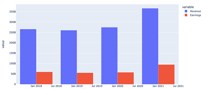
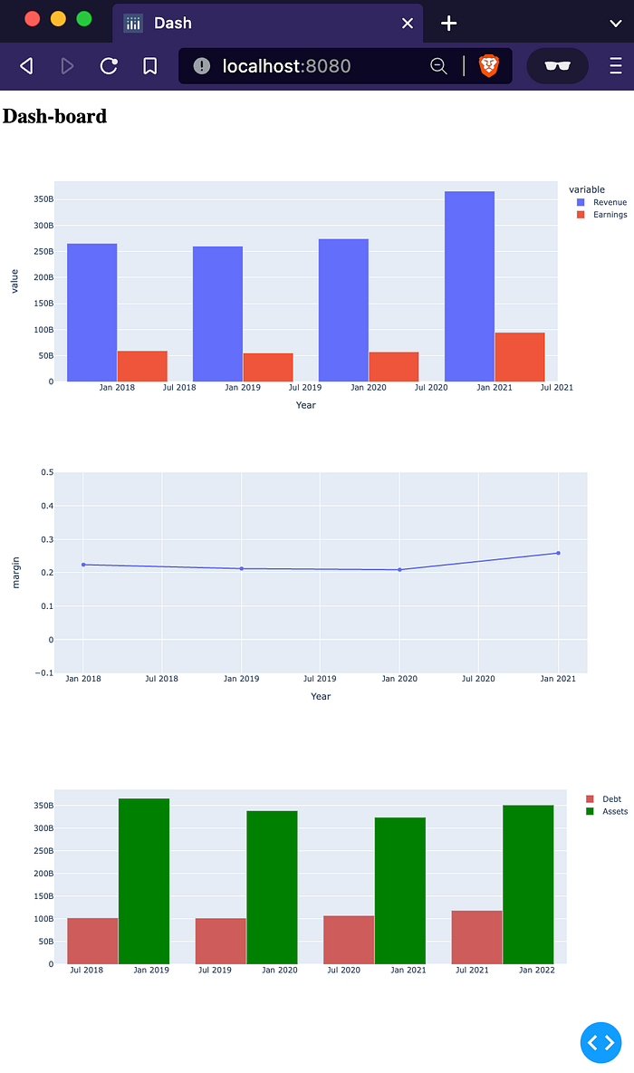
- We’ve created a bar chart containing revenue and earnings over the last 4 years
- We’ve plotted a line chart depicting the margin per year
For these plots we’ve used plot.ly express which is a great way to get started quickly with nice, interactive charts.
As a bonus, let’s add some information regarding the balance sheet aswel

For this section, we’ve done some similar transformations as before. But instead of using plot.ly express, we’re using the more verbose plot.ly graph objects. We created a grouped bar chart by adding two ‘traces’ to a single figure.
Creating a dashboard
At this point we have the necessary functions to create an interesting dataset and we have created 3 graphs for the dashboard using plot.ly. As a next step we’ll create a dashboard using Dash.
Empty dashboard
For the first iteration, we’ll just create an empty dashboard and run it locally. Create a python file main.py and add the following code:
This code doest 2 important things:
Lines 4–8: Create an object containing the title of the dashboard. In this case “Dash-board”.
Line 10: Create a Dash application object.
Lines 11–13: Add the title object to the application layout.
Finally on line 16 we run the application on localhost, port 8080.
That’s it! You just created your first dash application. To run it, simply execute the python script and navigate to http://localhost:8080
python main.py
Static dashboard
Next we’ll add some data and graphs to the dashboard
In this code we’ve added the data functions from the notebook (lines 10–25). This data is then used in the same graphs we created earlier:
Lines 37–39 collect the revenue, earnings and margin data and create the same graphs we created earlier. These graphs are then wrapped inside Dash Graph objects, which are wrapped inside a html Div object.
Analogous to the title, the newly created html Div object is added to the app.layout on line 72.
We do the same with the balance sheet data on lines 46–68 and add them to the layout on line 74.
The result can be shown by running the same command as before
python main.py
Dynamic dashboard
For the final iteration of the dashboards, we want to be able to provide an arbitrary ticker symbol. To achieve this we need two extra sections: an input field containing the ticker symbol and a button to trigger a new computation of the dataset.
We’ll start by creating the input fields:
Now comes the tricky part: we add callbacks that are triggered when the button is pushed. When these callbacks are triggered, the dataset will be downloaded using the provided ticker symbol.
The newly downloaded datasets will be used to create new graphs, which then replace the current images.
Let’s go over the code above.
The first callback is defined in lines 1–10: The callback is defined using the callback decorator. In this case we define one Output, which references the id of the object we want the figure to appear in (a dcc.Graph object with id earnings). We have one State that contains the input text field and an Input object that triggers the callback.
The function receives the state value (input_ticker) and the input value (n_clicks). The names used in the function signature are arbitrary, the ordering should correspond to the ordering inside the callback decorator. In the case of the callback function on lines 1–10, this means that the first argument for function ticker_earnings_renderer will always correspond to the state value and the second argument will always correspond to the submit button.
Inside the function we use the state input_ticker to build the dataframe and the plotly figure. The figure is passed to the callback Output, which references the Graph object with id earnings. As a consequence we should update the earnings_div function (and the balance_div function) to no longer generate its own figure, it will be populated by the callback function. The updated functions now look like this:
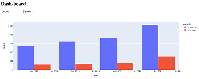
When we now run the application, we have an input field that is prepopulated with AAPL, but can be updated to any known ticker symbol. To inspect the finances for Twitter for example, use ticker symbol TWTR or use GOOGL for the finances of Google’s parent company Alphabet.


