Embrace failure!

”Fail fast, Fail Often”, ”Fail better” and ”Fail Forward” are just some of the mantras that designers hear often. Even though you might have heard this a bit too many times, we have chosen to say ”Embrace Failure!” at Design Matters 17, because we think it is important to celebrate the value of failure as a part of the design process.
Embracing failure as a designer is definitely not a new trend, but we believe it is more relevant now than ever. With more designers working in cross-disciplinary teams, we are no longer isolated with our design methods, attempts, and failures. Therefore, we need to include failure as a part of our process, make our colleagues and customers feel safe during this and teach them how to see this as a path to a beautiful design.
At Design Matters 17, we will discuss failure in several ways, hereunder testing with users, launching fast and having the right design attitude. But before we dive into these, we will tell one of our own stories on failure.
Our website design failure
The observant visitor of our website might have noticed, that the website went through what we refer to as “an intense identity crisis”. Back in December, we decided to launch the Design Matters 17 website and only made small changes to last year’s site.

But only a month later, we decided to change the design. We believed that Design Matters 17 needed its own identity. Inspired by “Designing against the trends” and with the aim of designing something unique and provocative, we launched a new design in February.

Already from the beginning, we didn’t really feel that we had landed the design. It simply felt wrong and neither had the attitude nor the aesthetics that we thought fitted the conference.
Luckily, one of our designers took the matter in her own hands and created the final design that everybody loved. Duotones, soft edges, and funky shapes were just what Design Matters 17 needed. Finally, we could sleep again!

Everybody who has tried something like this, know how a frustrating design process can keep you awake. And that the only meaningful thing is to keep being honest about what works and what doesn’t — and continue iterating!
1, 2, 3… This is a test
We strongly believe that if you want your product to succeed, you need to put people before technology and business. A way to do this is to invite the users to test mockups, prototypes or the product itself.
By inviting the users to take part in the design process you can dive into the user’s experience with the digital product. Testing usability is key for reducing failure at the users’ end. It’s important to emphasize the importance of testing both the UX and UI, since sometimes seemingly small visual changes can break what was working before.

Prototyping in Sketch, Axure etc. is ideal for having numerous short design-iterations, sharing often & early and keeping it “dirty” for much longer than usual. Instead of prototyping you can also build, launch and test smaller elements of the product. This gives you the opportunity to work with real content and data and observing real user-behavior online.
It’s all about the philosophy: “If you’re not failing, you’re not going to innovate”. It’s about cultivating the ability to adapt and learn from quick launches, bounce back from failures, and thereby transforming and gathering the elements to create the final digital product.

Sam Horner from Netflix is a strong believer in testing, and he will speak about testing at Design Matters 17. According to Netflix, 90 seconds is the amount of time a user spends browsing for movies before closing the app. Therefore, Netflix is working hard to optimize the user experience in order to make the users browse longer. They use testing as an integrated part of their design process, build incrementally, and use user data to drive decisions. They believe that this method makes the users guide them towards experiences they will love!
On the same note, Rahul Zen from Spotify will introduce us to the term “Jugaad” and talk about failing smart and often. Translated roughly, jugaad is a “hack” and refers to an innovative fix, simple workaround or a solution that bends the rules. Rahul’s talk is called “The end is the beginning”, and he’ll share his experiences with, how we as designers need to focus on learning cheaply through our process and make new mistakes to enable a culture of success.
A new attitude
For most designers, it is natural to share their work on Dribble and hide away the less pretty attempts created along the way. While we fill our portfolios with good design, we should also learn to embrace failure and show our mistakes. Both because the fear of failing can become an obstacle when being creative, and because we believe that embracing failure leads to better designs.
The faster we explore weakness during a creative process, the faster we can improve what needs to be fixed. As kids, we learned by doing and no one told us that experimenting was wrong, or that we had to find the right answer on the first try. By taking cues from our younger selves, we can become more experimenting and iterating our way through various designs. Approaching our design work as kids and not fearing the failure, will help us design better since we become more open to criticism, feedback, and iterations.
Nicholas Felton is a highly influential designer and famous for the Feltron annual reports. He has a lot of experience with taking a leap and challenging his own courage. At Design Matters 17, he’ll reflect on the attempts and products that worked and those that didn’t. Also, he’ll share his thoughts on incorporating the lessons learned into a new tool.
Failure meets the user
A completely different aspect of failure is, how to deal with this in the product, meaning when the user that experiences something that goes wrong and meets the error message.

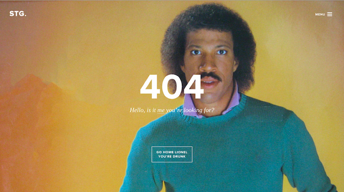
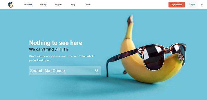
A few years back error messages were very standard, boring and sometimes hard to understand. But during the last couple of years, they have become a part of the company or product identity and tone-of-voice. By showing friendly and personal error messages, the product makes the user feel better and less frustrated.

This means that error messages can be turned into opportunities for engaging with the user. And to tell us how this is done, we have invited Marina Posniak and Tamara Hilmers from Spotify. They will host a workshop at Design Matters 17 called ”The art of the error message”.
So, get started practicing to embrace failure — and we’ll see you at Design Matters 17!
See more at https://designmatters.io/ 😜
