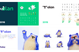
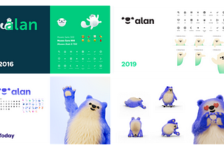
Alan has written a lot about its “no meeting” policy and about its written culture. Some like it; some hate it. Anyway, it does not leave people indifferent, and it generates lots of questions like “how do Designers collaborate in such an environment ?”
Let’s start with a quick description of the Alan way of working:
At Alan, designers work imbedded in small multidisciplinary teams; we call them crews. At other companies, you might use the term “pods” or “squads”. Basically, it’s a project team.
On top of a Designer, each of these crews has at least an Engineer (usually several) and a Product Manager. The team can also include Insurance, Sales or Care crew members depending on the type of topic the crew is tackling. …
Following up on the story on the Withings scale, here is a piece on the design of the Withings Pulse interface.
When I started designing at Withings in December 2012, two products were in the work; a new scale (the Smart Body Analyser), and the Withings Pulse. The hardware choices were already made on the Pulse, the product was going to production soon, but whole interaction and UI remained to be designed.
While the Smart Body Analyser was an iteration on an existing product, the Pulse was a totally new line, with no existing base to draw from.
As a wearable activity tracker, the Pulse would be monitoring the user’s activity along the day, counting Steps, Running, Elevation, analyzing Sleep and measuring Heart Rate. …
Here is the first of a series of case study I wrote a few years back on a very specific aspect of my work at Withings on embedded software and never shared online. Hopefully it will be useful to you people!
Arriving at Withings on December 2012, the first two products I had the chance to work on were the Smart Body Analyzer (the new scale) and the Pulse, the brand’s first activity tracker. I’ll be talking about the Pulse in a second article.
Both were being developed in parallel. They needed to share the same identity, as they were designed to be complementary and work with the same companion app. …
Before joining Alan to help build the best health insurance company in Europe, I was the lead designer at Withings (now Nokia Health) for 4 years. When I started in 2012, smart objects were just starting to become more common.
Since then, the hype around connected objects has gone up and down with the successes and failures of many companies like Fitbit Design, Dropcam, Jawbone, Nest, Pebble or Sense, only to name a few…
Hardware isn’t as trendy anymore👋
⌚ Today, hardware isn’t as trendy anymore. Still, we have more smart objects in our daily lives than ever before, with high tech devices like smart speakers, smartwatches, or connected lights finally reaching non tech-savvy audiences. …
A few weeks ago we shared a first article on how we build design at Alan:
“4 designer tricks to launch an online insurance in less than 9 months”.
One of the important tool described in the post is user testing. I wanted to go deeper with this practical guide on user testing for start ups!
Keep in mind this is the summary of my experience running tests at Orange, Withings and Alan. It’s certainly not perfect, but it will provide a solid base if you have no experience at all.
Please give us your feedback and comments!
Alan is the first 100% digital health insurance in France, and the first independent insurer to be regulated in the last 30 years.
You can learn more about us on Techcrunch.
A year ago, I left Withings to join Alan as the “first and only” designer in a team of 9 people.
Looking back on our first 9 months, here are four important lessons we learned, that helped us achieve our goal of launching a fully functioning health insurance company in just 9 months:
🤗 Be in contact with users all along the way
🏃 Start with a Design Sprint
💪 Take radical…
It’s a sentence I have been hearing a lot lately, usually to justify building big apps with a very large scope of functionalities.
As explained in a previous article, it sometimes is a great strategy to build an echo-system of apps instead of a juggernaut. So let’s look into this 3 apps thing.
Like most of the “mantras” around, there is a layer of good sense and truth to it. It usually comes from a short article that focuses on a small portion of a larger study (In this case, something like this Fortune article based on this Comscore study).
In this case, the article says people spend 50% of their time on a smartphone on one app, 18% on a second app and 10% on a third one, which is correct, according to the study. …
Facebook took Messenger out of its core product into a standalone app (and tried several times to build apps around other Facebook features), Foursquare made Swarm, LinkedIn made Pulse (and a bunch of others), Instagram made Layout, Hyperlapse and Boomerang, Google with Drive, Spreadsheet, Doc, etc…; other exemple can be found all over the AppStore.
More and more large services are now proposing suites of apps instead of one, centralized app, and I believe it will be trend in 2016, as more and more apps are growling large. So let’s answer a few questions:
For those who don’t know about Devialet, it’s a Paris based company founded in 2004 that aims at building ultra high quality speakers at a reasonable price (from $1600 to $2000) using cutting edge technologies (more on CrunchBase). Their latest product, the Phantom, has been getting rave reviews for its sound quality, simplicity and design.
Recently, Devialet announced Apple was going to distribute the Phantom in its stores (no surprise, it’s high end, wireless, obviously a good match) with the quote “Next year, everything is possible, especially miracles”. …
About