4 Layout Tips for Designing Card Games
In this post I’m going to go over four different ways to improve the layout of your card game. No matter what stage your game is in, these tips can be utilized to make your design a more readable, engaging and smooth experience for your players. The examples I use here are mostly completed designs but these rules can be applied to simple black and white prototypes as well.
1. Space it out
Nobody likes a cramped design. Nearly every element of a card’s layout needs some amount of space around it so players can visually distinguish important information at a glance. When a game gets this right, after you learn the meanings of various card icons and phrases, it only takes a second to “get” a card. This allows the player to spend their mental energy playing the game rather than just understanding the game.
To see what I mean, take these two versions of a weapon card from my game Mephisto.
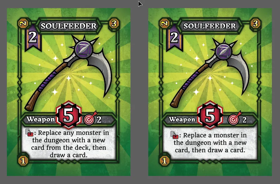
On the left: the text, artwork and icons are all just a little too cramped. They creep up on the edges of the card border and something feels off as a result.
On the right: I’ve left a little more breathing room around each element — leading to a smoother experience as you take interpret each piece of information on the card.
2. Use Visual Hierarchy
A crucial question you should ask yourself before laying out your card is: what information is most important to your players? For instance, do your cards have a cost that restrict when they can be played? Do they have an initiative that affects player order? Do your cards have a specific type that combos with other cards? Figure out what pieces of information have the largest impact on gameplay and design your layout around those.
For instance, the most important features of a weapon card in my game are its Cost, Attack and Range.
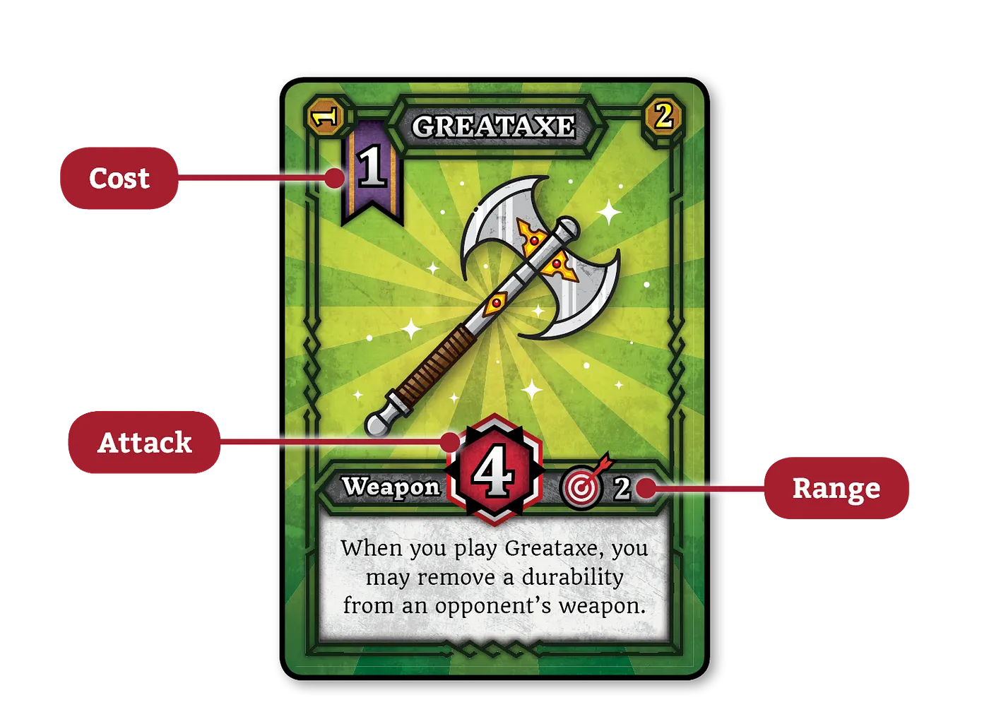
With that in mind, I put the weapon’s attack front and center with a colorful background and unique border to make it really stand out. The card’s cost is in the top left and sits on a darker purple banner so that it contrasts with its background. Lastly the range has a more detailed icon to draw the player’s eye. Think about what elements should get the most attention from your players and make them the most graphically apparent.
Thankfully, you can achieve proper hierarchy through various means. You don’t just need to make the most important details the biggest, though that does help. You can use color, location, shape, scale, texture or some combination of the aforementioned to add visual interest and focus the players attention on particular pieces of information. Doing so subconsciously feeds your player cues about how to play your game and where they should spend their mental energy.

Another way to put this is: don’t make flavor text your focus. Text that doesn’t add to the gameplay experience and only exists to add extra flavor to the universe should not be readily apparent. If your flavor text is as large or appears before any ability text, you are sending the wrong message. Let unimportant information fade to the background and keep the most relevant details front and center. Figure out what your players should see first, then make them see it first.
3. Think more about UI and UX
How will your cards be used? Are they mostly on the table or in your hand? Does the orientation matter? These are the types of questions you should be asking yourself when you‘re laying out your cards. You might not think of yourself as a UI or UX (user interface/user experience) designer, but if you’re designing a game, and the players of that game interface with some components you made, then you are a de facto UI/UX designer. Embrace that fact and use it to your advantage.
Take the deck building game, Arctic Scavengers as an example. The cards have a line of resource icons on the left side that are either “on” or “off”. When you play multiple cards, you can stack the cards so that the left side of each is visible, allowing you to easily tally up your total resources.


Likewise, think of a standard deck of playing cards. Why are the suits and numbers in the top left rather than just in the center of the card? Because when you fan the cards out in your hand, you can easily see all of the relevant information (sorry lefties). Since this behavior is common with cards, it’s not a bad idea to piggyback on this layout and reserve the space in the top left corner for important icons in your own game.
Another example of integrating UI into card designs is the durability mechanic I use in Mephisto. Weapons and items are spent by rotating them 90 degrees clockwise, representing a loss in durability. A card that is rotated 90 degrees has been used once, if it is rotated 180 degrees it’s been used twice and so on. Since the orientation matters in this case, I chose to display the durability so that no matter how many times you’ve used your weapon, it always shows the remaining uses in the top right corner.

This is a minor graphical detail but dramatically affects the usability of the game overall. I would urge you to take advantage of whatever unique ways your game is played on the table and try to design your layout with those features in mind.
4. Font matters
Typography comes with its own set of rules, and rather than opening up that can of worms, I will offer just a few tips for dealing with type in card games.
Keep it simple
Don’t be tempted to overuse that really cool looking header font you found online. It might even perfectly match the theme of your game, but if it can’t be read instantly, avoid using it anywhere other than the box cover or card back. A good rule of thumb is to treat text using complicated fonts as artwork rather than copy.
Not too small
Avoid going below an 8pt font sizing if possible. Depending on the individual, font sizes below 10pt introduce accessibility issues for the visually impaired and is just plain un-fun to read for most people. If you can’t keep your text within it’s bounding box, consider rewording, using a condensed typeface, or changing the size of the text box itself.
Leave room
Much like point number 1, spacing is especially important with type. Not only do you want to leave ample space between the text and its borders, you also need to create room between each line of text. Most programs will automatically adjust the leading (the typographer’s name for spacing between lines), but if they don’t, shoot for about 1.4–1.5x the font size. If the font is 9pt, the leading should be around 13 pts. It’s okay to go a little lower but be sure to print it out and see for yourself how it reads on paper.

Keep in mind that these rules can be broken. Sometimes you just aren’t able to remove a word from a text box without losing its meaning and have to shrink the font size to compensate. That’s okay as long as it is an exception. Don’t beat yourself up if you can’t get it everything to fit perfectly, just do your best!
— — — — — — — — — — — — — — — — — — — — — — — — — — — — — — —
Thanks for reading! You can follow me on Twitter: @dylanmangini
And please check out my stylish board gaming apparel at www.teebletop.com
Instagram: @teebletop