Color Theory in Fashion
When people talk about fashion, rarely does the term “color theory” slip into conversation. However, it has the potential to really shape how an outfit comes across. It evokes feeling and can influence how your style is perceived.
I like to think about color theory in connection to music. When two notes fit together well, you know it. They pair together beautifully, creating a beautiful sound. As more notes are added, a symphony is formed, delighting the listener. Different notes fit together differently, creating different moods: somber, excited, gentle, deep, or uneasy, for instance. Likewise, when notes are discordant, clearly not belonging together, the listener immediately knows.
While some people aren’t aware of colors and color theory, people still have feelings about them. When a picture includes a blue ocean and sky with soft white clouds, the monochromatic tones bring a sense of peace while associations with blue emphasize this calmness.
With orange and blue, which are on the exact opposite sides of the color wheel, the colors become more noticeable against each other, drawing attention to the differences and creating excitement.
Color theory is an invaluable tool for art and design, but it can also be used in fashion. In this blog, I want to visit different aspects of color theory and how basic principles can be applied to crafting an outfit.
But first, it is essential to understand color theory.
Hue, Saturation, and Value
The most basic breakdown of color theory can be described by the concepts of hue, saturation, and value.
First is hue, which is best visualized by a color wheel. The color wheel is broken down in different shades of rainbow order, or ROYGBIV — red, orange, yellow, green, blue, indigo, and violet with different shades of these colors filling out the wheel (for instance, yellow-green is seen here between yellow and green).
Next is saturation, which is how vibrant or intense a color is. The lower the saturation is, the closer a color is to white.

Finally is value, which describes how dark a color is. The lower the value, the closer a color is to black. An example would be the difference between red and burgundy.
To the left, we see the distinction between saturation and value, with greater value creating darker colors and higher saturation being more vibrant colors.
Color Schemes
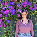
There are many different types of color schemes that can be crafted with different intentions. On my Instagram page, @ecstatic_monochromatic, I post different looks that I curate using different color schemes that I find visually appealing.

In these images, I created monochromatic looks using color schemes. For instance, the top set of images are focused around an analogous color scheme. This means that it is three different colors that are next to each other on the color wheel: in this case, pink, purple, and blue. Each outfit used colorful backgrounds that matched the color scheme.
In the other set of photos, I used a monochromatic color scheme. That is, I used green with varying saturation and value (especially value) to make that set of photos fit together well. Again, I used specific backgrounds to match the colors in the outfits. The outfits, themselves, are also monochromatic, with varying value and saturation so that there would be variety within each outfit.
Using analogous and monochromatic color schemes can create cohesion and subtle visual interest within outfits.


In the blue outfit, I used a monochromatic scheme that used different shades of blue with varying value levels and saturations in my outfit and accesories. Note that this color scheme, like the blue sky and ocean, is calming and cohesive.
Using monochromatic color schemes can be valuable and easy way to make your outfit look put together with relatively little effort.
In future posts, I will analyze other color schemes and how they can create different feelings surrounding a particular look.