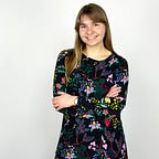
Gail Bichler
How she turned The New York Times upside down, quite literally.
Founded over 120 years ago, The New York Times Magazine is the weekly, Sunday magazine supplement of the daily newspaper, distributing 2.5 million copies, with an accompanying online edition.
Whilst partially weighted by some of the gravitas derived from its parent publication, having previously investigated topics such as workplace sexual harassment, US political party tensions and the refugee crisis, it does not allow this to constrict its editorial freedom, exploring an array of subjects and formats.
Indeed, the magazine has been known to visually delve into more daring realms, such as dedicating an entire issue to demonstrate the height of New York’s tallest buildings by rotating the publication sideways, as well as using new technology to make journalism more immersive and engaging by bringing issues, such as the refugee crisis, to life for readers through virtual reality (VR) to document the lives of displaced people in Lebanon, South Sudan and Ukraine.
The face behind its design is of course the magazine’s Design Director Gail Bichler. Her role is situated at the heart of the design and art direction in or in relation to the magazine.
Spanning the last 14 years Bichler has overseen the redesign of the magazine, led by herself and art director Matt Willey, working closely with editor-in-chief Jake Silverstein. They have won numerous awards for their print and interactive design as well as their groundbreaking work in VR. In 2015, they were named ‘Design Team of the Year’ by the Art Director’s Club (A.D.C). Bichler’s work has also been recognised by D&AD, S.P.D, the American Institute for Graphic Arts, the Type Director’s Club, American Photography and American Illustration.

Yet the origin of Bichler’s success was surprisingly not built on the foundations of editorial design. Having originally trained as a fine artist, she states that she saw herself becoming a painter or printmaker and “came to graphic design later” learning about it on the job. She claims “I wasn’t cut out to live the life of a fine artist. It was important to me to do something everyday that I cared about, that was really visual and that I could invest in. So I started taking graphic design classes near the end of my time at the University of Michigan… I got a dual degree in psychology and art which focused on graphic design and print making”.
As time ensued Bichler reached a crossroads; one which like minded creatives can certainly empathise with: “I was stretching myself too thin. I ended up feeling like I was going to have to pick either design or fine art. I don’t think everybody has to pick, but when I pursue things, I pursue them wholeheartedly. I wanted to be able to put a lot of effort into what I was doing, and to make sure that I did 1 of those things really well”.
After college, Bichler worked as a book designer for several years before moving to New York where she emailed her portfolio to prospective employers, including legendary Times MagazineCreative Director Janet Froelich. The reason why graphic design captured Bichler’s heart was due to her love of typography and the craft that accompanied it: “It was an interesting realisation for me because I am kind of a messy person… but there’s something about setting type that is calming. I also like the storytelling aspect of it and the way things unfold overtime, mostly in publications”.
Bichler notes that after starting work as a designer, she would go into printmaking studios at the weekends. By only having one’s mind to motivate, Bichler found this to be the driving force she needed to constantly push herself as she was the only one who could make something happen; a mindset which is both admirable and inspiring.
Beginning her career at a small studio in Chicago, creating projects for museum and publishing clients, she later founded her own practice in Minneapolis and served as a visiting professor and critic at Minneapolis College of Art and Design. In 2004 Bichler relocated to New York freelancing for studios and magazines before joining The New York Times, steadily working her way up.


The way in which the design team works at the magazine is very similar to that of a journalist; having to adhere to tight deadlines and a written brief.
Bichler’s core team of 9 receives written stories in manuscript form and are given between 2 days and 2 weeks to come up with conceptual covers. On occasion, rather than a fully-written story, a 50-word summary is plenty to stimulate concepts.
According to Bichler the more words the better at helping to spark ideas, going on to say “I read through it, underline things and sketch in the margins. That’s the ideal way for me to work. I do think that people have their own methods of approaching it.
My method is reading through a story several times. So I read through it once to get the sense and tone of it and then I go back in and look at the language because somehow language is very inspiring to me.
Sometimes I get an idea from the specific phrasing of a story. I often find it harder to concept something if I just have a general idea rather than the specific language that goes with it.
I think a passion for writing amongst editorial designers is key. I spend so much time reading these stories that it would be torturous if I didn’t enjoy reading them”.


However the saying ‘a picture is worth a thousand words’ very much rings true, as alongside the narrative of the story, Bichler individually considers the imagery: “There are certain tools I use when I try and think about a visual for a story: could it be typographic? Are there certain obvious visuals that you can subvert in some way to make something more interesting?”.
The point at which the whole team start talking about visuals depends on the particular article as Bichler describes: “It can happen relatively early on and we’re getting drafts at whatever stage they’re coming in, so the art and photo department are reading things as they’re developing. We have an ideas meeting which is mostly photo editors but there’s representatives from the art and photography departments there too and people are welcome to pitch stories as part of the process. There’s a real marriage between the visuals and the journalism and there’s also the idea that we’re doing something that really houses and affects the story”.
The constant filtration of drafts plus the juggling act of multi-tasking emphasises the fast pace at which the magazine runs. As previously mentioned, since the magazine is influenced by the newspaper’s focus on current affairs, it is common that cover stories will change, consequently shifting the idea and concept of the issue, affecting the visuals of the magazine.
Crucially, Bichler sees this as “one of the pleasures of working at the magazine” as the variety of subjects that the magazine covers means that they get to visually communicate events happening in the world at that precise moment.

An example of this is when the magazine used emerging technology to enhance its journalism and provide readers with a deeper insight into world issues. A VR and 360 degree video online platform called ‘The Displaced’, launched in 2015, followed the lives of 3 children in Lebanon, South Sudan and Eastern Ukraine, who experienced war and were displaced from their homes.
Alongside the launch of this series, The New York Times Magazinesent out free Googlecardboard VR headsets with its printed newspaper: “The magazine has become a place of innovation within The New York Timesrecently. Being a small, nimbler group within the company, we have more flexibility and more room to experiment”.
Indeed journalists and designers are keen to utilise new technology, such as VR, as it provides a realness and closeness that cannot be replicated through 2D mediums: “VR is a really powerful format for storytelling in terms of generating empathy. When you’re watching a film, you have a certain distance. With VR it feels like you’re there — standing in a swamp or in the rubble, looking up at the sky through a hole in the ceiling”.
Undeniably, the writing, photography and layout tremendously succeeded in providing justice to the power of the children’s testimonies.


At the same time the magazine is fervent in its mission to not subconsciously neglect its printed edition; most certainly it wants to keep it alive with interesting, unique formats, turning printed issues into keep-sakes. The team pride themselves on dedicating time and effort towards creating powerful covers in a bid to pay respect to the printed page and give the magazine a sense of longevity.
As Bichler audaciously states “we are not a news-stand magazine… what we’re aiming for is a beautiful object that is a record in history. I want to make something that is collectible, that someone can keep and have. I see the commitment people here have to telling these stories, to get information out there that is valuable to the public and I get to make something that I’m invested in that I think is useful out in the world. We treat every issue as if it’s the last magazine on earth. I love that to describe what we do”.
The designers look to create iconic design through different techniques. Some features whole-heartedly bask in photography, others need to communicate an idea graphically, whilst a few remain slightly more ambiguous when presenting any immediate visuals. According to Bichler “these are the hardest to make but I love working with them the most. Often it could be almost anything and you have to take the time to think about all the possibilities to come up with something that will have impact and really draw people into the story. I want to be as ambitious as I can be”.
However, the commendable efforts of the magazine are not always recognised by their readership, often diminished by social media users questioning why the team did not use quicker means, such as Photoshop, to produce such images. Significantly, shortcuts go againstThe New York Times Magazine’smantra which is to celebrate and give value to the printed word through clever, thought-out imagery, whilst also embracing new ways of investigating and telling people’s stories. As Bichler describes: “We try to make objects as often as possible. Photographing a real object has an authenticity to it that we can feel, and it’s also fun. I always love that kind of hands-on making of things”.


The New York Timeshas a deeply rooted heritage in the US media and this ultimately has a huge effect on the magazine.
“It’s very different tonally from the paper but we adhere to the same kind of standards. One area where that affects us quite a bit is our photography because we are under very strict rules about what we can and cannot retouch. Other magazines are able to go in and alter images quite a bit but we really cannot do that because we’re part of a journalistic organisation and people have to know that the photographs we are publishing are not altered. We also have standards for how we interact with the subjects of our articles and the way things are fact checked”.
However, since Bichler’s arrival to the magazine, her personality and passion most certainly shines through.
“The direction of the magazine now, I think, reflects my love of typography but also our incredible staff. One of the great things about working in a group versus making something yourself is being able to draw on the talents of the people that you work with, and the talents here are not only considerable, they tend towards typography.
I really enjoy being a part of a team here at the magazine. I love being around other designers; giving input and getting input from them. But I have also loved being involved in the edit process. There’s a real richness to the experience here because there are so many people who are so good at what they do and care deeply about what we make.
We have a lot of conversations; because people come at things with very different viewpoints and everyone is passionate. Sometimes we’re all on the same page and sometimes there’s a heated discussion about something. When I don’t get my way, I may be disappointed in that moment, but I usually realise later that there’s a reason for that because the process here works. There’s been very few times I’ve come away from something, having had some distance from it, and looked at it and thought we should have gone the other direction”.


Although fully established, the magazine is not at the mercy of its competitors as Bichler comments: “I am very aware of what they’re doing and sometimes I look at them and think I wish we would have done that, but we have a real sense of what our brand is, so oftentimes I will see something someone else has done and while I really appreciate it, I know it wasn’t something that would have been possible in our magazine”.
She goes on to discuss the art of acceptance and the mentality of moving on: “I always have worries about how things are going to turn out, and there have been periods of time where I’ve had to push myself to take greater risks. Pursuing riskier ideas and visuals is the way that you make something good, and doing that on the kind of timelines I work within means that there’s always the possibility that the thing that I’m working on might not work out and I might have to publish it anyway, or I might have to come up with a last-minute save.
I often remind myself that because we make so many issues per year, there are going to be highs and lows and some level of variance. If you’re making something that’s consistently pretty good, but you don’t have anything great, that means you’re not pushing yourself or taking enough risks- you’re just making sure nothing fails, and I think if you’re pushing to make new and interesting things, there are going to be times when that thing you tried doesn’t turn out the way you wanted it to.
The good thing is, if you don’t love this week’s issue, there’s always next week’s. That’s something we continually talk about. We can do this because we make 52 issues per year and each issue we make is not the last!
There will always be people that are unhappy about this thing, or the other thing, but I think people are interested in being surprised and (hopefully) also delighted. As long as it has meaning and it is well done, I think people are open to certain kinds of change”.

One of the magazine’s riskier issues was dedicated to the viewpoints of New York’s tallest buildings, released on the 5th June 2016, which Bichler describes as “the most extensive redesign the magazine has seen in the last 14 years”.
‘High Life: The City Above 800 Feet’, was flipped 90 degrees so that the whole publication read vertically, cover-to-cover, including all features and advertising, with new typefaces drawn and headlines written to fit this new size.
“We always do a New York-themed issue and within that we usually pick sub-themes to make the issue more unique or interesting. So this one was about altitude and things that are happening above 800 feet in New York. We redesigned everything, including the crossword and puzzles and the front of the book. Everything was orientated in the same direction, which we were adamant about making happen, because we felt like it would be a bad experience for people if they had to flip the magazine back at some point.
It can be really disorientating, but if people look further and then come to understand why it was done, and if they think it’s smart and makes sense and actually adds to the experience in some way, then I think they warm up to it.
There was something great about that issue’s boldness and how the format of the magazine influenced a design. Matt Willey ended up drawing typography the height of an entire spread, which was the biggest type the magazine has ever published, and the visuals were completely driven by that decision. I was really proud of how it turned out”.


Due to the intense fusion of pace and content, I feel immensely intrigued as to what drives Bichler to create even more innovative work. With sheer sincerity she reveals the secret to her legacy: “I feel really creatively satisfied and love my job. I wouldn’t have stayed here as long as I have if I didn’t love it and feel like it was such a privilege to be here.
My philosophy has always been to work as hard as I can. Design is a craft, and it’s something that you improve at the more you do it… it’s pretty easy when you’re young to look at somebody who’s been in the business for a long time and to think that they’ve just always been like that. But I didn’t start off having the skills that I have now; it took a lot of practice to get to this point”.
When describing what she believes is successful design, Bichler states: “I think successful design is the confluence of a number of different things. You might have a great idea but if the execution isn’t right on then it doesn’t work. I feel everything has to come together in ways that can’t really be orchestrated in order to have something great”.
With that, I commend Bichler on continuing to push beyond conventional journalistic design and create daring editorial pieces that intrigue and engage the general public. The magazine acts as a refreshing statement within a somewhat cluttered industry and I cannot wait to see what next week’s cover has in store!