PinnedEli HolderinNightingaleDashboard Psychology: Effective Feedback in Data DesignHow the psychology of feedback explains, “What you measure you improve” (+6 examples of commitment and contrast in data design)Apr 27, 20213Apr 27, 20213
PinnedEli HolderinNightingaleRadical Dots SimulatorVisualizing extreme belief formation, echo chambers, polarization, and attitude latitudesMar 4, 20211Mar 4, 20211
PinnedEli HolderinNightingaleWhat to Expect from Visualizing ExpectationsHow can information design strengthen our resolve?Nov 19, 20201Nov 19, 20201
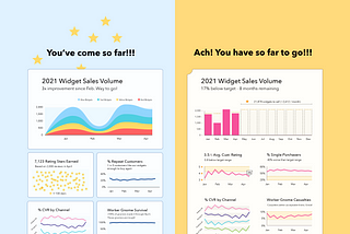
PinnedEli HolderinNightingaleGood Dashboards Inform. Great Dashboards Align.Dashboards don’t have to be data dumpsters. At their best, they are a monument to what matters within the organization.Sep 29, 20203Sep 29, 20203
Eli HolderWhat Does This Chart Do? Radon ExposureThis chart is meant to raise awareness about radon exposure. But what does it actually do?Jan 8Jan 8
Eli HolderHow to make Jitter Plots in Google Sheets to visualize social inequalityCreating a Jitter Plot of U.S. regional disparities in PrEP coverageApr 10, 2023Apr 10, 2023
Eli HolderQ&A Responses to my “Dispersion vs Disparity” Workshop @ Wellesley:Last week, Jeremy Wilmer invited me to present my and Cindy Xiong’s recent research project to Wellesley’s Psychology and Data Science…Nov 13, 2022Nov 13, 2022
Eli HolderIEEE VIS 2022 HighlightsIEEE VIS 2022 was a few weeks ago and featured some brilliant work. I was lucky enough to attend (and present my research with Cindy…Nov 9, 2022Nov 9, 2022