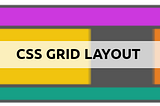
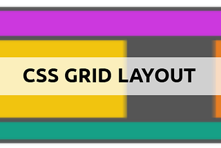
Safa GueddesinsatoripopCSS Grid — Understand How it WorksCSS Grid Layout is one of the most powerful CSS modules that has been introduced. It excels at dividing a page into major regions, with…9 min read·Oct 15, 2019----
Safa GueddesinsatoripopWebpack — Configure Laravel-mixIn order to get traditional CSS that can be parsed by browsers, regardless of the used Sass syntax (SASS or SCSS), you need to compile the…3 min read·Sep 19, 2019----
Safa GueddesinsatoripopDifferentiate REM vs EM vs PXYou may be confused about what REM and EM are because we often use PX as a CSS unit. Well, in this article, we will differentiate between …2 min read·Sep 19, 2019----
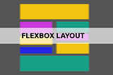
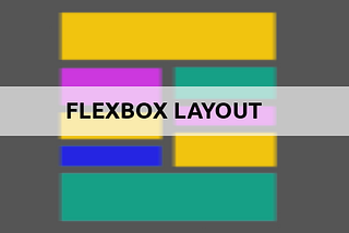
Safa GueddesinsatoripopFlexbox — Understand how it worksThe Flexbox Layout makes it easier to design flexible responsive layout structures without using float or positioning.3 min read·Sep 19, 2019----
Safa GueddesinsatoripopSASS — Learn the fundamentalsSass is an extension of CSS that adds power and elegance to the basic language. Together we will explore Sass and learn its concepts.3 min read·Sep 19, 2019----
Safa GueddesinsatoripopSASS, Bootstrap, Webpack — Create your first websiteBootstrap uses SASS as source CSS files, REM as a primary CSS unit and Flexbox for its grid system.6 min read·Nov 29, 2018--1--1