Grow — The Meditation App (A UX/UI Design Case)
They say that it takes 3 weeks to create a routine, they also say that meditation is not about results but about practice.
Practicing meditation can be tricky for the beginner, not really knowing what to do while not seeing any results immediately.
I chose meditation as a subject since I did not really know anything about it. I tried it a few times but could not do make it into a practice and quickly forgot about it.
It was the best subject I could think of for this UX Design Solo Project as I did not have any information on meditation, how to practice it and also its benefits. The perfect subject not to have any bias which is important for a designer.
Empathize
Quantitative surveys are always a good start to get raw datas about who the users are, how they operate, think or exchange.
I wanted to discover from the people doing meditation and those who aren’t.

Different answers came and I could already see a pattern which I wanted to confirm with qualitative surveys.
“I can’t change that practice and make it a routine”
“It makes me feel great but I don’t practice nearly enough”
“I don’t really know what I am doing and why I am doing it”
Other interesting insights appeared and I decided to leave it at that and start to define my user persona.
Define
Time to define who our users are!
An affinity diagram helped me regroup all of the information and organize the results.
From this, I continued with two empathy maps since I could see 2 main results from the survey.
- The first one already does meditation but can’t transform that into a routine despite the benefits.
- The second one has tried meditation once or twice, but did not see immediate results but is still curious as to why so many people are doing it and would like the good method to start.


It was decided, I had to create a solution for the people interested in meditation, facilitate its access and the creation of a routine. I chose one persona which answered perfectly to those requirements, meet Julia.

Julia knows what meditation is and wants to continue doing it. However, she can’t transform this practice into a routine. Her work is being a constant load of pressure, she is becoming more and more stressed and anxious. She needs her secret garden in which she can spend time with what’s really important. Herself.
I continued the work with the following problem statement:
“How might we improve Julia’s life so that she feels less anxious & stressed by practicing meditation while making it a routine?”
Ideate
Since it was a solo project, we organized ourselves in several groups to ideate for our projects.
At first I decided to brainstorm by myself and come up with as many ideas as possible. Then I grouped up with 3 students from my class and we started ideating.
Following a quick presentation of the project, the persona and the problem statement, we did:
- A Crazy 8: 8 Ideas to find, 2 minutes to write down, illustrate the idea
- A Round Robin: Pick up one idea develop how to do it and the next person will add to it
We would then explain further our ideas and challenge the most interesting ones to see how far we could go with it.
From this ideation, I came up with the main features of my solution, which would be take the form of an app:
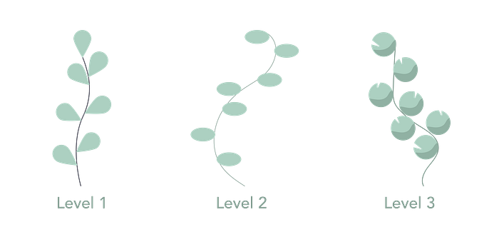
- Planty: Represent the growth and the evolution of the person practicing meditation with a plant
- Feedback: Have an easy feedback function to keep track of the previous sessions and to personnalize the experience even more
- Routine Maker: Have an easy routine maker, make the person set up a new session the day after or in two days

Because it is important for a routine to know what you can expect, the app should explain every steps of a meditation session and be clear on the fact that only practicing is the way in meditation.
Prototype
The prototype started with a sitemap of the entire app. Then I did the userflow to grasp what Julia would be doing and how the app would respond.

Then I started prototyping on paper to iterate easily and make some quick tests.
The following tests were very promissing, the people understood how the app can help Julia create a routine. Bonus point for Planty, the plant showing the evolution of the meditation level which would make them come back to the app to continue meditation on a daily basis.
Some screens were removed and wording improved to facilitate the use.
The UI
The Moodboard

While searching for inspiration, I wanted my app to be described by three main adjectives:
- Serenity
- Nature
- Contemporary
The first picture on the left really portrays what Grow is about, the plant representing the person whom wants to grow out of the oppressive space he or she is in.
The Style Tile

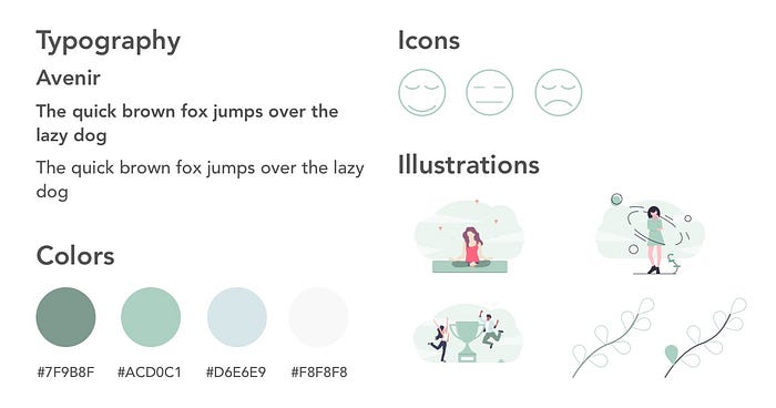
I chose the sans-serif typeface Avenir for the entire app. It is minimalist and modern enough to be the unique font of the project. I felt like having two would only add weight, so I played with the size and weight to add contrast between titles and body.
The light green, blue and grey offers a sense of serenity and minimalism which I wanted for the app while the darker green add the contrast for the texts and interactions.
Finally the icons and illustrations would add life and personality to the app.
The HiFi

A minimalist and clean look with just the right amount of contrast and usability.

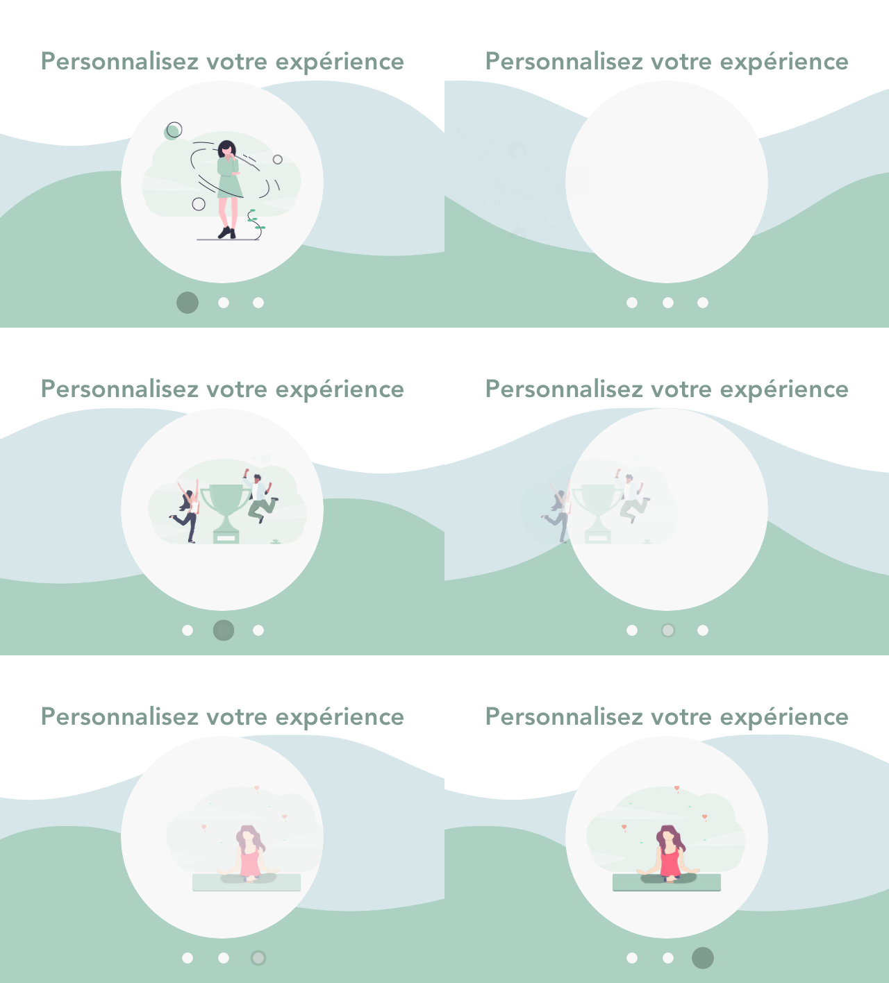
After signing in, the app asks you several question to better know who you are, your level and what you want to use Grow for.

You then arrive on the homepage, with the first meditation exercise adapted to your level. When pressing the button, the app asks you how you feel, what you want out of this exercise and how long you want to practice.
Finally, after the practice, the plant representing your level will start growing and a leaf will be added to it. You can choose to program a new practice and make it into a routine.
What’s next
After completing the first level you will have access to a new, harder level, with other exercises to developp the meditation further. Planty will evolve as well but the experience will remain the same. The more you practice, the more Planty grows.

Conclusion
This app was a struggle to design in the beginning. My first project was based on an existing brand with an identity, guidelines and already known customers and potential users.
With Grow, I had to start from scratch. Creating a color palette, an image, a potential users and what he would like to find in its app.
In the end, I am pretty happy with the look. It gives this sense of serenity, calmness and the users testing it had the same feeling.
