Our first experience implementing Google’s Design Sprint at Ruma
As I shared in the prologue, Ruma has started as a rather non-consumer facing tech company where we utilised technology to help our users mainly on the backend side prior to Arisan Mapan. We operated in the airtime business that did not really need extra User Experience touch as it was pretty much a straight forward service, the differentiator was mainly on the accessibility through our agent management platform and distribution — the latter was more or less a similar play to telco’s distribution model.
Currently, our target markets are split into two big categories. The offline, which service is covered by our field staffs, and the online, which currently is covered by our website and Facebook pages.
An app that nobody wants to use
As we are expanding our reach to a wider audience of online market, we are exploring our means through an app that is designed to cater the needs for our targeted audience which is to save money together with their friends.
The premise sounds simple right? But as you all might have guessed, the execution is far from simple. For the past couple of months we have been struggling with exploring ideas that might work and since most of our experiences are mainly along the lines of offline customers, creating a user journey that resembles the behaviour of our targeted customers on mobile is a tricky process.
Our team consists of a bunch of talented and smart product managers, engineers and marketers, but well, nobody knows better what customers want than the customers themselves right?
This is where we think we made our biggest mistake.
We assumed too much, and before we realised that we were going to the wrong direction, the development cycle had been set. This scenario became reality when we silently released one of our apps by last August for Indonesia Fintech Festival and Conference 2016. While the app served the customers need, it actually had several critical issue that hindered the users to know what they can do and completed the cycle.
In short, we had an app with a broken experience after we launched it.
The improvement plan
We found out that what we were lacking was the process to define what we really want (some called it product vision) and to test before we start building and set the development team in motion. After researching a bit, we thought that Google Design Sprint could actually be a tool that we might use as it has been used by Google Venture to minimise the risk of their portfolio to launch a products that nobody wants to use.
The framework of Google’s design sprint was pretty much a straight forward one. We acquired the initial idea, from product visions to customers insights, as much as possible before we tested the prototype of that idea to our designated representation of our customers.
However, we also found out that implementing full-fledge Design Sprint, which could last at least 5 working days sounded overwhelming for most of our team members. Apparently there are other companies who also think the same (which after interviewing several UX/UI designer candidates, I found out it was not an exclusive issues :p) and chose to implement a shorter version of Design Sprint, which allowed us to execute the process within the 3 days.
If I recalled the experience of implementing the design sprint, it was quite an impulsive one, but the right kind of impulsivity I might say. I got the idea to implement Design Sprint a day after the grooming meeting we had with the engineers and implemented the process later in the afternoon — exactly on the same day.
My premise for the Design Sprint was pretty simple:
- We need to set the right priority, and cannot let ourselves get distracted by new (and non-fundamental) ideas, yet untested, that came by regularly.
- We need to get everybody onboard and make sure all the relevant team members are involved in the process (to minimise any see-I-told-you-so moment later after release).
- We need to get user feedback, fast.
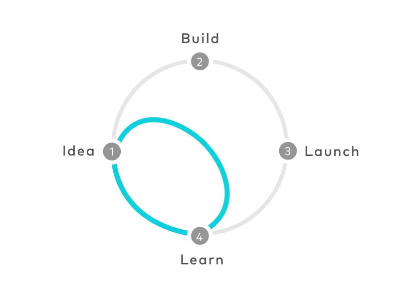
So here goes our own Ruma’s Design Sprint.
Day 1: User problems and common understanding
Our first initiative was to get everybody onboard with the idea of what the real problem was, i.e. the broken UX that our app has, and define the who’s who of the project. We also prepared some post-it, markers and space to jot down our idea in the glass wall.
For this first iteration of Design Sprint, I took the liberty to be the Decider (alongside Aldi, our CEO, for the first day) with Richard Lyu, our Product Manager, as the Facilitator. Then we have three engineers, two front-end and one back-end, as participants.
It took us approximately 1 hour to define the priority and then we sent everybody home with a homework to find their own version of a solution. In comparison to what Design Sprint checklist has in its playbook, we did it much shorter as actually the problem has been an ongoing issues and explored quite deeply within the last 1-2 weeks.
Day 2: Sketch, explore and prototype
We started quite early in the morning as the team needed to visualise their idea on the creative space that we provided for them.

After the participants posted their ideas there, they have 5 minutes to pitch it and share why their solution provides a better experience for the users, both from UI and user journey stand points — minus the complexity of the development in order to minimise creativity constraint and explore the best possible journey from user point of view.

Immediately after everybody got the idea of what other team members shared, it’s time to vote. Everybody got one vote for each of the suggestion that other team members have presented, except the Decider who got more weight on the vote to be the tie-breaker.
This process was very fun and quite refreshing as every team member can really be open about new ideas while at the same time bantering that particular ideas if they thought it did not make sense.
After the voting process has been done, we took the highest voted input (and it can be a part, not the whole process) before we decided what was the most ideal user journey for us.
All in all it took us approximately 3 hours to get things done on the exploration process before we move to the prototyping in the afternoon.
Prior to the user testing, I did the mock up development by myself using Sketch app and develop the prototype using Marvel app. Of course there are some other tools that have been recommended by other UX/UI developers out there, but for quick iteration so far these tools have served its purpose.
Note: Actually I am totally interested in using the likes of FramerJS, but well, we’ll see about that.
Day 3: User testing
Here is the D-day where we eventually got the real feedback from the users. We used two different approaches when doing our own Usability test, in which we gave them a brief introduction of the app, a couple of simple and specific tasks to ensure the user journey was easy to digest and finally a thorough interview about their experience.
The first approach was to random users in Blok M Plaza, right in front of our office.

The second one, we conducted later in the afternoon by inviting 5 (potential) users.

To record the feedback properly, we utilised the Lookback app. By doing so, we can get both verbal (from the recording and what we note on the spot) and the non-verbal (seeing the real user interaction with the app and their gesture/body language).
We wrapped up the process around 8pm on Friday night before we compiled all the feedbacks and set the priority for the development plan the following week.
Conclusion
This was our first experience of Design Sprint process. It was far from perfect but it gave us lots of insights that shorten the time span that was needed for us to get feedback from the users. Here are some of the lesson learnt:
- Saying Yes is not always the best answer. As product owners or managers we tend to think we want to make the most ideal products, and that limited time and resource have always been our enemy — while actually our main enemy is our inability to set the priorities right based on the actual needs of our users.
- Keeping it simple is not as easy as it sounds. As shared by Steve Krug in his book, we found out that what we think as simple process might still be considered as complicated in our users’ eyes, as sometimes we tend to limit our creativity due to technical constraints.
- The devil is in the detail. When we are seeing the high-level of the User Experience, it might seem plausible. But things got really different when you start going deeper and seeing things on the detailed UI perspective. Some button sizes and colouring alongside their typography choice might be a game changer in guiding your users to use your app properly.
Loving what you read? Be sure to ♥️ this piece below to help spreading the idea. Also share any feedback or other common practices in the responses section below. Let’s discuss!
