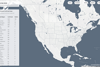
Jason ZhuinTowards Data ScienceVisualizing the Coronavirus SpreadAn interactive choropleth map & dashboard tracking the coronavirus outbreak across U.S. countiesMar 17, 20202Mar 17, 20202
Jason ZhuPalpable Pulse: An exploration of ferromagnetic interfaces to visualize personal health dataOverviewMar 9, 2020Mar 9, 2020
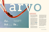
Jason ZhuArvo: Typeface VideoI think I did a fairly good job of outlining Arvo’s unique qualities and personality here. In a nutshell, however, Arvo is a quirky…Dec 17, 2018Dec 17, 2018
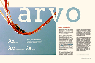
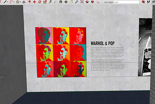
Jason ZhuArvo: Typeface SpreadArvo is one of those hidden gems that we, as designers, stubmle upon every once in a while — and I mean this sincerely.Dec 17, 2018Dec 17, 2018
Jason ZhuPittsburgh Arts and Lectures PosterThis post is a deep dive into my design process in regards to a poster assignment for Pittsburgh Arts and Lectures, a non-profit that…Nov 14, 2018Nov 14, 2018
Jason ZhuStudy in HierarchyFor the following study, I used Neue Haas Grotesk Display Pro with a primary stroke weight of 55 Roman and secondary stroke weight of 65…Nov 6, 2018Nov 6, 2018
Jason ZhuBreaking Down Wired MagazineWhat is Wired and how do its target audience inform its visual elements across its website and print magazine? Let’s find out.Oct 29, 2018Oct 29, 2018