Matplotlib is a kind of reference stone of Dataviz that every pythonists have to know as a basic skill, even the recent developers, to go to update solutions as Plotly or else. So did I, coming from 1992 to 2017…

To add a point of view to WK’s post, I’d say the next level of data visualization in Python is “there is no Python”.
A bit extreme but not so much if you consider the level of Dataviz app you aspire. Graphics is a basic feature but if you want to update to 2.0 user interactions you have to architecture your solution: frontend — backend pattern, for creators only.

To develop a Dataviz app identify the data axes, add 2 classics axes, timeseries (with prediction) and geolocation Mapbox, and then you have a various axes data system computed backend. Next find the data crops, simple geometric forms, often a rectangle 2D or 3D, that intercepts axes : That’s what your app is showcasing users, strolling along data axes croped.

With IT expertises, you can embed Python solutions in your frontend. e.g. Flask dev with PyGal, Angular embeded, but it’s not a trivial way to deliver data to user.

When building your Dataviz app, Python solutions have other usefulness: RGD (notRapid Graph Developments) to construe the datas, in a way. Jupyter is the tool, as a built-in frontend. 2 examples of data analysis :
Full-timeseries analysis.

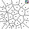
Unconventional GIS prototype.

Expatiating about Dataviz, there are particular data contexts that need particular solutions, e.g. Graph. Following examples are use-cases with TinkerPop whizzed up with Python and JS solutions.

Huge Graph and exoticular solutions.

Answering the question about nowadays level of datavisualization is a way to define the Dataviz today front hashtag. To begin, this min interactive post is the Dataviz#0.
When data computing have met users is the Dataviz kickoff. I’d say it was past century, Developer toolkit was C/C++ X11 SDK32b/MFC JAVA2D bwt swing…