Jecelyn YeeninAngular BlogIntroducing Puppeteer Schematics: Test Your Angular Apps with EaseIntegrate Puppeteer seamlessly in your Angular projects with the new @puppeteer/ng-schematics!2 min read·Dec 20, 2023--4--4
Jecelyn YeenDetect Responsive Screen Sizes in AngularMost of the time, we use CSS media queries to handle responsive, screen size changes to layout our content differently. However, there are…1 min read·Jun 13, 2019----
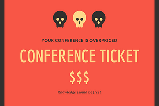
Jecelyn YeenSo You think Developer Conference is Overpriced?That’s why you don’t see many developer conference in Malaysia, especially 100% independent one.6 min read·Apr 8, 2019--1--1
Jecelyn YeenDear IKEA, would you consider sponsoring us some NG-MY KIA?We love IKEA’s creativity, especially the recent IKEA’s Penang marketing campaign. We, NG-MY made our own version of it. Hopefully, IKEA…5 min read·Mar 24, 2019--1--1
Jecelyn Yeen5 Tips to Write Better Conditionals in JavaScriptWhen working with JavaScript, we deal a lot with conditionals, I have 5 tips to share with you for writing better / cleaner conditionals.1 min read·Sep 17, 2018--1--1
Jecelyn YeenRxJS Operators for Dummies: forkJoin, zip, combineLatest, withLatestFromIf you are confused about the differences between forkJoin, zip, combineLatest and withLatestFrom, you are not alone! :)2 min read·Sep 10, 2018--3--3
Jecelyn YeenBuilding a PWA Conference Management App in 3 days [Part 2/2]If you would like to know the background of the conference and event management flow, checkout the part 1 of this series.11 min read·Sep 2, 2018----
Jecelyn YeeninGoogle Developer ExpertsBuilding a PWA Conference Management App in 3 days [Part 1/2]This is a long overdue post 😛! On July 15 (Sunday), we had a successful conference Google I/O Extended KL 2018, bring together 400+ local…7 min read·Sep 2, 2018----
Jecelyn YeeninGoogle Developer ExpertsSetting up Web Dev Environment / Angular in Pixelbook (Chromebook)Great, just got my Google Pixelbook not long ago! Time to setup the web development environment.5 min read·Aug 20, 2018--9--9
Jecelyn Yeen3 Useful TypeScript Tips (for Angular)These are the 3 tips I found pretty handy while working with Typescript:1 min read·Jun 5, 2018----


![Building a PWA Conference Management App in 3 days [Part 2/2]](https://miro.medium.com/v2/resize:fill:160:106/1*a4IbKvoARayhTYv58zOG0w.png)
![Building a PWA Conference Management App in 3 days [Part 2/2]](https://miro.medium.com/v2/resize:fill:320:214/1*a4IbKvoARayhTYv58zOG0w.png)


