Why We Hate the New Meetup Logo
(And Why We Don’t)
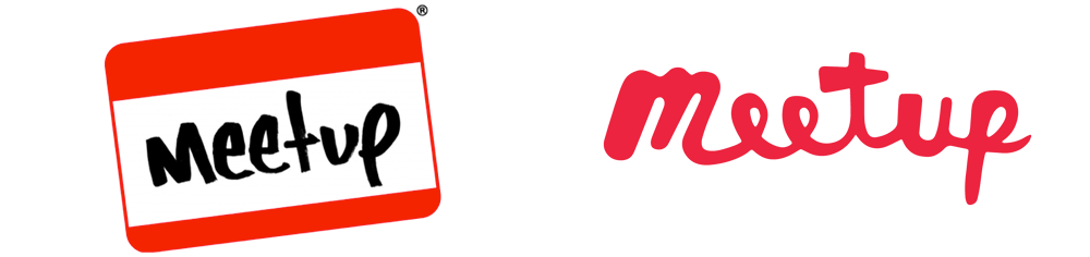
Back in late September, Meetup released their new logo and brand identity, designed by Sagmeister & Walsh. I am personally a fan of S&M’s work and follow Walsh religiously on Instagram. That being said, this new logo caught my eye in all the wrong ways.
1) The lettering is unrefined.
The curves feel unintentional. Perhaps lack of intention is their intention, and their goal is to appear spontaneous. But from a purely typographical standpoint, the logo is distracting in a corrugated way.
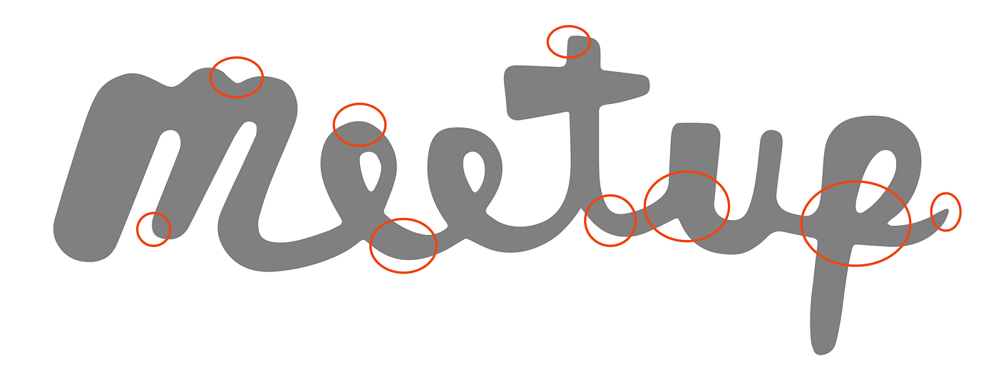
Speaking of curves, I can’t help but think of Jessica Hische’s redesign of the MailChimp logo. She focused on keeping the voice and style of the original logo but refined bezier curves and uncomfortable conjunctions. The result is a “facelift”, as she calls it, and a fluid,well thought-out logotype.
Now, MailChimp wasn’t looking to do an entire redesign, while Meetup was. That being said, I wish S&M had treated their logotype with more typographic integrity. I wish they had considered the positive and negative spaces and curves as well as Hische did.

As one of my favorite quotes from Michael Vanderbyl goes, “You have to think as though there is sand between each letter, and there has to be the same amount of sand between each letter so it all balances.” The new Meetup logo could benefit from this type of methodical thinking.
- The new design works better as a system than as an individual logo.
The m monogram fails to convey any context to me, and its reliance on the dotted background forces the silhouette into visual limbo — it loses its hand-drawn quality as the viewer is distracted by the polka dots. As a complete system though, the dots come together to form shapes and deeper meaning. The logo fails to stand strong on its own because the designer sacrificed the opportunity to create an idiosyncratic motif for a puzzle piece that needed the complete puzzle to be recognizable.

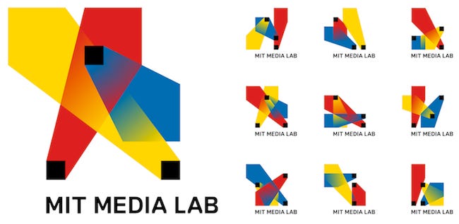
I can’t help but be reminded of the MIT media lab’s previous logo whose branding system also works better than the individual logo. As Pentagram veteran and design critic Armin Vit brilliantly points out,
The previous logo, designed in collaboration by E Roon Kang and TheGreenEyl was fairly well received back in 2011 mostly because of its unexpected and irreverent approach that allowed for thousands of permutations. As a logo-logo, however, it wasn’t the most functional. Yearning for an MIT Press-like logo without losing the flexibility of its existing identity, the Media Lab’s new identity successfully marries both.
- The color scheme is cliché and overused.
The Meetup branding system has fun colors, as usual, but they’re not innovative. By this I mean that Sagmeister and Walsh repetitively uses color schemes that are bright, saturated, and inspired by pop art. It feels as if little thought was put into the selection of the colors. It was their default, their Gotham, or their Avenir. (Of which I admittedly am guilty of using repetitive typefaces.)

- It’s quirky just be be quirky, with no other purpose.
The result is an eye-catching, playful logo type that brings the viewer in, but fails to convey any further meaning or depth. The blob-like quality reminds me of logos created for children.


- It fails to convey “swarm”
Meetup might argue their purpose is to convey the impression of swarming or gathering, but the logo fails to accomplish this as the dots collide and form an ambiguous blob. Through animation, the swarm is successfully expressed, but unfortunately, logos need to be comprehensible as unanimated visual motifs. Again, the concept only works as a system.
- Regardless, it’s still better than the old logo
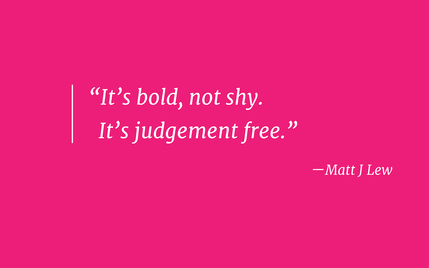
Meetup’s old identity focused on the most awkward aspect of Meetup events: the introduction. The new identity focuses on the best part of Meetup events: the fun. Their identity as a whole is refreshing, as it is not something I have seen before (at least in tech). Something new always creates inspiration for others. In this case, it’s groundbreaking, the first of its kind.