Foreign impressions of impressionism— a UX case-study of the Musée de l’Orangerie
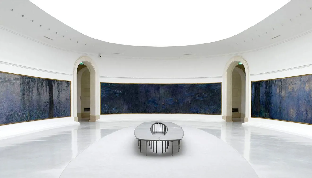
Amongst the many impressionist museums in Paris, it’s the Orangerie museum where you can find Monet’s famous Nymphéas. The oval spaces in the heart of Paris attracts visitors from all over the world. How can we offer them a better experience? This is a case-studay about finding playful digital solution for visitors of any nationality or background.
The Musée de l’Orangerie is a small museum with happy visitors. Yet the experience is not the same for a Korean who visits Paris for the first time, compared the the Parisian lady that comes to see the exhibitions en passant. Cultural references are not necessarily alike, and Parisian museums are generally ill-equipped for Korean speaking people. Yet the foreign visitors from seem to be in the majority. So what are the possibilities to improve the experience for them?

(Note On The Side: the museum also exposes a mysterious mini-exhibition on spoons, displayed in a room just before entering the Nymphéas. How did these spoons relate to Monet’s waterlillies?
No visitor could tell, neither could we — until we got back from the museum and we had a look at the leaflet. The spoon shape is similar to the oval of the Nymphéas exhibitions, creating similar light reflections.)
Magnetic Monet: talking to tourist attracted from far
When we headed out to the museum to observe the visitors and talk to them, the first thing that struck us was the exoticism of the visitors. A vast majority of the visitors we spoke to came from other continents, the Americas, Australia and Asia. It’s impressive to see how popular impressionism is in all these parts of the world. The overall “brand” of French impressionism seems to run just by itself; no effort is needed to attract visitors.
The visit of the Orangerie museum is therefore usually one of the many impressions users get during a well-packed visit of a few days to Paris. As visitors come from far, their Paris visit is often part of a larger European tour, but not only. It means that the Orangerie experience is “in competition” with other museums as well as many other impressions users get during their trip.
If we take for example the archetype visitor from China, it could be something kind of like this:

When we tried to walk in the shoes of such a visitor, we realized first of all that no information is currently catered in many visitors’ mother tongue. Besides that, their references to Monet’s artworks must be quite different from those of a Parisian just passing by.

Indeed, our interviewees were delighted to see the work, but when we asked them to elaborate it was hard to get any more precise appreciation of the work. What is particularly so great about Monet’s waterlilies? What do visitors remark when they are surrounded by it? It would be great if the museum could share a more common experience to visitors from any culture. So how can we provide a non-European visitor contextualization for the artwork that she is so excited to see?
Defining the improvement
The solution had to meet several criteria:
- Accessible and comprehensible for users from any culture and any mother tongue
- Be engaging and simple
- It should not be in competition of attention with the real artwork
- It should make the experience of the Monet’s Nymphéas deeper and by doing so indirectly create better memories
- It should not require any installation.
Creating a prototype
This made us come up with a QR-code path to follow. At different spots in the museum users would be able to scan a QR that would give them context information about the Nymphéas that would be very intuitive, quick and yet give a strong experience. As we did not want visitors to massively stare at their phone screens in the actual Nymphéas exhibition, we imagined it to be a preperatory tool that would prepare visitors like Mei to have to “tools” to get the most out of her observation of the waterlillies.

As the space is limited and we did not want it to be something long anyway, we decided to go for 4 QR spots: 3 of them placed in a hallway/bridget leading towards the exhibition — and a last one placed in the “spoon room”, which is located just before the two Nymphéas rooms.
The QR codes would cover the following subjects:
- A language selection tool that would only appear once, in which ideally all target audiences should be served
- QR 1: a slide-through tool to see the historical evolution of the Orangerie museum

- QR 2: a focus on Monet’s intentions and inspirations for the waterlillies

- QR 3: a three-fold element that lets users play with color, movement and light in the Nymphéas

- QR4: a morph animation that shows the link between the spoon exhibition by Tosani and the Nymphéas.

To test this idea lo-fi, we created a paper prototype with a cartboard phone that allowed us to slide-through the different screens. We also drew a QR scan spot and a signpost that would inform visitors about the existence of the QR-tool.
We brought all this to the museum and tested it on 6 users in the cafetaria. They all happened to be asian, female and fit really well with our archetype user. Each test took about 20 minutes. We first observed users using the tool and then interviewed them about their comprehension of it.
Conclusions and improvement
It’s always delightful to see that users enjoy the idea of the prototype. They found it to be exactly what we were hoping for:
- It was clear what it was about
- They found it playful up to a point that they could even imagine it to be a great tool for children
- They appreciated the fact that their language was available, but in the same time they added that they would check the English version, too, as the translations in their languages were often of poor quality. In the same time, we were not able to interview some users because of language barriers.
- They said they would be likely to use it, if it really existed in the museum.
On the improvement side of our conclusions, this is what came out:
- We had to communicate a lot more about what people could expect from the experience. The signpost that we had added last-minute was clearly not given enough thought. We had to learn how to “sell” the product to visitors.
- On a less urgent level, we had to communicate more clearly how to scan each QR and in the same time give a hint of the content available behind it.
- The video was considered unsuitable and indeed it was less interactive than the other elements. It also caused problems because of the sound: we certainly do not want to cause sound pollution in an otherwise calm and relaxing museum. It actually forced us to come up with a much cooler idea: show a gallery of the 250 waterlilly paintings that Monet made during the last 31 years of his life, and show each of them in relative size formats, so users can get a grasp of the obsession Monet must have had for his subject.
- Similarly, we also improved the color interaction so it would be clearer to users that they could play with the different color schemes that Monet used.
- The same counts also for the spoon-morph. However, it was kind of hard to visualize this in a clear way in a paper-prototype. Its success would really depend on the quality of the animation that would be created.
But overall, the Orangerie audience seems ready for a tool like QR-info. And more importantly, it seem to point out of them what they could look at when looking at the waterlillies. Perhaps a next step for this charming museum, that above all should not lose its soothing character?
Thank you for reading!