
Welcome to my first UX article, where we’ll explore Apple’s Spatial Vision Pro guidelines for designing Interfaces in the spatial design with Apple pro
The principles established by Apple’s visionary design team to create spatial user interfaces that captivate and engage users. Apple’s commitment to consistency and familiarity across platforms has led to the development of a powerful visual language, ensuring a seamless experience for users.
This is a summary of key sections of the “Design for spatial user interfaces” video tutorial provided by the Apple Design Team.
In this series, we delve into:
- We will start by the UI Foundations and design principles to consider while creating app icons and interfaces that are legible and usable in any environment
- Key concepts and best practices that are ergonomic and easy to target
- From screen to spatial
UI FOUNDATIONS
These are the core design principles we will cover on this section.
App Icons
Apple wanted to keep home view familiar and they’ve gone one step further, and realistic in your space. When people look at them, they expand. And the system enhance this visual effect by adding specular highlights and shadows to reinforce the subtle depth between layers.

how can you design a great icon?
First of all, use multiple layers of app icon. Just by use flat layers, the system can create this truly 3D effect.
Convert the app icon to 1024*1024 pixel with foreground layers as transparent

Avoid using large regions of semi-transparent pixels.
Layers with reduced opacity will blend with the shadow cast behind it.

Materials
The App your designing should be easy to place in the space around you, easy to use at any distance, and easy to view with any lighting conditions.
That’s why, Apple has introduced Glass material

- This lightweight material also gives people a sense of what might be behind a window, like other apps or people.
- To deliver great spatial experiences, it’s important to be aware of your surroundings.
Avoid using solid colors on windows.
Too many opaque windows can feel constricting and make the interface feel heavy.

Designing an Window?
First, we start with a glass window.
If you want to separate sections of your app, like a sidebar, use a darker material
- Or a lighter material to bring attention to interactive elements, like buttons.
- Or you might even consider using darker materials to increase contrast for standard components, like input fields.

So, imagine that you want to design a lock-up like this one, and you want to add a lighter button.
It is great to place it on top of the glass material Or if you want to get more contrast, use a darker cell behind it.

Try to not stack lighter materials on top of each other, as it impacts legibility and reduces contrast.

Typography
To improve the contrast of text against vibrant materials, font weight has been modified to be slightly heavier.
For example, on iOS, we use regular weight for the body text style.
- On this platform, we use medium.
- And for titles, instead of semi bold, we use bold, keeping text clear all the time.

Even though windows can scale up to incredible large sizes, custom smaller or lightweight fonts can still be difficult to read.
To improve that, consider increasing the weight or using a typeface designed for optimized legibility, like system fonts.
Vibrancy
This is one of the most important details to maintain legibility across the system.
- Vibrancy brightens foreground content that displays on top of a material and works by pulling light and color forward from what’s behind it.
- On this platform, since the background can be constantly changing, vibrancy updates in real time to make sure your text is always legible.

Use vibrancy to indicate hierarchy for text, symbols, and fills.
Use primary for standard text.
Or use secondary for description text, footnotes, and subtitles.

Colors
Most of the time, consider using white text or symbols so they are always clearly visible.
If you need to use color, use it in a background layer or an entire button so people can see it.
When possible, use system color instead of custom color, as they have been calibrated for legibility and dynamically adapt to maintain hue and contrast on the glass.

LAYOUT
Ergonomics
People primarily interact with their eyes and hands on this platform, it’s important to create experiences that prioritize people’s physical comfort and safety.
More than ever, you need to consider the ergonomics of your design, ensuring that the placement of content is intentional and doesn’t cause eye or neck fatigue.
For example, because of the neck’s range of motion, it’s easier for most people to turn their head farther to the right and to the left rather than up and down.

So keep your UI in people’s field of view and be careful about placing anything too high up or too far down.

If you need a large canvas for your app, go with a wider aspect ratio than taller.
For example, in Freeform, the canvas extends horizontally and not vertically.

Prioritize having the most important information centered in your app so people can comfortably view your content.
Sizing
Each person is unique and our eyes have slight variations from one person to another, which is why elements should use sizes that are easy to target.
Interactive elements must have a tap target area with at least 60 points of space, so they can be easily selected.

This means that your UI element can be visually smaller, like the standard button, which is 44 points, as long as you add enough space around it.

You can use a mini button, which is 28 points, in an area like the section header.
Even though this button might look small, because it has 60 points of space around it, it’s easy to select.

Similarly, using large and extra large buttons requires less spacing around them.
So, always remember to give all interactive elements at least 60 points of space.
Focus Feedback
Focus feedback is a powerful tool built into every interactive element in this platform.
When people look at system-provided components, they automatically display a subtle visual brightening or hover effect.
This hover effect allows people to understand which parts of an interface are interactive just by looking at them.

As you go creating layouts, it’s important to take the hover effect into account.
For example, if you’re creating a list or a menu, you need to account for a small amount of padding in between each item to avoid having the hover effect overlap.
Four points is recommended.

From Screen to Spatial
Windows
Let’s start with the core structure of an iOS app.
You need a window, which has an opaque material and provides the canvas for all elements to sit on top.

Tabs
The tab bar is vertical, floating in a fixed position on the left side of the window.
Designed to be out of the way and easy to access.
When people look at the tab bar, they can quickly select an item.
And if they look at it for a little longer, It automatically expands, showing labels for each section.
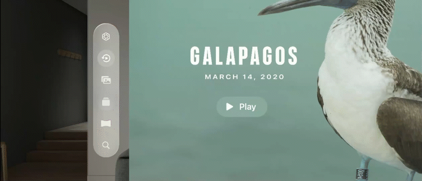
Ornaments
In the Photos app, we have a floating accessory element at the top center to navigate between years, months, and days.
On this platform, since we’re not bounded by a screen, that accessory is placed as an ornament at the bottom, slightly in front of the window.
This gives people additional persistent controls that are easy to access using depth to create hierarchy.

Since ornaments are usually a collection of buttons and sit on their own glass container, this is a perfect place to use borderless buttons.

In this example of a “player” bar, it is recommended to position it 20 points above the main window being controlled.

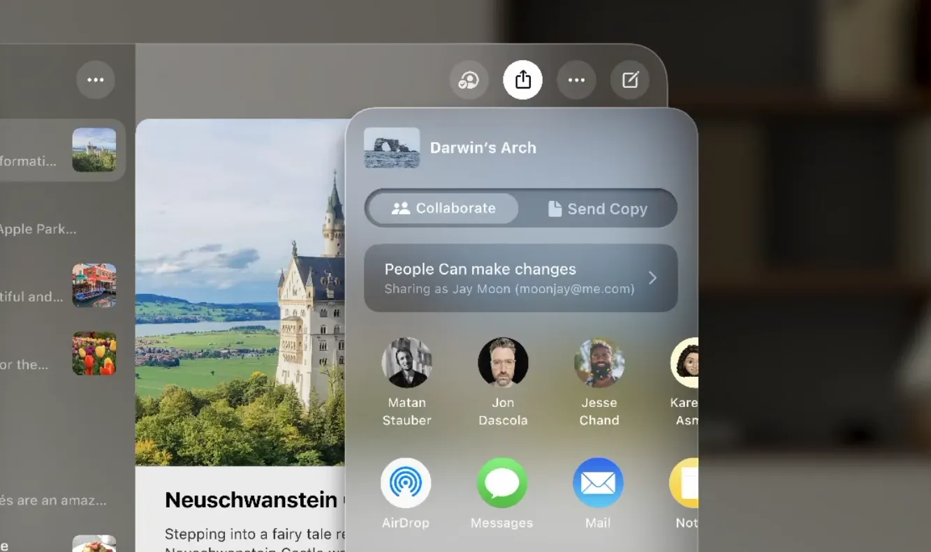
Menu & Pop-overs
On this platform, menus and popovers can expand outside the window.
They appear centered by default, ensuring that the content always appears right where the user is looking.
On this platform, we always use black labels on a white background to show buttons are selected.
Sheets
Sheets are presented as modal views, and they appear at the center of the app.
Modals contain the same Z position as the parent window.
The parent window pushes back and dims.
This helps focus the experience and prevents people from interacting with the parent view until the sheet is dismissed.
- If you need to present another sheet, a secondary modal can appear in front with an additional layer of dimming pushing everything back
- Use push navigation for nested views.
The secondary view will present a back button instead of close.
As a system pattern, always place close buttons on the top-left corner.

Thank you for reading! Your time and interest are greatly appreciated. Stay tuned for more insightful articles in the future.