Top 35 Minor League Baseball Team Logos (and the worst one)
Minor league/Semi-pro baseball and the team names associated with it is one of my greatest joys in life. It’s fun for baseball and non-baseball fans alike. But as a baseball fan, there is something potentially controversial I must admit. A big reason why I love baseball is that I am fascinated at how much other people have the capacity to follow it. Baseball can’t help but stick out like a sore thumb in the modern world of sports. Modern life moves at an unbelievably rapid pace, but baseball maintains its slow speed. It’s one of the only ways I imagine I could find kinship with a person living in the 1920s.
In normal times, 162 games are played. The game pace moves relatively slowly and sometimes games are so uneventful that it can be downright meditative to watch. As a numbers enthusiast, I also find myself having a blast looking at all the statistics that have been created to tell stories about the quality of players on the diamond. There’s an old joke that many baseball statistics are invented and calculated because people watching are too bored to not solve such algorithms.
But enough about the game itself, the purpose of this listicle is to pay homage to the minds and graphic designers behind the team identities in minor league baseball. In the list below I will reveal my top 35 favorite minor league baseball teams as well as the worst design concept I’ve ever seen. My picks are largely based on what I find to be truly unique and truly fun and even though these are opinions, I reserve the right to be wrong about my opinions. On to the show!

Worst Ever: Lowell Spinners
At best this is confusing, at worst, it is paying tribute to a textile industry that exploited cheap child labor for decades in the 19th century. The logo here just replaced a miserable dirty child with a cute massive alligator. Maybe I shouldn’t be so cynical and I should recognize that at the time, conditions and pay in Lowell mills were better than many alternatives, but it feels strange to celebrate the cold brutality of working in a textile mill back then. Regardless, how did this new Chance the snapper escape the dirty south and get caught up in a mill in Massachusetts? Using the Red Sox lettering is in poor taste. Everything about this team is bleak and I’m having no fun at all. This is the worst logo in minor league sports and it’s not even close.

35. Binghamton Rumble Ponies
What I like about this logo is that the graphic designer tried to make it intimidating even though the name is as absurd as “Rumble Ponies.” Such a metal font and color scheme juxtaposed with such a light and mystical team name. It’s quite good, but it’s low on the list because it is taking itself way too seriously. This IS minor league baseball we’re talking about after all. I’m not here to watch ‘A Knight’s Tale”, I’m here to goof off.

34. Akron RubberDucks
The team name here really doesn’t make sense, but neither does the state of Ohio, so here we are. I understand the rubber part is paying tribute to the rubber industry in the city, largely bolstered by the Goodyear Company. That said, adding a levitating tread mark behind an evil iteration of the iconic bathtub rubber duck is just strange. But because it’s strange, it made my list of favorites cut. Strange is good in Minor League Baseball. The consistent color scheme and commitment to tread themes makes this clean and easy to look at, but it still makes no sense.

33. Northwest Arkansas Naturals
When I found out that the Naturals were almost named the “Thunder Chickens” from an online fan poll, I couldn’t help but wonder about the glory that could have been that logo. That aside, Naturals is pretty cool here, especially considering the team is in Arkansas. This team name references the film “The Natural” and the state nickname “Natural State”. Honoring your state and honoring a classic baseball film is #BaseballAF. Some could argue that this logo is too busy, and no doubt, I think the logo could go without the baseball being propelled by piss wind? But still, the cliff, waterfall, and lightning bolt do well to show that Arkansas is a wild wild state with wild wild weather. It’s also pretty cool how much this design causes one to think. This is not a person, place or thing, this is MF nature in general. Pretty powerful stuff.
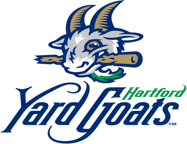
32. Hartford Yard Goats
Leave it to bourgeois Hartford to add 18th century-ass squiggles to the “Y” and “G” letters in Yard Goats. This is a design for the summer long money making gimmick of minor league baseball, not an old timey insurance contract. That said, if I were a 22 year old kid getting paid almost nothing to get his ya-yas out all summer trying to make it to the bigs, I would surely enjoy donning Yard Goat attire. The goat MONCH of the baseball bat is a nice touch here.

31. Lansing Lugnuts
Small scale alliteration and an iteration of comic sans all in the same design. Considering this is minor league baseball, sign me up! It’s odd to see such a child-like font representing such an adult blue collar building component and that’s what makes this so special. I feel like I’m getting a hand written invitation to a 10 year old’s bowling birthday bash. Let’s also appreciate that the lugnut is screwing into the U and the S, the lugnut is screwing us. How fun! The nut has eyes that look like a shitty bird drawing and has a tooth. This whole logo is proof that you can personify anything if you want to because there are no rules down here.

30. Columbia Fireflies
This is truly a one of a kind color scheme combined with a very predictable for South Carolina design choice. Incorporating the state flag Palmetto tree/Moon combination is clever for this team, but par for the course for South Carolina. Feeling consistently inferior to North Carolina and being the state that started and lost a bloody civil war fought for immoral reasons must be difficult. I think that’s why they’re always throwing their sexy flag around all over the place. Only Texas is more obsessed with their own flag. Bonus points for the odd color scheme and fun team name, but some points were lost for being JUST fireflies as opposed to the “Thundering Fireflies” or “Far-Flung Fireflies”, etc.

29. Greensboro Grasshoppers
There’s a lot for baseball purists to love here. The cursive Grasshoppers underlined by the city name basically just told me that instant replay is ruining the integrity of the game and Fernando Tatis Jr. shouldn’t be swinging at a 3–0 pitch in a blowout ball game in the 8th. Some iteration of this would be sweet for a local pest control company. I’d like to point out the form of the grasshopper about to throw the ball here. It’s excellent. Any little league dad looking to teach their catcher kid how to increase his Pop Time (POP) can point to this grasshopper on what he should look like making a pick-off throw. Overall, this design is classic, cute, and fierce.

28. Richmond Flying Squirrels
There’s a lot to like here. The color scheme is dark and powerful and all that power is coming from an MF Flying Squirrel. The NUT image over where the squirrel heart would be is adorable and it shows the devotion any squirrel would have towards nuts. Too many people sleep on squirrels and it has to stop. Also, having been to the stadium, their “Welcome to the Squirrely Gates” sign by the gates is a nice touch. Go Squirrels.

27. Fort Wayne Tin Caps
This apple for real looks like what a QAnon believer looks like to the vast majority of the American population. Unfortunately, this team name is not a nod to conspiracy theorists everywhere. It is in honor of America’s favorite apple enthusiast, Johnny Appleseed. While modern folks wouldn’t appreciate a DIY apple orchard planter renegade planting apple trees in random yards and near commercial plaza retention ponds, this modern folk appreciates the Tin Caps existing.
There’s no evidence of Johnny Chapman (Appleseed) ever consistently wearing a tin cap, but there is physical evidence that he’s buried in Fort Wayne, IN. This logo is the first time I’ve ever been scared of an apple and I’m here for it. That smile says “Yeah, I was with your girlfriend last night, what are you gonna do about it?” and the lettering looks like it would be in a Crimson Chin comic book if such thing existed. I kept wanting to put this lower on the list, but the tin lettering really got to me. Let’s go ‘Caps.

26. Wisconsin Rapids Rafters
This rat has an energy that matches the rat from Fantastic Mr. Fox much more than the sorry soft-ass rat from Ratatouille. Also as an aside, financing a restaurant for the rat in that movie is a poor investment because rats just don’t live very long. Anyways, this rat looks like he just got a job at a factory in 1970s Detroit and is stoked about the pay before realizing how actually hard his job was going to be. This rat worked hard and lived a decent middle class life but once layoffs at the factory happened and his pension was cut considerably, he realized his retirement wouldn’t be as comfortable as he once dreamed.
This new reality has made him quite cynical about modern times and quite nostalgic about the “good ole days.” Just like that he started looking for scapegoats for why his life took a turn. Instead of recognizing that his situation is a reflection of a hard line shift to a knowledge based service economy, global competition, and vast increases in the effectiveness of automation, he blames immigrants for his problems. This now racist rat will continue to buy into the quack gospel of Trump worshipping pundits to a point where his entire personality is now just low grade Trump idolatry. His entire philosophy and world view now make him unrecognizable to his kids. His kids are sad for him. But for now, he’s rowing a shitty makeshift boat with a baseball bat, so that’s something. Sad rat story aside, it’s really just a cool vibe on this design. This could also be a design for a white water rafting company, easily.

25. Augusta Green Jackets
Well, this is probably the strangest Bubba Watson fan art I’ve ever seen. It’s a bit odd to name a baseball team after a golf tournament, but when that golf tournament is one of the most iconic on the planet, I think we can let it slide. It may be getting warmer, but it’s not officially spring until…The Masters, I mean Augusta Green Jacket baseball. My favorite part of this logo is the absence of any baseball motifs. In fact, the two golf clubs show that no one in Augusta really cares about baseball. But wait, where it looks like the insect is just flexing his jacket, he’s actually holding two barely noticeable baseball bats.
Bonus points for the artist incorporating a shadow. If not for someone on the roster with the first name of “Blake” and another guy on the roster with the last name “Cabrera”, I wouldn’t believe this was a real baseball team.

24. Quad Cities River Bandits
If you didn’t know that Quad Cities here references Davenport, Iowa and the “quad” part pays homage to the 4 minor league baseball teams that have played nearby historically, you should probably think twice before you sign up to participate in Iowa trivia night at the local pub again (now socially distanced pub, hopefully). Bandits alone is not terribly inspiring, but River Bandits led by a trash panda with a cowboy hat and a mask…you had my curiosity but now you have my attention.
Baseball enthusiasts could point out that the seams on the ball are embarrassingly inaccurate compared to a real ball, but we’re not here for accuracy, we’re here for fun. The lettering for Bandits is as classic baseball as it gets, which is a nice touch. You can’t help but think that this raccoon would know to bring his mask the next time he visits a hospital during a pandemic. Someone tell Mike Pence.

23. Sugar Land Skeeters
This semi-pro team is not affiliated with any MLB club, but it surely has MILB design quality. There are a lot of excellent subtleties that can’t be overlooked here. The Skeeter letter font has little slits in it suggesting that this pesky little skeeter has been sucking blood from the lettering itself. It is so vicious that it has burrowed deep into the state of Texas for heaven’s sake! Cleverly, the skeeter is sticking his little demon needle into the rough geographical location of Sugar Land, just southwest of Houston. All over the country but especially in the southeast, people are acutely aware of how miserable mosquitos can make the outdoors in the summer time, but that’s what makes this logo so intimidating.
It is unique for a club to be named after something not feared, but actively hated by just about everyone and have it come out cool. Are skeeters a fan of the Skeeters baseball club? Yes, because baseball is played outside and more people outside is good for skeeters. The star imagery is a nice touch because Texas and don’t sleep on the fact that the Skeeter here looks like he’s about to throw a surprise knuckleball or Eephus pitch.

22. Norwich Sea Unicorns
Don’t you dare breeze past this one. This design shows a seamless insertion of a baseball motif where it ordinarily wouldn’t make sense. Too many logos try to sneak a baseball bat in the corner, unassociated with the action front and center. Our sea unicorn Narwhal friend here has a hybrid baseball bat/harpoon, which really would be the ideal weapon against a home intruder in my opinion. Anyone entering would be so flabbergasted they’d probably immediately high tail it out of there in sheer terror.
Back to our logo friend…this is one badass Narwhal with a very classy rose prison tatt on his arm. It is strange that this creature is holding a harpoon, a weapon used to specifically kill whales. So this means the narwhal is living one of two possible realities.
a. The narwhal has commandeered a ship (hence the boater hat) and is intending to harpoon other human boaters as a form of revenge for centuries of murdering his brothers and sisters. As an aside for those who don’t know, Whale blubber has historically been used for soaps, perfumes, and oil for lighting back in the day making whale murder all too common. Revenge is never the answer, but it would be warranted here.
b. The narwhal has decided that whales truly are gross and in the hatred of his own kind, has found the resolve to kill his fellow whales. Or I guess he could just be posing in some tasteless photo for money??
Regardless, the font beautifully ties mariner vibes with baseball vibes (no Seattle based MLB references intended), the logo is an excellent combination of intimidating, cute, and silly, and serious bonus points for the rose tattoo on the arm.

21. Walla Walla Sweets
This cute lil guy has the face of the Volcano from the Pixar short, ‘Lava’ and it’s heckin adorable. Walla Walla, WA for those who don’t know is notorious for growing sweet onions enjoyed all over. These onions are also the official Washington state vegetable if anyone cares. Back to the design, the underlined cursive is baseball AF so bonus points there. This team is not associated with major league baseball, but again, the design rocks so I don’t care. There is a good color scheme, the name is relevant to the area, and the logo is adorable, check check check.

20. Modesto Nuts
I don’t know if these Nuts are trying to sell drugs or bribe someone in congress, but on the cool scale, they’re straight jazz. Let’s try to appreciate the Pablo Picasso-esque lazy abstract “s” stitching baseball. This is a logo where if you take the baseball motifs out, it could easily look like an edgy mixed nut company. Extra points for the absurd name and the classic baseball font in the spelling of “Nuts.” The Modesto font is weird and looks more like a brand of pasta or espresso, but you can’t win them all. That the team is named the Nuts appeals to children and immature adults in a way that is special and can bring the masses cheap joy. All of this combined makes this a mid-tier favorite.

19. Green Bay Booyah
Located on Holmgren Way because of course it is, this team is proof that there is at least one non-football team in Green Bay. A lot of streets in Green Bay are named after football people because no one else in that town has ever done anything else noteworthy, probably. There is one good coffee shop I found in that city though and this Northwoods League baseball team truly rocks so maybe they have SOME alternate identity.
At first I was confused about what Booyah had to do with chickens, because I think of “Boo Yah” as a kind of exclamation meaning some derivative of “Hell yeah.” Turns out it is a kind of hybrid chicken soup-stew popular in Wisconsin and elsewhere in the Midwest originating from folks native to Belgium that settled there. Enough with the history, the chicken looks like the “Cluckin’ Bell” chicken from the fast food chain featured in the Grand Theft Auto video game series. The lettering has a Go-Gurt feel, the baseball bat looks like an oar, and most importantly, the Y letters are shaped like CHICKEN FEET. Y’all, this is all good.

18. Portland Pickles
Another unaffiliated with MILB team, another glorious addition to fun logos. I have attended a Pickles game before and it is as gimmicky as you could imagine. Fried pickles galore, giant pickle mascot, an emphasis on selling merch, etc. I actually think the baseball behind the pickle is lazy design but the cartoon pickle with that brilliant toothless/one giant tooth(?) smile inspires me. Is the P on the hat a celebration of Portland or a celebration of Pickle pride? We may never know, but these are the questions that make this logo high up on the list.

17. Kokomo Jackrabbits
Floppy Carrot bat? Yes, floppy carrot bat. MILB needs to take notice, the Northwoods league baseball has more fun than you. At first I thought this might be a team based in a place off the Florida Keys that the Beach Boys are enthusiasts about. Turns out there is no place called Kokomo off the Florida Keys and that was news to me. I didn’t realize we were dealing with softcore Atlantis here.
So where is this Kokomo? Did anyone guess INDIANA? While it may be far from what the Beach Boys would be looking for in Kokomo, this plot of Indiana boasts a tactical lazer tag venue, the world’s largest steer I guess, a lounge that looks like Snake Lounge from Parks and Rec, and the pride of knowing that Brett Michaels went there once. Cool.
Back to the design…this rabbit is jacked, has above average ears, and handcrafted an artisanal baseball bat out of an effing carrot. I would never think about messing with something like that. The ‘“Kokomo” lettering fills the classic baseball font requirement while “Jackrabbits” looks like it just came out of the basement of ‘That 70s Show’ stoned out of its mind. Sheer quality here.

16. Traverse City Pit Spitters
The cherry pit is a baseball? The cherry pit is a baseball. I want to take a second to roast the previous name of the Pit Spitters. They used to be the Beach Bums. Right off the shore of Lake Michigan, the people of Traverse City really tried to paint themselves as “beach” bums. I’ve seen a number of “beaches” around Lake Michigan and for all y’all interior US folks, It’s cute but that ain’t a beach. Pit Spitters is infinitely better. Props for the classic cursive underlined “Orioles” looking font. This is pure fun, go ‘Spitters!

15. Albuquerque Isotopes
When I see this logo, I can almost hear Jesse Pinkman say “Yeah science, bitch.” Chemistry teachers in Albuquerque probably enjoy this team too because it likely leads to a lot more kids asking way earlier in life, “what the heck is an Isotope, anyway?” Rusty on chemistry, I just had to remind myself right now. That the logo shows an atom and spells out an A is quite good. And how could you hate on a team paying tribute to a variation on the building blocks of all matter? As a bonus, this team for a few games a year switches their logo to become the Albuquerque Green Chile Cheeseburgers and it brings me joy to see how much fun New Mexicans clearly like to have. On the red versus green chile debate that never ends in the state, if you can’t get both, you gotta go green in my humble opinion.

14. Salt Lake Bees
Where this overall concept loses points for its lack of absurdity, it makes up for in a big way with its insane cuteness. The lettering of “Bees” screams Pittsburgh Pirates but they get bonus absurd points for actually being an affiliate of the Los Angeles Angels. The bee is stout, confident, and smiley despite having absolutely no bend in the knee for the batting stance. The bee should work on that otherwise it may be late on a lot of fastballs. But the cap and whole vibe is so stinkin cute. Bonus points for paying tribute to the vital work bees do every day as pollinators of our planet. GO BEES.

13. Fayetteville WoodPeckers
At first glance, it’s not the most inspiring and I think gray is just a bad choice here, but I think this is quite good for obvious reasons. This woodpecker doesn’t discriminate on which wood it wants to peck considering it has already taken some hacks at its own bat and the logo itself.
My guy has arms like a deli owner in Little Italy and a star patch on his shoulder that looks like an anarcho-communist motif. Interesting choice, comrade. The personification of this bird is creepy and the lettering “Wood Peckers” looks like an ad for a horror movie or old-timey amusement park. Frankly, I can’t wait for Fayetteville WoodPeckers 2: The Hollowing.

12. Everett AquaSox
Cute. This truly is the team for middle aged women who recently moved to Arizona and became obsessed with yoga and frogs. Why is the frog trying to tongue slap a baseball and not a fly? Who cares, it’s cute. That this is not the logo of an exotic pet store is a missed opportunity. The color scheme is first grader approved and that’s what makes adults donning AquaSox gear that much more disarming.
Could you imagine a guy getting into a fight with an AquaSox shirt on? If you saw someone heated with an AqauSox shirt on, you could just remind them of the state of mind they must have been in when they bought such adorable apparel and they may calm down, emphasis on “may”, white rage is no joke. I see this imagery and forget just how brutal the world can be for at least a moment. Imagination is a beautiful thing and these hues are just so damn calming. Bonus points for turning the Seattle Mariners M (their affiliate club) into an E for Everett.

11. Portland Sea Dogs
Calling manatees SeaDogs is very very cute. The Sea Dogs font has a very nautical 1970s feel and I feel like I’m about to go on a game show and get talked down to by a jazzy host with one of those stupid ultra-thin microphones. Looking at this makes me want to eat Caramel corn on a dock by the sea with a nice cold lager in some gimmick town like Seaside, Oregon.
But let’s not forget the angry manatee, classically animated like it came right out of School House Rock. Perhaps the manatee is upset about all the boats infringing on where it wants to hang out. If it weren’t for the baseball bat in the manatee mouth, this could easily be the logo of a Seafood restaurant in Maine and that interchangeability makes this so well received. The font just solved a Scooby-Doo mystery and I’m here for it. Let’s go Sea Dogs.

10. Ogden Raptors
If Chuckie from Rugrats saw this logo, I wouldn’t blame him for suddenly getting hungry for Reptar Bars. The childish complexity here is magic. Many flags that represent entire countries are really just a few arbitrary colors, but the raptor on this small-ball ball club has wrinkles, stripes, a specific tongue definition, and the craziest anatomically accurate toe ever.
This logo inspired me to look at depictions of previously IRL raptors and HOT DOG, they have some WEIRD toes. The utterly unplayable baseball behind the raptor which is supposedly how a baseball would look post-raptor attack is a really nice and unnecessary touch. I like that Ogden is barely what matters here as well. RAPTORS is what matters. The lettering design looks like something someone who mastered MS Paint in the early 2000s would be proud of and I’m here for it. While it loses points for the simple name, it gains some points for being so hilariously drawn.

9. Jacksonville Jumbo Shrimp
I’m biased because I live here, but this team name and execution is splendid. Don’t get me wrong. The color scheme is ugly, but it correctly shows a shrimp out of water and that’s all that matters. The day the name changed from the Suns to the Jumbo Shrimp is one where many local boomers, normies, and baseball nostalgia purists mourned, but it is one that I cheered.
I’d like to first point out that this shrimp looks like he’s ska dancing at a Catch 22 live concert so that’s fun. Further, this shrimp is buff AF and forms a letter “J” for Jacksonville so that’s even more fun. Finally, because Jacksonville, specifically Mayport is known for its shrimp, this a perfect name for the team. Not to mention the social media campaigns…#CrustaceanNation, Batter Up, Shrimp and Grit, the puns and fun never seem to end. When the Shrimp play the Biscuits at home…sheer bliss. This is probably the best thing Jacksonville ever did outside of struggling to host a Super Bowl once and by happenstance being the place that raised James Weldon Johnson, The Allman Brothers, and Lynyrd Skynyrd. Let’s go Shrimp!

8. Asheville Tourists
I don’t know how, but this logo found a way to invite me to an actually tasteful luau hosted by native Hawaiians with a Pinterest account. The color scheme makes me want to go swimming followed by a restful nap before meeting up with my friends at a brewery.
It’s odd to see Tourists shown in a positive light when that is so rarely the case. But that is exactly what the Cool Whip font is doing here. Let’s get away from the calm parts here and recognize that a perforated marshmallow was just launched into space with a mallow cloud following it. This is so whimsical and mythological.
I want to live in this world for about a week. Leave it to the friendly town of Asheville to welcome an already abundant number of tourists by naming their ball club in their honor. This is much more cozy than the former team name 100 years ago, the Moonshiners.

7. Fond Du Lac Dock Spiders
If MILB is a little more fun with design and team names than MLB, smaller scale summer league teams take the MILB bet and raise it to unimaginable levels. This is where the MF Dock Spiders come into play. Spiders alone as spooky, but Dock Spiders are spookier because docks are often spooky on their own. Sure, you could be on a dock for a fun family fishing trip outing, or you could be on a dock with cement blocks on your feet about to “swim with the fishies” because of a debt unpaid in early 1900s New York.
Regardless of why you’re on a dock, it’s no fun to deal with spiders on them. The font is right in line with spooky season, the spider is equally cute and scary, and the little webs on the letters and in the back ground is just adorable.

6. Normal CornBelters
In yet another stroke of brilliance not associated directly with MLB, the Corn Belters immediately show the world that they’re not afraid to have some design fun. This team is smart to recognize that all the money is in the merch and who wouldn’t want a CornBelters T-shirt? Based in Illinois, it makes sense that they would pay respect to the abundant crop in the region made more abundant by absolutely wildin’ ethanol subsidies that somehow still exist I guess to keep farmers busy and happy. Definitely has nothing to do with Iowa being the first primary state…
Corn subsidy policy aside, that’s one mean looking stalk who looks more than ready to belt some balls into the stratosphere. With a glare high school girls fire off upon receiving a tasteless prom proposal and “hair” that looks like Bernie Sanders just announced his candidacy for president, we’re dealing with a very competitive design in this space. Just excellent.

5. Vermont Lake Monsters
Nessie the Loch Ness Monster is real and so is this Burlington based baseball team. This dragon seriously looks like it can rake, Adam Dunn style. Further, it looks to be hitting piss missiles with a bat that has the girth of a wiffle ball bat. Someone needs to call Daenerys Targaryen to get their dragon back because this fella is capturing hearts and minds in Vermont and far beyond. First I’ll show appreciation for the fact that it is the Vermont Lake Monsters and not the Burlington Lake Monsters. That anywhere in the state is populated enough to support a minor league baseball team is a feat in itself. To attract more fans, why not dedicate the team to the whole state instead of just Burlington. This minor league baseball team is probably one of the best things Vermont has ever done and in no way am I roasting the state when I say that.
The font is delicious. There is a fury to it that suggests it’s about to get whipped up in a hurricane-esque flurry. This font could easily be on the cover of a new DragonForce album cover and lake monsters are already inevitably metal AF. The best part though is that really truly, this monster is adorable. He looks like the cousin of Publix’s mascot, Plato the Publixaurus (look it up, it’s worth it) but maybe just a little bit meaner and not associated with a grocery store. All around, this is a hit, go Lake Monsters!

4. Amarillo Sod Poodles
Holy shit, it’s the MF Amarillo Sod Poodles. Do I honestly need to go into more detail about why this is great? Let’s consider for a moment that they were close to being named the “Boot Scooters”, “Jerky”, or the “Long Haulers” and all of that is potentially the most Texas thing that ever happened. This is more Texas than Davy Crockett defending the Alamo and the “Come and Take It” flag combined. This name gets bonus points for being confusing. I know what sod is and I know what poodles are, but I have no clue what a “Sod Poodle” is. A poodle that rips up sod? A poodle that protects sod?
Turns out it is a reference to a prairie dog and that makes this even cuter. Who TF doesn’t like prairie dogs? Little homie is monchin on wheat, hiding in a hole, with an Amarillo pride cowboy hat. You could canoe the Navasota River, spend 24 hours straight at Buc-ee’s, stroll down the San Antonio River Walk, see some Friday night lights in Odessa, or tour an oil field in Midland and still not see anything quite as Texas as this. Well done.

3. Rocket City Trash Pandas
The Jacksonville Jumbo Shrimp got one-upped in the Southern League for most absurd minor league mascot here. Located right outside Huntsville, AL, the ‘Rocket City’ part of the name references Huntsville as a place where NASA rockets were developed to put humans on the moon. No offense to Alabamians, but I don’t generally think of rockets or creative graphic design when I think of Alabama. But here we are. 2020 is weird as hell and internet driven globalization has made us all collectively weirder as well.
As much as I can see hyper “I love my truck/chivalry ain’t dead/I aint no sexist” masculine southern men of all ages refusing to wear Trash Panda gear because “that’s just stupid, man” I can also see plenty of folks embrace this hilarious team. An effing raccoon is in a trash can that is ACTUALLY an EFFING ROCKET with a weird calculator looking thing on the front of it. I mean honestly, what is not to like here?
Not to mention, ‘trash panda’ is one of my favorite slang animal roasts I’ve ever heard. The only animal slang roast I like better is ‘danger noodle’ for snakes. Raccoons in general have always confused me because I hate them when they mess with my trash but I can’t help but think they’re just stinking adorable. This right here is a masterpiece.

2. Rocky Mountain Vibes
This flaming s’more rocking Ray Bans and Doc Martens may have peaked in high school, but the way I love this suggests that I’m still in high school alongside this badass s’more. What a beautiful stereotype for the state of Colorado to proudly flex with. This mallow with graham cracker pool floaties just made out with everyone’s girlfriend and no one is mad about it. This guy just made Four Loko’s cool again and drunkenly found a way to resolve the never-ending Palestinian-Israeli conflict.
If this team were to lose and get roasted on Twitter (no pun intended), responding with “Stop the hate, good vibes only” is actually a legitimate response. What if they win the league? Good vibes only. It’s perfect and I can’t imagine anyone hating this team. As a quick side bar, s’mores aren’t as American as one may think when you break it down. Marshmallows originated in Egypt. Chocolate is from Mesoamerica. BUT, Graham Crackers may or may not have been inspired from a dude in Connecticut. So that makes the s’more at least somewhat American which adds some ‘Merica points here. A+ on everything happening with this design and team name. The world needs more of this right now.

1. Montgomery Biscuits
This is it, chief. This is the best logo and design I have ever seen for minor league baseball. The cross-eyed biscuit with a butter tongue sneaking behind the letter B almost looking scared like a deer in the woods baffles and amazes. The font and color scheme looks fluffy and tasty like a real biscuit. I’m hungry just looking at this.
Again, I had no idea Alabama had an idea this good in them, but by golly, they got the Rocket City Trash Pandas too! I must point out that they have biscuit stands at the stadium that say “Biscuits, of course” and I love that. It’s funny, it’s fluffy, it’s absurd, and the cursive screams classic baseball. Pure perfection here.
What the Vibes and Trash Pandas missed was the classic baseball cursive font tying it all together and that’s where the Biscuits just nailed it. I mean c’mon, googly eyes, a butter tongue, and gloves that a Mario character would wear. If you don’t think this is cute and hilarious, you really need to slow down and stop taking things so seriously.
