
Apple Watch Journey— Learning Through Doing.
Originally published on Smashing Magazine.
One sunny morning in the summer of 2014, I was sitting in a café having just finished an hour-long call with my remote team. I had some free time on my hands, so I pulled my notebook out and started playing around with an iWatch app idea. Yeah, you read that right — 2014 and iWatch, before a watch had ever been announced.
Scheduling that call had been a messy exercise: we live in different time zones and it was hard to find a time that worked for everyone. I wanted to make dealing with time zone differences less painful. Here’s the sketch I made that day, which is where it all started:

Since it was early August 2014, we had no idea what shape an iOS watch would take, let alone its name. But we learned the latter a month later, when Apple announced the new wrist-worn device it had been secretly working on: Apple Watch.
It’s a story with an unexpected ending
We started with the problem — making time zones easier to handle — and learned a lot along the way, including a surprise we received at the very end.
Before we get to that, here’s the final product we developed:

You can take the iPhone app for a spin today, but Apple Watch version isn’t available yet. (More on this later.)
The concept is simple: one 24-hour clock face that shows all locations/time zones. To convert times, simply twist the crown. Each clock hand moves in synch with the others, showing you the correct times everywhere.

We made an iOS clock app. Apple made a watch. Perfect match, right? Not so fast.
The problem
The problem before the watch problem, that is. We wanted to solve a headache this new world of interconnectivity created. With the Internet and mobile, communication became really easy. So easy that people all over the world can now chat, work, and play as if they’re in the same room. Except they aren’t: the earth is still round, it still spins, and that creates time zones. That creates a problem.
While some people are sipping their morning coffee, others have to run off to collect their kids from school, and some are already asleep.
At Minimum our team and our clients are distributed across five continents. We have to deal with a half-dozen time zones on a daily basis, which can be a nightmarish experience: calls in the middle of the night, frustration, missed deadlines, broken communication, lost opportunities.
Pop Quiz: Is there any reasonable time for a phone call between US West Coast, Eastern Europe, and Australia? (Answer: No, there isn’t. Someone always has to suffer.)

We wanted to make time zones easier for ourselves. Multiple clocks began appearing on our dashboards, we scheduled meetings in advance, and we started using the calendar more smartly. But even with multiple clock faces, for instance, you could see the current time, but it was still tricky to predict what 8pm your time meant for everyone else across the world.
Some seemingly innocent time-related questions can make your brain hurt:
• If you wanted to call someone come (your) morning, would they still be awake wherever they are?
• Would your iOS developer in Russia be available to answer questions if you needed to pull them into your conference call between Australia and the US West Coast at 3pm Pacific?
The way people measure time is screwed up, and there’s little we can do about it
Most of us have ten fingers. We count to ten in pre-school. One meter is a hundred cantimeters, there’s a hundred pennies in a dollar, etc. Our brain is trained for and constantly reminded of the decimal system. In fact, many of us don’t think there’s any other way to count: 9+9 is always 18. Until we start measuring time.

We count hours using a duodecimal (base 12) numbering system. And count minutes using a sexagesimal (base 60) system. Our brain is trained to think that 9+9=18. But in the world of time, 9+9=6.
It’s unnatural. We’re using systems and techniques that are thousands of years old. The role of time in the society has changed, the technology has changed, yet the imperfect system lives on.
This system makes time-related calculations very hard — more so when you have to hop over 12 while counting. Most people, including the author, can’t do these calculations quickly and reliably.
First Solution
World Clock app for Mac
To solve this problem of time, we started with a World Clock app for Mac. It allows you to quickly convert time by dragging a shadow over a world map. While you drag, all clocks will adjust their time according to the position of the shadow. To find a suitable time, just keep dragging until one of the clocks shows the time you want.


We loved using the app ourselves and were blown away by how well it was received in the Mac community. (At one point we reached #9 top paid app in the US.)

World Clock Widget: For some people the World Clock app was too dense. They just wanted to convert times quickly. Having an entire window with clocks was overwhelming. So we made a separate app that added a Notification Center widget to your Mac. The World Clock Widget also received a warm welcome.
People then began asking for an iPhone version. But making one wasn’t as straightforward as we thought it would be.
Mobile Version Struggle
We solved the time-conversion problem for big screens, but everything we tried for smaller devices never felt quite right.

We noticed others started trying solve this problem for mobile as well. (For example Miranda and TimeZones). While the apps looked sexy and well thought-out, they were still too complicated.
To be honest, we didn’t have any better ideas, so we put the iOS World Clock concept in the bottom drawer and focused on other projects.
And then something interesting happened.
Intensifying the conflict
At Minimum we sometimes use the principle of intensifying the conflict: make the contradiction 10, 100, 1000 times more intense than the original problem. This forces us to look at the problem in a completely different way and often helps us find unusual solutions.
Example: We need to make cars use less gas. → We need to make cars use zero gas.
“Wrist-first” approach distilled our thinking
We were stuck until Moto 360 came along, and Apple Watch rumors started to leak. That’s when I started playing around with a wrist-worn version of our World Clock Mac app.
The original problem of shrinking our Mac app to the size of an iPhone intensified:

It became abundantly clear that we couldn’t just massage the app to fit a tiny watch screen. All our iPhone concepts were compromises. Cut a corner here, nudge a thing or two there. Maybe it will fit, maybe it won’t, maybe it will still be useful… That’s why it didn’t feel right. Compromises never do.
There had to be something simple.
Second Solution:
“24 Hours” app for iPhone and Apple Watch
Ironic cliché: the solution was staring at us the entire time. Have a look at the icon of our World Clock Mac app.


Multiple hands on one clock face can elegantly show times at different locations with minimal user interaction. That made sense. The only problem was the twelve-hour clock face: if we see a hand pointing at 3 o’clock, is it 3 a.m. or 3 p.m.?
To avoid confusion we decided to use a 24-hour clock face: the top half for day, the bottom for night. Easy, clear, and obvious.

The trade-off
Remember: our goal was not to re-invent the clock, or make a better one, we just wanted to make telling and converting international times easier.
We decided that using a 24 hour face is a fair trade-off: it’s not as familiar as a 12-hour clock face. People would have to get used to it, but they’d have a much easier way of telling and converting times once they do. We decided this was a fair trade-off.
Was it the right decision? We hope so. Let us know what you think in comments after you’ve had a chance to play with the app. (iTunes link.)
The process

Prototype
How do you design for a product that doesn’t exist yet? Since we started before Apple Watch was ever announced, we decided to prototype on an iPhone.
We agreed on using a circular clock face for our prototype so we could scale it down for a smaller screen should an “iWatch” be released. This would fit a rectangular or circular watch face — since we had no idea which it might be.

The first thing we wanted to test was our interaction model. The idea was a user would rotate the clock hands in a circular swipe motion to convert time. But would that be comfortable to use?
We created two interaction options.
Option 1: A user rotates the clock face itself while panning in a circular motion (clock hands stay put).
Option 2: A user rotates the clock hands while the face stays put.

Although the face seemed easier to reach and rotate, especially with one thumb, we felt rotating the hands made more sense. We’re used to clock hands being mobile while clock faces stay put. Familiar often equals intuitive.
To make interactions with one thumb even easier, we decided to add a map view below the clock face: it illustrates the geography of the cities, shows night and day, and pans left and right with one thumb.

Update: this is crazy, someone actually did the version on the right in real life!

We felt we’d landed on a good solution. And then September rolled around and hit us with a bunch of external factors.

External factor #1: iPhone 6 is released
iPhone 6 was beautiful — and black. We liked how the screen became virtually indistinguishable from the hardware, so we decided to switch our gamma to black to support this effect.
And of course iPhone wasn’t the only thing announced that day…

External Factor #2: Apple Watch gets announced
We were really happy about the watch when we finally saw it. (Who wouldn’t?) We were glad we’d started planning an app for it so early, and felt prepared to make something awesome by the time Apple Watch went on sale. But it was hard to stop calling it “iWatch.”
Our most important takeway was Apple Watch would have a rectangular-shaped screen. That clarified a lot in our plans.
We carefully examined every piece of UI we could find in the keynote, press reviews, and Apple’s website. Among other things, we noticed its native world clock:


Seeing that was good news: it didn’t come close to what we were trying to achieve. You couldn’t see more than two times at once, and it was impossible to convert time (and even compare times) at different locations.
Using the crown
The Apple Watch crown really excited us. We couldn’t imagine a better user interface for a world-clock app: people are already used to twisting the crown to rotate watch hands. What could be simpler! Only now there would be more than two hands.

Apple Watch also started to influence our iOS version. (Note “+” and calendar buttons in the corners.)

Around this time we did our first test
with external users.
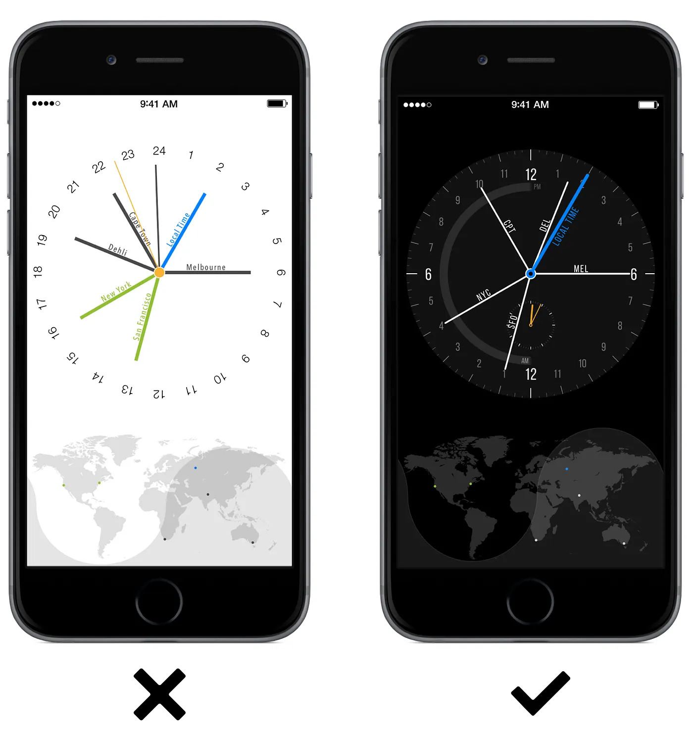
Bad news: almost everyone looked at the iOS prototype above and assumed that the clock face they saw was a normal 12-hour face clock. After looking closer they would notice that number 12 and number 6 repeats twice. That would get them completely confused. Clearly, we needed to make our 24-hour face more different, which in turn will make it obvious and self-explanatory. At least we hoped so.
With a 12-hour clock face it would have been incredibly hard to differentiate between AM or PM for any given time. Jakarta and Palo Alto would appear to be only 2 hours apart on 12-hour face, even though the time difference between these two cities is 14 hours.

To make our 24-hour clock face look different from a 12-hour one, we decided to put more stress on the difference between night and day. We debated this for a while, until I found an interesting artifact that somewhat validated our design idea:

Adding night/day separation not only helped us make our clock face more distinguishable from a 12-hour face, it made our overall UI more obvious and self-evident:

This modification changed our users’ reactions during subsequent tests. Now when they saw the app for the first time, they realized immediately they were dealing with an unusual clock. That made them pay more attention in the beginning, and allowed them to quickly grasp the app’s core concept.
We made a few more prototypes to ensure we definitely wanted to rotate the clock’s hands and not the face. With the night/day separation, rotating the clock face felt strange and made us dizzy. We were definitely going ahead with moving hands.

Apple Watch challenges
Since we started prototyping before an Apple Watch even existed, our original plan was to scale down our iOS design. But the Apple Watch turned out to be tiny. We couldn’t just shrink our existing UI.
We skipped every odd digit on the clock face, made the type more legible, and, most importantly, abbreviated all city/timezone names to three letters. (We started with airport codes. If there wasn’t one available, we abbreviated using the first letter, the second consonant, and the third consonant. Yekaterinburg would be YKT, Winnemucca would be WNN, Ubud UBD, and so on.)

We’ve spent a ridiculous amount of time trying to find the best way to display information between the night and day edges. We’re not ecstatic about the result yet, but we feel it’s reasonably good. (We’re open to your ideas!) Let us know in comments if you have any other ideas for us to try. Here are some of our iterations:

Prototyping without Apple Watch
Since the Apple Watch wasn’t out in the world yet, we strapped iPhones to our wrists. This prototype had the correct Apple Watch measurements.

Reality sets in
Playing with the prototypes was fun. At one point we got carried away with additional functions: adding clocks, a map, calendar events — all of which can theoretically be done on your Apple Watch:

Around December 2014, Apple’s Watch Kit was released.
That’s when we found out that all animations would have to be generated on a paired iPhone, and then sent to Apple Watch frame by frame. We didn’t find any sign of crown control, or any kind of gesture support. We assumed Apple would make these available later.
We moved forward with a few iterations.

Converting Time
When a user twisted the crown, or spun the clock hands, time would shift from “Now” to the future or the past.

Accounting for color blindness
This future/past addition created a new problem: green and red wouldn’t work very well for people who have color blindness. If you color blind, red and green could become yellow and gray, you could still distinguish between the two, so you can tell whether you converted time forward or backwards, but we felt that it wasn’t elegant and could be confusing.
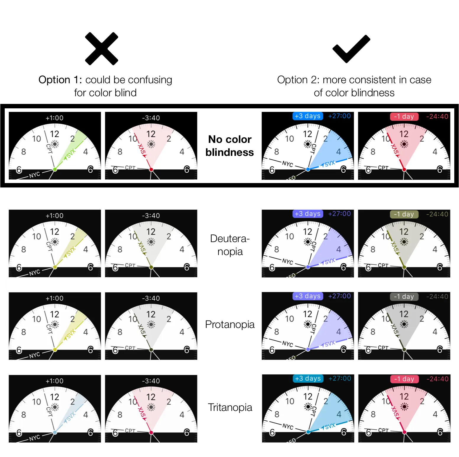
Blue and red for forward and backwards seemed to work much better in case of a color blind person using the app: for all three kinds of color blindness blue virtually remained being blue, and red was either gray or still red. Either one did a good job illustrating that you’ve gone to the past.
Progressing from new concept to completed design:

Accounting for various iPhones screen sizes and getting ready to ship:


Working around constraints
Here’s how we saw our “perfect” product at the time:
Crown wasn’t yet available to 3rd-party developers
Newer versions of Watch Kit didn’t show any sign of crown control, so we had to come up with something that would work in a meantime. We decided to try swiping/panning gestures:
We quickly realized that swiping wasn’t yet available to 3rd-party developers either. We played around with more ideas: how about we add back and forward buttons so a user can just tap to control the app? It hurt our eyes, but it seemed better than nothing:

Time to ship something
We realized that Watch Kit probably won’t be updated soon enough for us to fully realize the potential of our concept in time. We needed to ship something before Apple Watch went on sale so we worked with what was available. That’s what you sign up for when you are trying to be among the first delivering a product on a completely new platform.
Update: Watch OS 2.0 that was announced on WWDC in June 2015 allows crown-control for 3rd-party apps.
Next we built our prototype on Apple Watch. However, we couldn’t quite make it as smooth as we wanted it to be: at the time, frame animations couldn’t be generated and transferred from an iPhone to Apple Watch quickly enough. This caused lags and slow reactions to touch:
Eliminating animations didn’t seem to improve things. The app was still too slow to react on user interaction:
Shipping
At this point we decided to temporarily turn off the time-conversion feature on Apple Watch version of the app. Our iOS version would be used to it’s full potential while Apple Watch could be used to just tell times at different locations.
At this point it was mid-March 2015. The Apple Watch release was imminent, and we really wanted to be among the first people who made apps for it. So we uploaded the build to iTunes, clicked “Submit for Review,” and waited.
Unexpected rejection
The Apple team must have been on the lookout for apps that offer Apple Watch support because It didn’t take them long to reject our build:

We’re used to rejections, but this one was pretty unusual and surprising:
“Apps that contain a clock face, or a likeness of a clock [will be rejected].”
Long story short: after a bunch of back and forth with the review team we decided to put Apple Watch version of our app on hold and released iOS-only version for the time being.
Releasing iOS-only version (for now)
We stripped our iOS app of Apple Watch support and submitted again. This time it was approved.
“24 Hours” is now available on iTunes. We love it and use it every day. And we’re really interested to know what you think about it. I coundn’t imagine a better tool for converting/viewing international times.
Thank you to everyone who made “24 Hours” and our other world-clock apps possible: Alexander Ustinov (Graphic/UI designer), Misha Nikanorov (iOS/Mac development), and Nikita Yermolayevs (advisor).
I also want to take an opportunity to thank Apple Developer Relationship team for all their help and support they’ve given us.
P. S. During this time we did develop a successful Apple Watch app: Chat Center. Apple also gave us tremendous support with this, and it was approved. So in the end we did get one product in for the Apple Watch launch. :-)
P. P. S. Are you ready to get your Apple Watch app designed and developed? Ping me at alex@minimuminc.com (or chat instantly here: http://chat.center/alex)
