New Material Date Range Picker in Android
Step by Step guide on how to use the new Material Date Range Picker in android
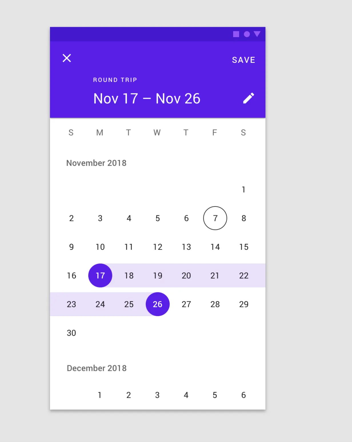
Material Components Android released a new Date Picker around Oct 2019 with subsequent enhancements. You can check out the UI/UX of this https://material.io/components/pickers/#
Recently we wanted to change the 3rd party library we had used for our Date Range Picker. While researching through many android date-range pickers, I came across this and it seemed perfect to our use-case. I couldn’t find much documentation or how to use this so I decided to write a tutorial myself.
It’s quite easy to use.
Step 1: Add dependency in build.gradle (app) file
You can select the latest stable release from https://github.com/material-components/material-components-android/releases. After adding the dependency, sync Gradle files.
implementation("com.google.android.material:material:1.2.0-alpha03")Step 2: Check App Theme
Make sure your app theme inherits from Material Components theme. If it uses AppCompat theme instead, inherit from one of the Bridge themes as mentioned here https://github.com/material-components/material-components-android/blob/master/docs/getting-started.md
[Note : If you do not do this, the app will crash on building the picker]
<style name="AppTheme" parent="Theme.MaterialComponents.Light.DarkActionBar.Bridge">Step 3: Initialise the Material date-range picker builder
In whichever fragment or activity you want to open the date-range picker, instantiate a builder there.
[Note : You can similarly instantiate the datePicker if you want to use that instead]
val builder = MaterialDatePicker.Builder.dateRangePicker()Step 4 (optional) : Set various attributes for the builder
You can optionally set certain attributes in the builder. For example, if you want to set the default start and end date as seen in the picker use
val now = Calendar.getInstance()
builder.setSelection(androidx.core.util.Pair(now.timeInMillis, now.timeInMillis)
You can also set the calendar constraints, theme and the title text.
Step 5 : Create a build and display
Create a picker build and call the show method on it as follows.
val picker = builder.build()
picker.show(activity?.supportFragmentManager!!, picker.toString())
Step 6 : Add logic in Listeners
The new material date-range picker provides multiple listeners like onCancel, onPositiveButtonClick, onNegativeButtonClick listener. You can store the date- range selected and use it in these callbacks.
The positive button click listener returns the Pair of dates selected. Pair<Long!, Long!>
For example
picker.addOnNegativeButtonClickListener { dismiss() }
picker.addOnPositiveButtonClickListener { Timber.i("The selected date range is ${it.first} - ${it.second}")}
And thats it!!
Build and run the application to see it in action.
This component has some good feature requests too which you can track here https://github.com/material-components/material-components-android/issues.
Miscellaneous
By default the material calendar opens fullscreen. If you want to change this you can set the materialCalendarFullscreenTheme attr in AppTheme and declare the android:windowFullscreen to false. Refer (https://stackoverflow.com/questions/59265243/material-date-picker-custom-styling/59265751#59265751)