A Look at Typography of the Harris/Walz Campaign
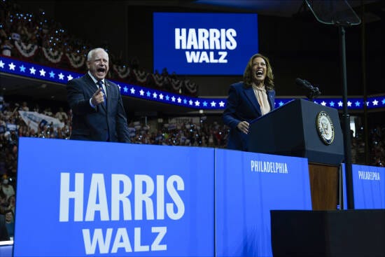
I contributed to a discussion thread on LinkedIn about the typography in the new Kamala/Walz campaign signage.
My hastily put-together (between meetings and Ubering my kiddos) and typo-ridden comment was thankfully met with a positive response. I even received a few side DMs from people thanking me for the background explanation of the typeface design, so I thought I’d sit down and put together a more coherent thought-piece on it.
Nerding out on typography is my strong suit. Back in the Blogger days, I even used to have a blog, Typezilla celebrating all things typography. I’m actually surprised it’s still up after 10 plus years. Enjoy the broken links!
A surefire way to create a strong brand mark is for it to have meaning and a solid foundation — a history that grounds and defines it. Whether it’s Starbuck’s siren, inspired by the company’s nautical locale, Amazon’s A to Z treatment, or Baskin Robbin’s hidden 31, to truly engage audiences an identity’s design should speak to the brand soul.
Before we delve into the Harris campaign visual treatments, it’s important to look at Vice President Harris’ influences. In particular, Shirley Chisholm who, in 1968, became the first black woman to be elected to the United States Congress and the first African American to run for a major party’s nomination for President of the United States, (which also made her the first woman ever to run for the Democratic Party’s presidential nomination.)
Simply put, Kamala’s inspiration was Shirley.
And it’s clear Kamala and her team took influences and inspiration from Chisholm’s campaign materials.

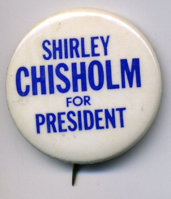
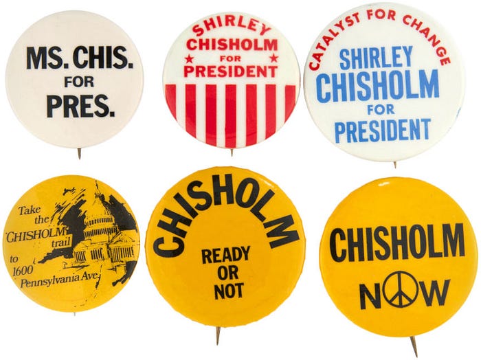
Condensed bold typography, succint phrases, a palette of blue, red with the addition of an unconventional yellow. From D.C.-based creative agency that developed her last two campaigns, as well as the 2020 White House visual identity, Wide Eyes, “For our wild branding sprint, we did what amounted to an extensive amount of research on the Senator herself — delving into her background and her values. And through further conversations with the campaign, we ended up drawing a powerful through-line between Kamala Harris’s then-impending candidacy and Shirley Chisholm’s historic run in 1972 as the first African American woman presidential candidate in US history. Ultimately, we made the bold choice to pay homage to Chisholm — in addition to other creative references — through introducing a yellow tone to an already unconventional red and blue palette.”
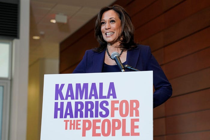
So how did that influence the look of Harris’ campaign? Let’s take a look. From then Senator Kamala Harris’ 2020 Presidential Run.

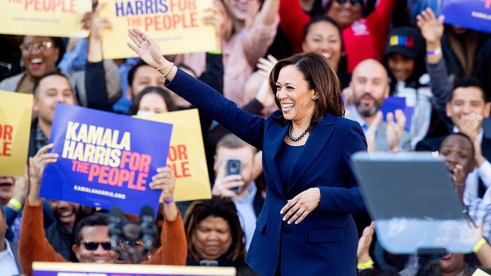
And, now this is just my assumption. Seeing as how Kamala’s entry into the presidential race was hurried and swift. Even her husband, Doug Emhoff was caught off guard, “We’re out there having coffee, messing around and talking, and … people are coming up to me, so it’s now, like, after the announcement has gone out, and my friend’s partner said, ‘Um, you need to look at this,’ and I said, ‘What?’” Emhoff said.
What the friend was holding up was Biden’s letter to the country announcing he was dropping out.
This tells me that, from my years being on the business end of ad agency project managers’ work orders, that as soon as Biden announced he was dropping out, there were thousands of nervous and anxious printing vendors across the country needing deliverables IMMEDIATELY. They had to meet ridiculous turnaround times to send banners, yard signs, posters, signage, koozies, and “Midwest Princess” caps to every known swing state and campaign stop across the U.S.
No time to reinvent the wheel. “Dance with who brung ya”, as we would say in the South.
So it appears as though the team stuck with the same design sensibilities from the 2020 campaign materials. The simple Bureau Grot Condensed Bold font paired with the simplicities of the blue color palette.


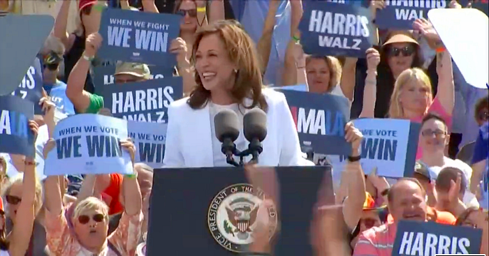

Now some will say the design is dull, or uninspiring, but I would argue that the simplicity is the message.
The Harris campaign sees this as an incredibly pivotable time in our history. A make or break event. And there is no a time to get cutesy with metaphorical flag icons, symbols or even exclamation points. So much is on the line; from Democracy, women’s reproductive rights, the economy, education, the list goes on.
One glance at Project 2025 will throw you into a panic. Yeah, it’s really not a time for quirky. This is serious. Really serious. It’s not time to follow what’s been done in the past, but be bold and provide a clear path forward to the future.
Or as Shirley Chisholm once sucinclty said, “Leadership does not mean putting the ear to the ground to follow public opinion, but to have the vision of what is necessary and the courage to make it possible.”
