A Comprehensive Overview of Designing a CRM Sales Performance Report for MavenTech in Power BI : Part 4
Welcome back to the final article in a series detailing our journey through the Maven Sales Challenge, where we harnessed the power of Power BI to create a dynamic CRM Sales Performance Report.
Previous article: Building the Foundation: Designing the Data Model in Power BI : Part 3
This article combines insights and visual storytelling to guide you through the design of visual elements, the interpretation of report data, and the extraction of actionable business insights. It will also delve into lessons learned and future recommendations for enhancing the efficacy of the report.
Designing the CRM Sales Performance Report
Visual Elements
In the CRM Sales Performance Report, every visual was selected to convey specific information clearly and efficiently:
- Card Visuals:
These visuals provide at-a-glance metrics, such as total sales revenue on closed deals, top product, top manager, top agent and the number of opportunities still in progress. These cards are essential for quick summaries.

- Treemap:
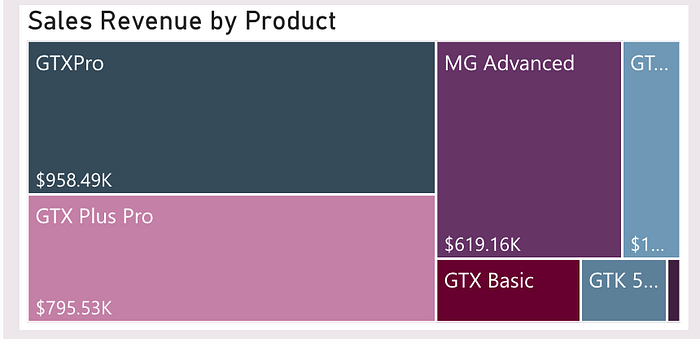
These visuals offer a hierarchical view of data, such as which products are performing best in terms of sales revenue.

- Line Graphs:
Line graphs are utilised to track sales trends and win rate over the quarters, helping to identify peaks and troughs in performance.


- Column Chart :
The vertical display of data in column charts helps in quickly drawing attention to differences in magnitude between categories. The taller the column, the greater the value, which makes significant differences stand out and enhances the visual impact of the data presentation. We have a bar chart showing the top 10 accounts by revenue and it could be useful for focusing sales efforts on high-value clients.

We also had a horizontal display of a column chart. Horizontal bars are also excellent for highlighting differences between categories. They can sometimes make these differences even more pronounced due to the natural way humans perceive horizontal movements and gaps. We used this kind of chart to highlight the magnitude of differences between won and lost opportunities with the hope that the won opportunities are a lot more than the lost opportunities.

- Radial Gauge Chart:
This visual is particularly effective for displaying progress towards goals, such as reaching a sales target, giving a clear and immediate sense of how close the team is to achieving its targets. In our case, we can check how much of closed/all opportunities were actually won.

Each of these visual elements was chosen not only for their aesthetic appeal but because they match the specific type of data analysis they facilitate, making the report both informative and intuitive.
Interactive Features
To enhance user engagement and utility, our report incorporates several interactive features:
- Tooltips:
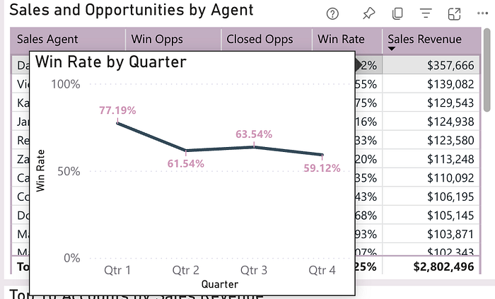
Hovering over certain visuals reveals detailed data points and metrics, offering deeper insights without cluttering the main view. Tooltips can range from simple comment boxes providing basic information to tooltip pages, which are essentially mini reports in their own right.
In our report, we have utilised both options:


Tooltip pages in Power BI are a powerful feature that enhances the interactivity and informativeness of reports. They provide additional context or detail about the data without overcrowding the main visualisation. Acting as mini reports, these pages can display not just basic data points but also include visuals such as charts, tables, and images that elaborate on the underlying data. They allow viewers to delve into more detailed layers of data without leaving the main report view, ensuring a streamlined and focused user experience. This feature is especially useful for adding depth to data presentations, showing trends, comparisons, and detailed breakdowns that become relevant when exploring specific data points.
- Drill-through Pages:
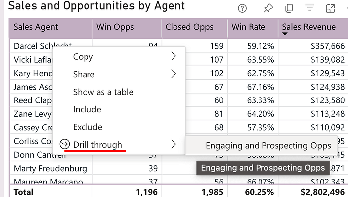
These enable users to click on a visual element and drill down into more detailed data views related to that element. We have employed this feature to examine opportunities still in progress for a particular agent.

These features transform our CRM Sales Performance Report from a mere presentation of data into a dynamic tool for exploring and understanding data.
Interpreting the Report
Guide to Report Usage and Interpretation

At the top of the report, you’ll find dropdown filters that allow you to hone in on specific factors or combinations thereof. Currently, we’ve selected the year 2017, Quarter 4 for our view. The report begins with ‘at-a-glance’ cards that summarise key information for the selected time period and any additional factors chosen by the user. For this quarter, the total revenue stands at approximately $2.8M. The highlights include our top product, GTX Pro; top manager, Melvin Marxen; and top agents — Darcel Schlecht based on revenue and Versie Hillebrand based on win rate.
Win rate is calculated by the percentage of won opportunities out of closed opportunities.
The left-most third of the report delves into the breakdown of sales revenue for the current period selected, as well as the trend over the quarters. We’ve introduced a versatile element called field parameters, which allows users to adjust the breakdown in the treemap and the quarterly trend chart by various factors, such as regional office, manager, sales agent, product, and sector. This customisation lets users view these visual elements based on the factors that interest them. The treemap displays the current breakdown, while the line chart tracks how the selected factor has performed over the quarters.
The middle third of the report focuses on agents’ closed opportunities and the resulting sales revenue. The accompanying table allows sorting by any desired factor and includes a drill-through feature to an engaging and prospecting opportunities page. This page provides insights into deals still in progress. Here, you can also view the tooltip page displaying the win-rate performance over time for each agent, alongside information about top revenue-generating accounts — highlighting which should be prioritised in ongoing opportunity management.
The rightmost third of the report highlights the opportunities themselves. It features cards that display the number of engaging and prospecting opportunities, followed by a horizontal bar graph comparing the number of lost and won opportunities. This visually represents the ratio between lost and won for the selected period. Finally, a radial gauge chart shows the percentage of won opportunities against closed or all opportunities, depending on the user’s selection.
Overall, this report offers a comprehensive view of sales revenue, broken down by multiple user-selected factors and tracks performance over time. It allows users to drill into specific areas such as agent performance, top accounts, and the overall health of the opportunity pipeline, assessing whether a substantial number of potential opportunities exist, and if the closed ones are yielding a satisfactory win rate.
Future Recommendations and Conclusion
Throughout the Maven Sales Challenge, we have learned several key lessons, including the critical importance of maintaining clean and organised data, as well as the necessity for iterative testing of report designs to ensure they are clear and user-friendly.
Recommendations for Improvement
For future iterations of the report, we might consider implementing:
- More granular user access controls to enable customised views for different management levels. For instance, introducing row-level security would restrict managers to accessing only their agents’ performance data, thereby protecting the privacy and integrity of data across departments.
- Views that facilitate a comparison between agents’ quarterly performances, highlighting variations and trends that may warrant managerial attention.
- Views that display percentage changes between the currently selected quarter and previous quarters, providing a dynamic and temporal perspective on performance shifts.
- A Gantt chart illustrating deal sizes and potential revenue against expected close dates, offering a visual timeline for sales progress and forecasting.
- The integration of predictive analytics to forecast future quarterly performance based on historical data, enhancing strategic decision-making.
- The inclusion of metrics such as the average number of days spent on closing deals, offering insights into the efficiency and velocity of the sales cycle.
- An overview of revenue trends over the quarters, presented holistically rather than broken down by specific factors.
- Expanded details on engaging and prospecting opportunities, including the duration of current engaging deals and the prospective sales revenue from these deals, providing deeper insights into the sales pipeline.
Closing Thoughts
This project was not just a technical exercise but a growth opportunity, marking the first time I’ve engaged with sales revenue data in my career. This comprehensive overview should lay a solid foundation for anyone aiming to understand or develop a basic sales performance report. The methodologies discussed should empower you to utilise Power BI effectively in your data-driven endeavours.
Happy reporting!
I am happy to hear any comments or suggestions on how this report could be improved.
My Maven Sales Challenge Entry
Articles in Series:
Harnessing CRM Data for Insightful Sales Reporting at MavenTech: Part 1
Mastering Data Cleaning and Transformation with Power Query at MavenTech: Part 2
Building the Foundation: Designing the Data Model in Power BI : Part 3
