Visualizing daily and geographic activity from LastFM dataset
By MSXH (Mario Becerra, Saif Ismail Hameed, Xian Ji, Huijing Zheng)
In our first blog post, we described the data we’re going to be working with, and what we plan to analyze. In our second blog post we described the process of using Spotify’s API to get the genres associated with each artist. In our third post we identified regular and clumpy customers using a Bayesian multilevel model and plotted their behavior. In our fourth post we looked at the listening behavior of users according to their age and gender, with data obtained using Spotify’s API.
In this post we quickly look at the geographic distribution of the users and the listening behavior according to day of the week and time of the day.
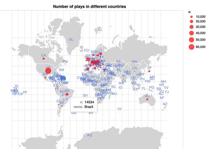
First, we look at the following map. It shows the number of playbacks in each country. We can see that most of the listening activity takes place in the USA and in Europe .The plot shows only a screenshot, but it is an interactive map made with vega-lite. The code can be found here.

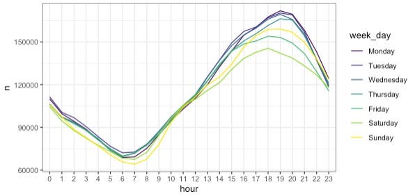
In the following plot, we can see the number of playbacks by all users by each hour of the day and each day of the week. The hourly tendency is very similar in all days, with the most activity being at around 7 pm and the least between and 7 am. It can also be seen that there’s more activity during working days.

The following plot displays similar information to the previous plot, but in a different fashion. Also, it is an interactive vega-lite plot, in which the user can select the age group and gender of the users. The code is available here.


