
Responsive Design: Why and how we ditched the good old select element
How rethinking the way users make complex selections across devices completely changed our design.
We’ve all seen this and know what it does:

It’s the HTML select element. The invention of select dates back to 1995 with the introduction of the HTML 2.0 specification. So most of us have never experienced designing for web without select as an option. But it can be a really, really frustrating component to let into your designs. Let me tell you why.
Good things first
By using the select element it’s a no-brainer to create a list of selectable options. It’s easy and it’s cheap. It’s supported by all new and old browsers in use, and it comes with a lot of nice features, such as grouping options, keyboard navigation, single and multi select and reliable rendering across platforms without me having to put on my thinking hat. It just works!
So why not just use it?
At Tradeshift we’ve been working a few months on some soon-to-be-released updates for our user interface. Some of our core features include creation of invoices, quotes and purchase orders. It’s business documents with substantial amounts of data. Most often a human is involved in creating these business documents. Luckily, this human user has access to a lot of already existing data from various sources, which potentially makes document creation faster. All this data is predominantly represented as lists that the UI must enable the user to select from — efficiently and effectively — no matter the device.
Presenting option lists to users is most easily done by using checkboxes, radio buttons and by using select. However, some limitations in these components made the design team hit a wall for a number of reasons. Here’s an excerpt from a longer list of drawbacks of using select. The drawbacks would to some extent also apply to radio buttons and checkboxes:
- The number of selectable options we have is often counted in hundreds which makes the standard select element hard to navigate.
Example: When specifying the unit type on an invoice line, the complete list contains hundreds of possible units. It’s not just hours, meters, liters, kilos, pounds and pieces — but also crazy units such as hogshead, syphon, ‘theoretical ton’ and ‘super bulk bag’. Tradeshift deals with global trade and compliance and we must be able to provide all these options. Standard option selectors would turn into haystacks.
A more common example is country selectors. I often find myself struggling to select United States in most selectors, no matter how smart the sorting of options has been done. For ‘popularity reasons’ United States is often found at the top of country list. Other times Afghanistan tops the list due to alphabetical sorting. Sometimes United States is far down the list, just after United Arab Emirates. Sigh! In addition to this, keyboard search is not available on most mobile devices. This forces the user to flick through the options manually. Searching is slightly better on desktop though, but it’s still limited to searching from the first letter onwards, so typing Emirates on your keyboard is not going to give you United Arab Emirates. You get it… and we've not even started talking synonyms yet. - The user often has to modify the options in the lists provided.
Example: We provide a set of default taxes that the user can apply to each invoice line item. Often, however, legislation and taxes change and we must provide the flexibility for the user to add and change the default options. We don't want the user to go to the engine room (aka settings pages) while creating an invoice. For a fluent workflow, users should update properties like these in context, else we risk the product becomes harder to use than say a word processor template. Unfortunately, the select list cannot technically be extended with inline interface for mingling with taxes. We could of course show a modal dialogue with an interface to modify the taxes list. We'd then return the user to the updated select element when editing options is done. It’s an option, but quite a UX derailment that we've seen cause confusion to less experienced users. - The same input value can be generated from different selection paradigms.
Example: Payment terms can be expressed as a relative measure (e.g. Net 30 days), or an absolute value (e.g. Dec. 10th, 2013). One could imagine many solutions combining radio buttons, calendars and selects. None of them seems to provide the kind of simplicity we were aiming for. We don't want two distinct inputs to select one value. - Select element UI interaction makes bad use of screen estate on mobile devices.
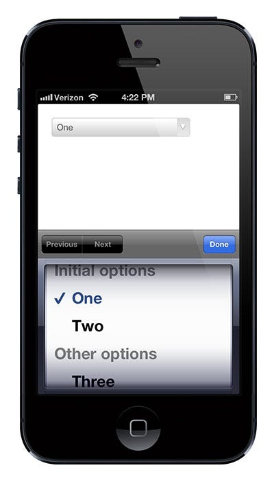
Example: On an iPhone 4 the select element takes up 54% of the screen space (520pt of 960pt vertically). This allows barely five options to be visible in the list. This simultaneously limits gesture space to the same 54% of the screen (Android does a slightly better job in many cases, though).
- Hierarchical data can be a real pain to deal with using the standard select element.
Option groups which is a part of the select element’s features, have limited usage when you deal with complex hierarchies. Country selection offering sub-selection of states is an obvious example. Standard solutions typically involve lining up multiple select elements. So interaction goes like this: first the user picks one option in one list, then closes that list, interprets the UI adding or unlocking another select element, which must then be clicked, etc. Not totally insane on a desktop browser, but on mobile the pain grows and the visual/contextual relations are easily blurred. I recently heard the previous Principal Designer at Twitter, Josh Brewer, quote someone that Mobile is a magnifying glass for your usability problems which seems right, and in this case it definitely corresponds with Tradeshift’s own usability studies. - Styling the select element is poorly supported.
There’s a whole bunch of reasons for the historically limited options for styling the select element — and even more scripts/hacks exist to overcome these limitations. Bottom line is that if you want your selectable options to fit nicely into your design in various browsers you're pretty far into Hackland. And even if you go with one of these very nice styling scripts, you've not solved any of the interaction issues listed above — you may actually have added a few issues if your hack has changed the scroll wheel or touch behaviours or eliminated the standard “search feature”.
So in spite of the advantages mentioned initially, the many shortcomings we experienced in more complex scenarios simply left us frustrated with the standard select element.
So what can we do now that the cookie cutter solution does not make the cut?
We looked at many existing solutions, also the scripts that re-style the select element. We figured out we had to dig deeper. Please note: I don't claim we've made big inventions in the following or that we invented the solution we ended up choosing. Variants of our final solution have been seen in many places. Also the solution we picked definitely has new shortcomings that we're working on solving now — but most importantly, it allowed us much more freedom in working with user input and we can provide a consistent experience to our users across a number of scenarios and platforms. I only claim that we had a good critical process where we evaluated the most obvious options, found them insufficient and came up with a solution through a solid RITE process. A process of describing our needs (some listed above), ideating, prototyping and end-user/acceptance testing over and over. We wanted a new UI component that provided richer interaction options while completely replacing the select element, since we didn't want a mixed user experience depending on what the user is selecting.
The solution
I'll skip the process and describe what we ultimately ended up deciding on. Mostly by using screenshots — please be aware that these are somewhat early screenshots where copy is not final. To explain, I'll use a few simple examples from the invoice creation feature, which requires a lot of selections by the user.
Basically the concept is to stack layers with the appropriate options providing ample space for rich interactions:
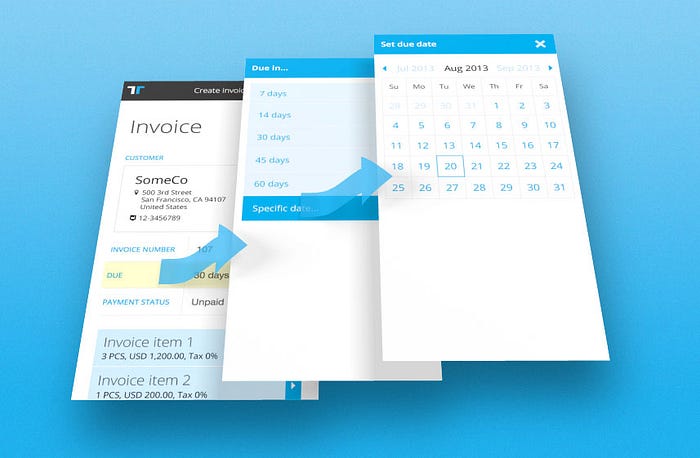
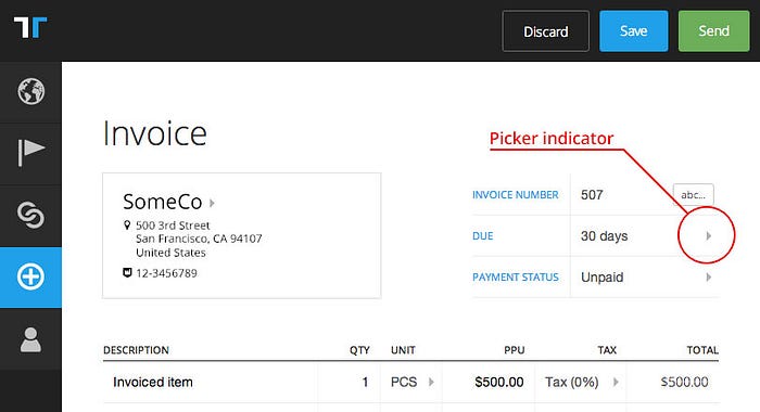
In the UI a subtle triangle indicates that there’s a list available for the field (full keyboard navigation is of course supported):
Upon clicking a field with the triangle indicator, a panel sides in smoothly (in most browsers) and the page is darkened with an opaque overlay, which focuses attention on the panel; we call this panel a picker. In this example the user clicks the invoice due field and a list of standard payment terms are presented:
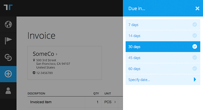
If none of the standard options satisfy the user there’s also the option to specify an absolute date by clicking the last option, specify date:
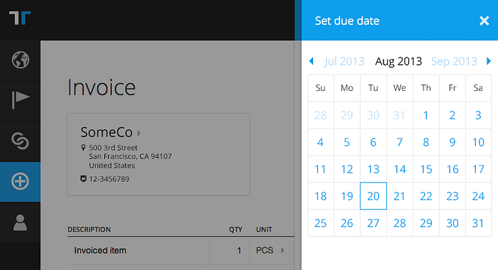
This second layer presents more fine-grained options and is visually layered on top of the first layer, providing context to the user, keeping the user’s mouse and eyes in same position while also allowing back-navigation by closing the picker (escape key or clicking/tapping ‘x’). The visual layering provides an almost breadcrumb-style sense of navigational depth. What’s missing here on the screenshots is unfortunately the smooth horizontal animations further strengthening the sense of context.
Picking a date value closes all picker layers and sets focus back to the initial field activated, invoice due, and the user can tab on:

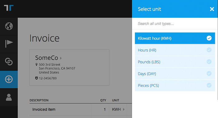
Another example is clicking the unit type selector in an invoice line (the one that says PCS in screenshot above). Here the current value is highlighted in the picker:
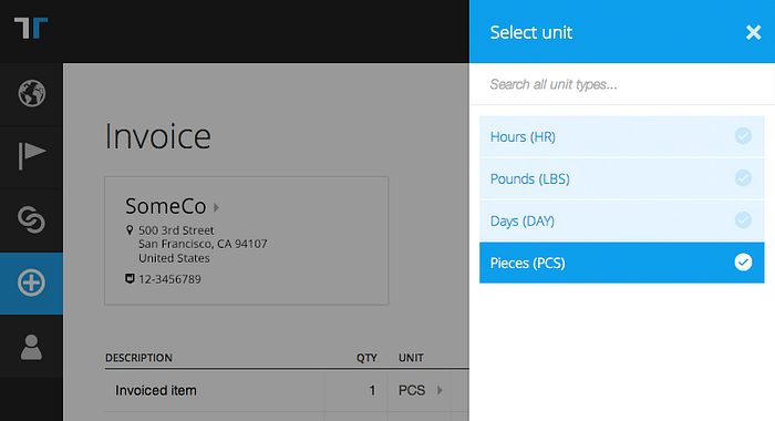
As aforementioned the full list of unit types is counted in hundreds. Meanwhile many smaller companies only use a very limited set of unit types, so instead of presenting the full list we only show the most recently used ones and a search field. Searching, in this case for kilowatt, returns the options from the full set:
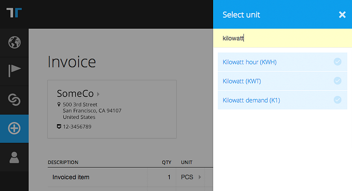
Picking a value, here Kilowatt hour (KWH), closes the picker and returns the focus to the target field:
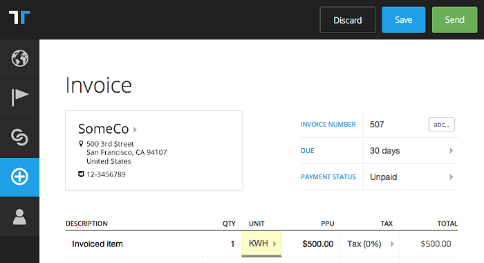
Clicking a unit type field again now has Kilowatt hour (KWH) available as an option. Users who use a unit type once are very likely to use that unit type again, so this approach provides a settings free way of defining custom/individual lists:
There’s a ton of other examples with more complex dialogues (not least configuration of taxes) which keep the user in the context and don’t abstract away into who-knows-where settings pages. Our studies show that the user usually knows where to find, and how to use the values added, when it all happens in the same context.
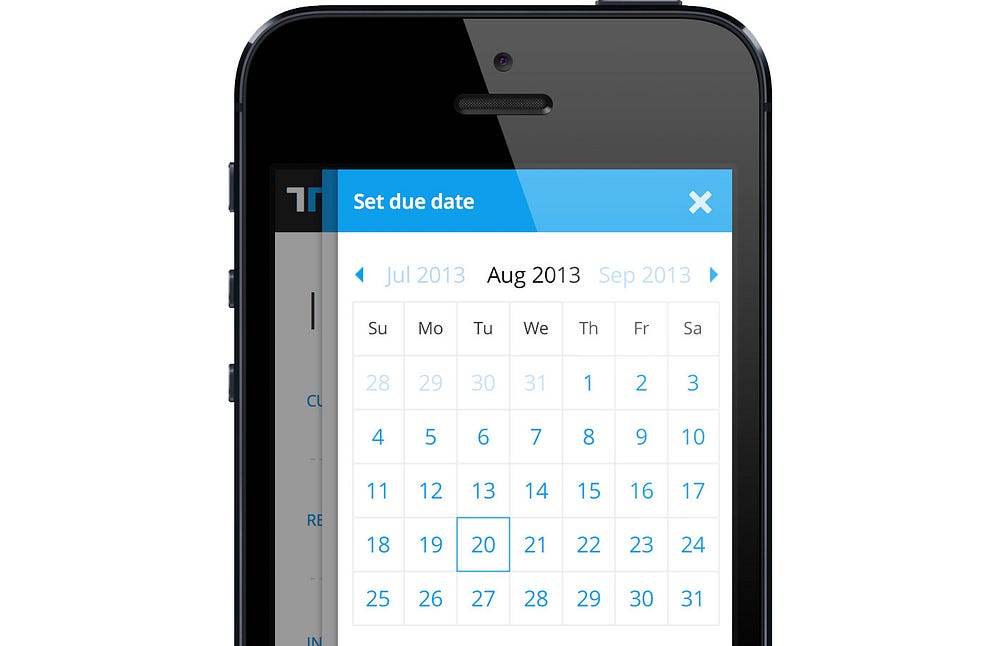
The concept of pickers first appeared when we started designing the new Tradeshift from a mobile first perspective. I.e. not trying to squeeze the desktop experience into mobile, but more the other way around. On phone size devices we now also have entire invoice lines in pickers instead of presented in the “page body” as on tablet.
It adds some extra layers of pickers, but we've found out, that the visual clues provided for the user to establish a mental model of where things are going on, are sufficient to go at least three layers deep. Example of a three layer deep scenario could be: Invoice line (picker on mobile) > List of applicable taxes > Add new tax to list.
Obviously, we wouldn't believe this could also be the the solution on desktop if we'd not tested it. But out of the different scenarios setup for complex selection of field values in the cases we have, this one won hands down, also on desktop. We've found out, that compared to using a series of select elements and modal dialogues, this solution decreases the cognitive load on the user significantly. This, by the way, reminds me of a comment Rebekah Cox (Quora’s first employee and designer) once made: “Design is what we don’t ask the user to do”. I couldn't agree more. We should free up the users’ mind to work on their business not our tools.
This doesn't mean there’s not room for improvement. For instance we've figured out we need some way to not stick the picker to the right edge of the browser on larger resolutions and keep it closer to the field.
Extended use
An extension made a bit later during the redesign process was using pickers to manipulate and navigate using objects (such as invoices) as “hubs” for navigation:

This allows us to reuse a small-screen friendly design pattern already known by the user while not forcing the user reload another page to get the options.
Implications for the overall design
We’ve come to love the concept of pickers. We use them every time the user needs to populate a field from a set of options. We’ve done enough testing that we’re also confident that our users understand and prefer the pickers over complex select element combinations.
Using the pickers as navigation hubs allowed us to further simplify navigation and present options in-context without forcing the user into subpages or even worse, cluttering the UI into a non-decodable mess. Our lists are now cleaner, it’s easier prioritize the screens for end-user consumption and decision making, and synergies in desktop/mobile seem to pay off as users need to learn fewer patterns. Another benefit is that we technically have less different UI components to maintain.
If you had to start from scratch and the standard form elements didn't exist, would you end up designing your “multiple options selector for any platform” as it’s implemented with the select element today? Maybe not, and for us this was reason enough to reconsider.
You can follow me on twitter @mibosc
