Why Japanese Websites Look So Different
& how to analyze design choices without jumping to conclusions
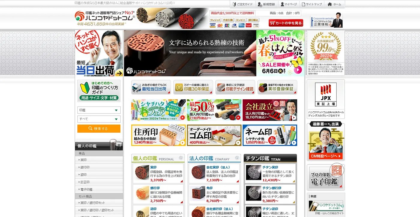
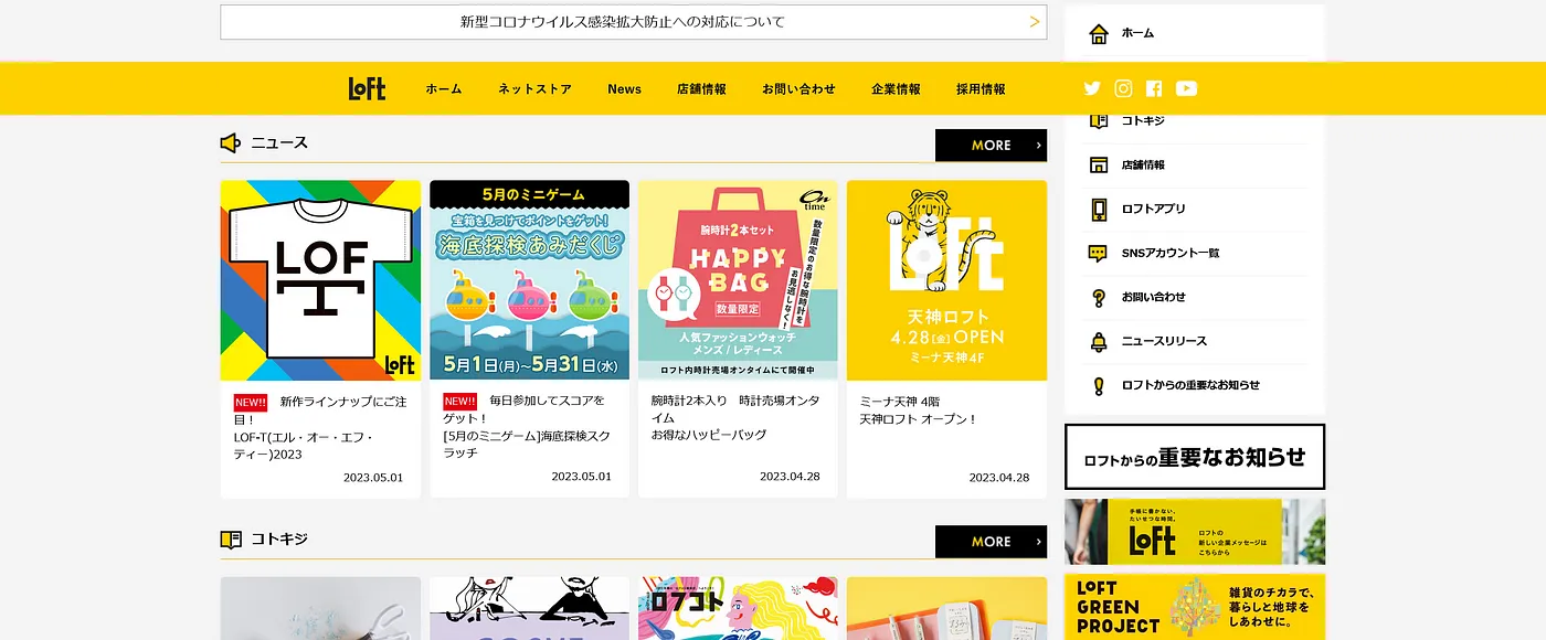
Over the years, I have had many encounters with Japanese websites — be it researching visa requirements, planning trips, or simply ordering something online. And it took me a loooong while to get used to the walls of text, lavish use of bright colors & 10+ different fonts that sites like this one throw in your face:
Though there are numerous examples of sites with a more minimalistic and easy to navigate design for someone used to Western websites, it is worth examining why this more convoluted style remains prevalent in Japan.
And just to be clear, these are not remnants from the past, but maintained sites that — in many cases — were last updated in 2023.
There are several angles from which we can analyze this design approach:
- Fonts & Front-End Website Development Constraints
- Technological Development & Stagnation
- Institutional Digital Literacy (or the lack thereof)
- Cultural Influence
As with most topics, it is likely that there is no one right answer, but rather that this website design is the result of various factors interplaying over time.
Fonts & Front-End Website Development Constraints
Whereas creating new fonts for romanized languages can be an enjoyable challenge everyone with a basic understanding of typography, an appropriate program & some time on their hands, can take on, doing the same for Japanese is an endeavour on a whole other level.
To create a font from scratch in English you’ll be looking at around 230 glyphs — a glyph being a single representation of a given letter (A a a counting as 3 glyphs) — or 840 glyphs if you want to cover all languages based on the Latin alphabet. For Japanese, as a result of the three different writing systems and countless Kanji, you will be easily looking at 7,000–16,000 glyphs or even more. So, creating a new font in Japanese requires both an organized team effort and a lot more time than its Latin counterparts.
It won’t come as a surprise then that similar workloads ensue for Chinese and (Hanja) Korean fonts, leading to these languages being often covered in what are called CJK fonts.
And with less designers rising to this particular challenge, there are less fonts to choose from when building a website. Add this to the lack of capitalization and Japanese fonts being accompanied by longer loading times due to referencing larger libraries, and you end up with having to use different means in order to create visual hierarchy.
Let’s take the American & Japanese versions of the Starbucks homepage as an example:


And just like that, we have an explanation for why many Japanese websites tend to represent content categories with text heavy images. You’ll sometimes even see each tile using its own bespoke typeface, especially when it’s a limited time offer.
Technological Development/Stagnation & Institutional Digital Literacy
Despite the countless discussions of the “Lost Decades” and Japan’s relationship with technological advancements, I like this summary the best:
Japan, living in the year 2000 since 1985. (thanks Reddit)
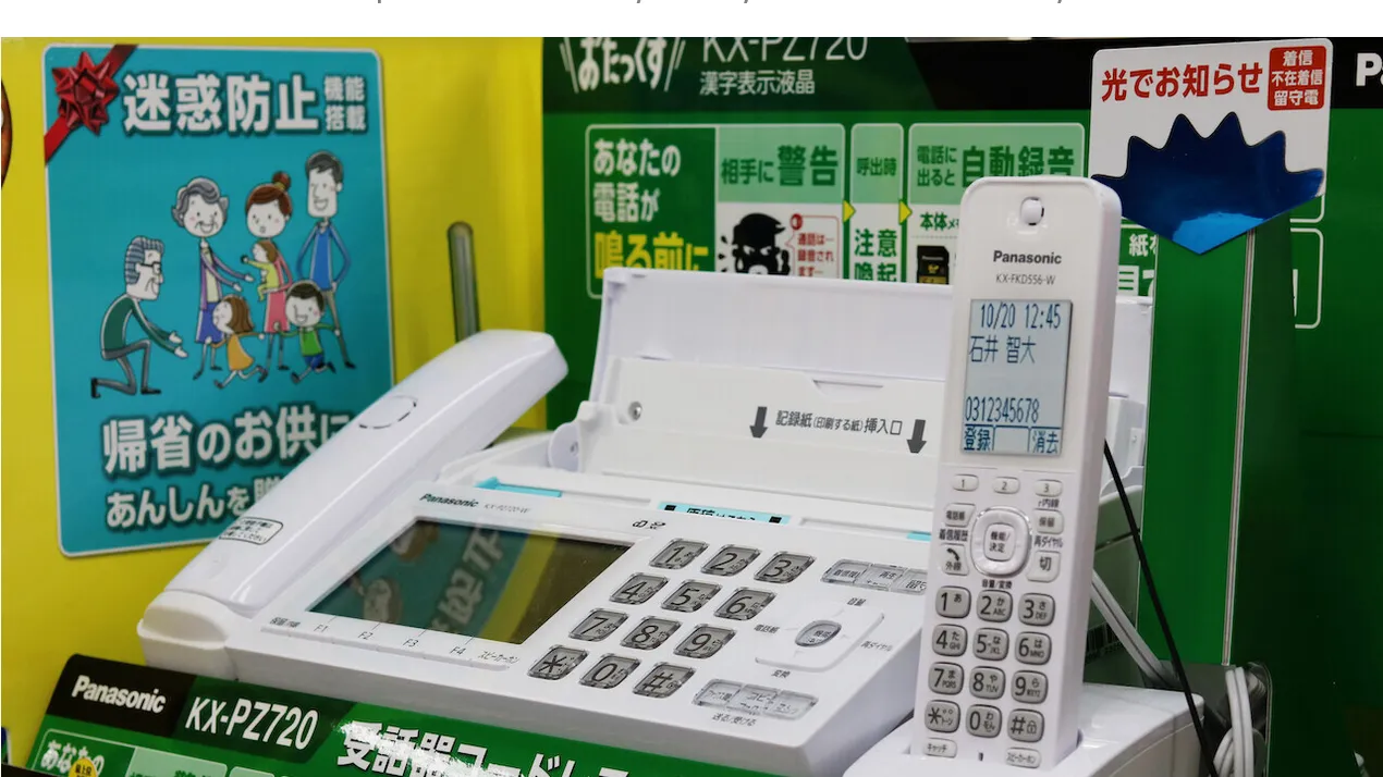
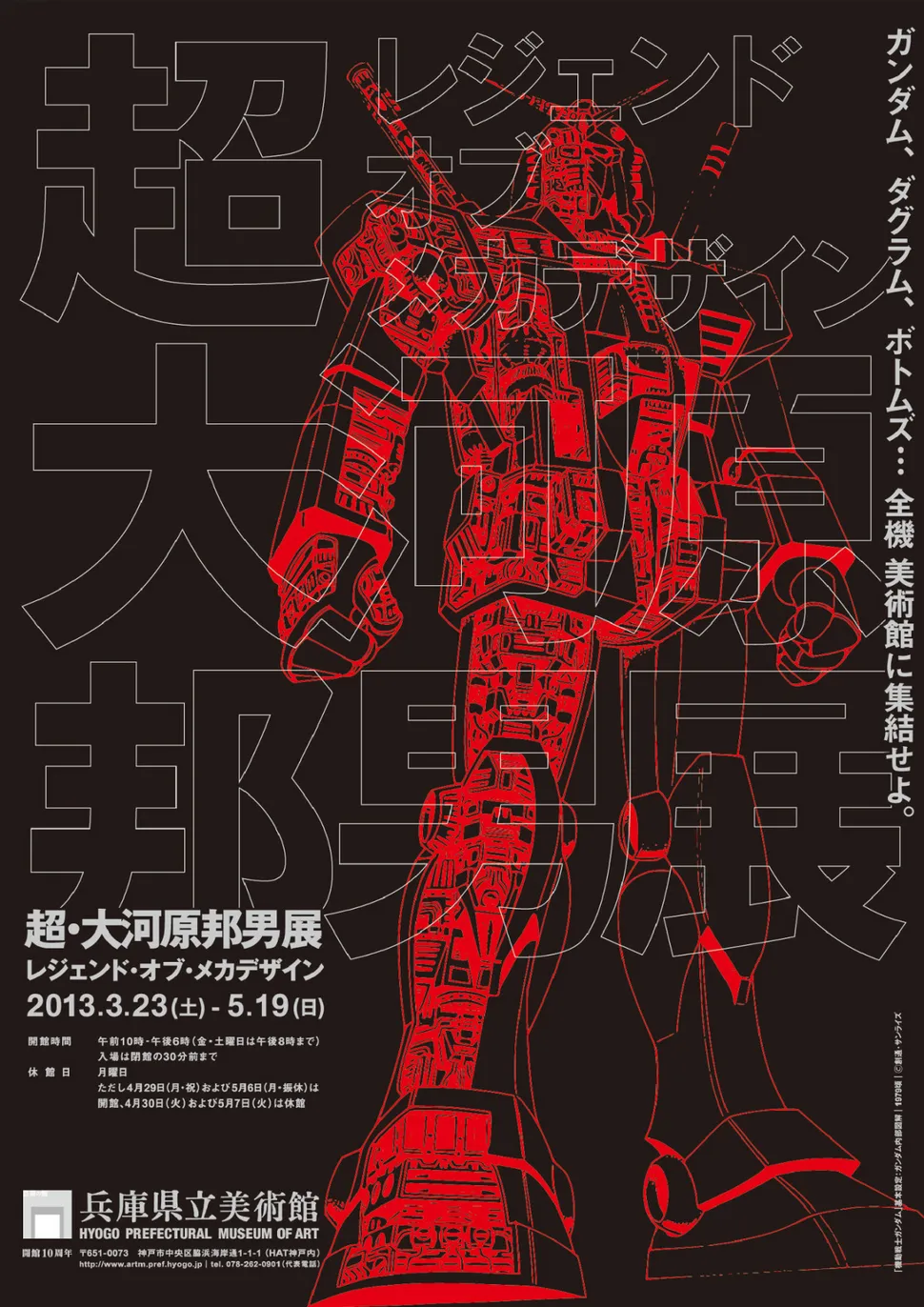
If you harbour an interest in Japan, you might be familiar with the at times striking dichotomy between state of the art & utterly obsolete technology that are juxtaposed in many places. That one of the world leaders in robotics — the country that put a life-sized Gundam statue on the artificial island of Odaiba — is also one of the top leaders in still relying on floppy disks and fax machines, panicking in the face of the Windows Explorer shutdown in 2022.
In Germany, former chancellor Angela Merkel was made fun of nation-wide after she called the internet “uncharted territory” (original quote in German: „Das Internet ist für uns alle Neuland“) in 2013. This was easily topped by former cyber security minister Yoshida Sakurada, who, in 2018, claimed to have never once used a computer & was — and I quote — “[…] confused by the concept of a USB drive when asked in parliament” (source).
As strange as it might sound for someone who hasn’t yet had the chance to look behind the curtain of illusions, Japan is — and has been — severely lagging behind its update schedule when it comes to technological literacy. Thus, it isn’t far-fetched to infer that these issues also played a part in holding back Japanese website design. And it is, specifically, Japanese web design that faces this struggle — just search up Japanese poster design on Google or Pinterest to witness a very different and contemporary level of graphic design.
Cultural Influence
Cultural customs, inclinations, biases, and preferences shouldn’t be underestimated when analyzing design choices of any kind. Still, “it’s culture” runs the risk of over-simplyfying the topic and being used as an excuse to justify all sorts of differences. And to shed ones own perspective bias is tricky and perhaps not even fully possible.
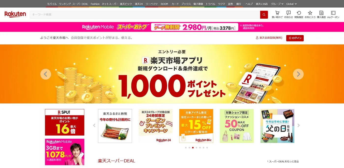
So, from our point of view, it’s easy to look at this website…
… feel overwhelmed, judge it as badly designed, and call it a day. Because who would even use this discombobulated mess of a website?
And that’s where interesting insights get flushed down the toilet because of ignorance. Now, I am not in the place to tell you how exactly Japanese culture has influenced this kind of design. However, I am in the fortunate position to be able to draw from conversations with Japanese natives, as well experience from working in Japanese & having lived in the country.
One conversation I had that relates to this analysis was actually not about websites, but YouTube thumbnails — which, at times, can be equally overwhelming.

For someone used to the minimalistic and sleek design many Western channels use — featuring one title, recurring color palettes, and limited fonts — the above thumbnail is a lot to take in. The Japanese native I had asked about why many thumbnails of hugely popular channels were designed this way, however, was surprised about the idea of this design being seen as confusing. He felt that the Japanese approach made the videos seem more intriguing, giving several tidbits of information to latch onto, in turn rendering it easy to make an informed decision on whether the video would be interesting. The English video thumbnails I showed him as a comparison on the other hand, felt extremely vague and boring to him.
And it might be exactly this information-seeking attitude that is the root-cause of our perceptions diverging so much. In Japan, the level of risk-aversion, double checking, and hesitancy towards making quick decisions is noticeably higher than in Western countries. This is tightly connected to the more collectivist social mindset — for instance, double (or triple) checking a document before sending it to a business partner might take a bit longer, but poses a significantly lower risk of errors slipping through, and thus prevents anyone involved from losing face.
Though there is an argument to be made that this only holds true for sufficiently high stakes, which confusing foreign tourists appears not to qualify as — search up the term “Engrish” & thank me later.
Back to website design and this cultural angle helps to explain why online shopping, news and governmental websites are often the “worst offenders” from an outside perspective. After all, these are exactly the cases in which a high amount of details directly corresponds with making a good purchase decision, staying up-to-date efficiently, or making sure you have all the necessary information about a certain procedure.
Interestingly, there’s also a considerable body of research about how different American and Chinese/Japanese perceive information. Results from several studies seem to show that Japanese, for instance, perceive information more holistically, whereas Americans tend to pick one focus point to direct their attention towards (source). This may give us another hint at why Westerners have a difficult time with these types of websites even at a high level of Japanese language proficiency.
Last but not least, it needs to be said that websites don’t exist in an online vacuum. And with various media ranging from pamphlets or magazines to advertisements in the metro also using layouts that cram as much information in as little space as possible, people may simply be so used to this ubiquitous approach that nobody ever thought of questioning it.

To make a long story short, this is neither an attempt to find the absolute answer to the title question, nor to reinforce the notion that the Japanese are unique à la nihonjinron (日本人論). Instead, especially after having seen several discussions that focused on one explanation to be the “true answer”, I wanted to show the bandwidth of technological, historical, and cultural influences that ultimately shape such differences.
Sources & further reading
Fonts & Typography
Interview with Font Designer Akira Kobayashi: https://www.smashingmagazine.com/2015/04/interview-with-akira-kobayashi/
A detailed breakdown of the creation process behind a Chinese font: https://qz.com/522079/the-long-incredibly-tortuous-and-fascinating-process-of-creating-a-chinese-font
An example of a Japanese font including glyph count from Adobe Fonts: https://fonts.adobe.com/fonts/source-han-sans-japanese#fonts-section
CJK Fonts: https://en.wikipedia.org/wiki/List_of_CJK_fonts
Japan & Technology
An article on Japan’s fading hi-tech image and where it came from: https://thenextweb.com/news/japan-loves-fax-machine-techno-orientalism
Bloomberg on the effects of the Internet Explorer shutdown in Japan: https://www.bloomberg.com/news/articles/2022-06-15/end-of-internet-explorer-era-spells-trouble-for-japan-businesses#xj4y7vzkg?leadSource=uverify%20wall
The Guardian on the 2018 statement made by Japan’s former Cybersecurity Minister: https://www.theguardian.com/world/2018/nov/15/japan-cyber-security-ministernever-used-computer-yoshitaka-sakurada
Reading up on the Lost Decades: https://en.wikipedia.org/wiki/Lost_Decades
Cultural Influences
Wired on several studies about perception differences: https://www.wired.com/2008/03/japanese-more-s/
A study on the same topic: https://www.researchgate.net/publication/11645680_Attending_holistically_vs_analytically_Comparing_the_context_sensitivity_of_Japanese_and_Americans_Journal_of_Personality_and_Social_Psychology_81_922-934