Evelina JudeikytėinNightingaleI Learned Data Viz in a Year, and You Can TooHow I went from making simple charts to running workshops, and what I learned along the wayMar 24, 202015Mar 24, 202015
Andy McDonaldinTowards Data Science4 Essential Tools to Help You Select a Colour Palette for Your Data VisualisationTools for Making it Easy to Select Colour Palettes for Data VisualisationsMar 15, 20233Mar 15, 20233
Andy McDonaldinTowards Data Science7 Steps to Help You Make Your Matplotlib Bar Charts BeautifulEasily Improve the Quality of Your Matplotlib Data Visualisations With a Few Simple TweaksMar 27, 20233Mar 27, 20233
PlotlyinPlotlyAnalyze Data: Five Ways You Can Make Interactive MapsPlotly’s new map making tools let you tell stories about data as it relates to geography. This post shows five examples.Sep 18, 2015Sep 18, 2015
Ben HuiinTowards DevThe most 50 valuable charts drawn by Python Part IIPart I: https://medium.com/@benhui.ca/the-most-50-valuable-charts-drawn-by-python-4584d4626e55Feb 5, 20231Feb 5, 20231
Ben HuiinTowards DevHow to use matplotlib-rcParams to custom your visual style in Python?matplotlib-rcParams can be used in jupyter environment to custom visual style. Once setups, every box in jupyter will use the same style.Mar 28, 20231Mar 28, 20231
Andy McDonaldinTowards Data Science3 Unique Charts You Wouldn’t Think Were Created with MatplotlibUtilising Python’s Matplotlib to Create Advanced Data VisualisationsMar 20, 20231Mar 20, 20231
Patricia Carro GarcíainAnvilTurn Your Pandas Code into a Web AppIn this tutorial, we will build a dashboard using a local Pandas script or Jupyter notebook.Mar 16, 20233Mar 16, 20233
Rishi GhaiBuilding Interactive Business Dashboards in Python with Dash“The goal is to turn data into information and information into insight”Feb 16, 20232Feb 16, 20232
TheDataProfinTowards Data ScienceThe Battle of Interactive Geographic Visualization Part 7 — BokehUsing the Bokeh Library to Create Beautiful, Interactive GeoplotsApr 13, 2022Apr 13, 2022
Open Data AnalyticsinPython in Plain EnglishYou’ll Never Walk Alone: Use Pygwalker to Visualize Data in Jupyter NotebookAs a data scientist, you’re always looking for ways to simplify your workflow and create interactive and engaging visualizations of your…Feb 23, 2023Feb 23, 2023
Andy McDonaldinDataDrivenInvestor9 Creative Alternatives to the Traditional Pie Chart for Data VisualisationUsing Python to Create Alternatives to the Pie ChartFeb 10, 2023Feb 10, 2023
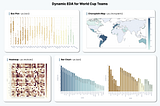
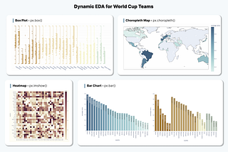
Destin GonginTowards Data ScienceHow to Use Plotly for More Insightful and Interactive Data ExplorationsCase Study: Dynamic EDA for Qatar World Cup TeamsDec 13, 20221Dec 13, 20221
Destin GonginTowards Data ScienceHow to Develop a Streamlit Data Analytics Web App in 3 StepsStep-by-Step Guide to Build Your First YouTube Analytics AppFeb 25, 20231Feb 25, 20231
Michaël ScherdingBuilding a Data Visualization App with Looker, Streamlit, and PlotlyData visualization is an essential tool for understanding and communicating insights from data. In this tutorial, we’ll explore how to…Mar 1, 2023Mar 1, 2023
Dr. Shouke WeiData Visualization with hvPlot (I): Change BackendshvPlot provides a high-level and pandas-like plot API to easily generate modern and interactive plotsMar 1, 2023Mar 1, 2023
Chi NguyeninPython in Plain EnglishSimplify Your Process of Building Interactive Dashboards with Taipy (1)Do you have minimal coding skills but want to build your first Python interactive dashboard? Consider Taipy!Feb 3, 20235Feb 3, 20235
Alejandra VlerickinTowards Data ScienceStep by step bar charts using Plotly ExpressAnswer the question “What am I looking at here?”May 29, 20201May 29, 20201
Tim GattingerPart 1: How to automatically access each weather station data of a region, plot climate graphs and…Automatically access station data from German weather service (DWD) makes it easy to look at basic meteorological parameters such as…Feb 10, 2023Feb 10, 2023
SETIA BUDI SUMANDRAPerformed Visual Analysis to Airbnb New York Dataset using Barplot, Pie Chart, Catplot and Map…IntroductionJul 1, 2022Jul 1, 2022